
Ignite UI API Reference
ui.igColorPickerSplitButton
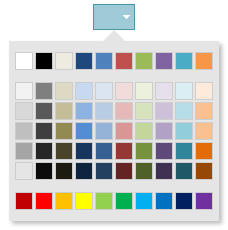
Code Sample
<!DOCTYPE HTML>
<html>
<head>
    <title>Color Picker Split Button Demo</title>

	<!-- Infragistics Combined CSS -->
    <link href="css/themes/infragistics/infragistics.theme.css" rel="stylesheet" type="text/css" />
    <link href="css/structure/infragistics.css" rel="stylesheet" type="text/css" />
    <!-- jQuery Core -->
    <script src="js/jquery.js" type="text/javascript"></script>
    <!-- jQuery UI -->
    <script src="js/jquery-ui.js" type="text/javascript"></script>
    <!-- Infragistics Combined Scripts -->
    <script src="js/infragistics.core.js" type="text/javascript"></script>
    <script src="js/infragistics.lob.js" type="text/javascript"></script>
    <script type="text/javascript">
		$(function () {
			$("#color-picker-split-forecolor").igColorPickerSplitButton({
				items: [{
					name: "textColor",
					label: "Font Color",
					icon: "ui-igbutton-forecolor"
				}],
				defaultItemName: "textColor",
				selectedTextColor: "red"
			});

			$("#color-picker-split-backcolor").igColorPickerSplitButton({
				items: [{
					name: "backgroundColor",
					label: "Background Color",
					icon: "ui-igbutton-backcolor"
				}],
				defaultItemName: "backgroundColor",
				selectedTextColor: "red"
			});
        });
    </script>
    <style>
        body {
            margin-left: 150px;
        }
    </style>
</head>
<body>
    <div id="color-picker-split-forecolor"></div>
    <div id="color-picker-split-backcolor"></div>
</body>
</html>
Dependencies
jquery-1.9.1.js
jquery.ui.core.js
jquery.ui.widget.js
infragistics.util.js
infragistics.ui.shared.js
infragistics.ui.popover.js
infragistics.ui.toolbarbutton.js
infragistics.ui.splitbutton.js
infragistics.ui.colorpicker.js
Inherits
-
defaultColor
- Type:
- string
- Default:
- #000
Default color.
Code Sample
//Initialize $(".selector").igColorPickerSplitButton({ defaultColor: #000 }); //Get var defaultColor = $(".selector").igColorPickerSplitButton("option", "defaultColor"); //Set $(".selector").igColorPickerSplitButton("option", "defaultColor", "#000"); -
defaultItemName
- Type:
- string
- Default:
- button1
Default button item.
-
hasDefaultIcon
- Type:
- bool
- Default:
- true
With or withour icon.
-
items
- Type:
- array
- Default:
- []
- Elements Type:
- object
Button items.
Code Sample
//Initialize $(".selector").igColorPickerSplitButton({ items: [{ name: "textColor", label: "Font Color", icon: "ui-igbutton-forecolor" }] }); //Get var items = $(".selector").igColorPickerSplitButton("option", "items"); //Set var items = [{ name: "textColor", label: "Font Color", icon: "ui-igbutton-forecolor" }]; $(".selector").igColorPickerSplitButton("option", "items", items);-
iconClass
- Type:
- string
- Default:
- ui-icon-gear
Css class to represent the iconClass of the item.
-
label
- Type:
- string
- Default:
- button 1
Item display label.
-
name
- Type:
- string
- Default:
- button1
Item name.
-
swapDefaultEnabled
- Type:
- bool
- Default:
- false
Specifies whether the default button will be switched when another button is selected.
For more information on how to interact with the Ignite UI controls' events, refer to
Using Events in Ignite UI.
Note:
Calling API methods programmatically does not raise events related to their operation unless specifically stated otherwise by the corresponding API documentation; those events are only raised by their respective user interaction.
Show Details
-
click
- Cancellable:
- false
-
collapsed
- Cancellable:
- false
Event fired after the button is collapsed.
-
collapsing
- Cancellable:
- true
Event fired before a button item is collapsed.
-
expanded
- Cancellable:
- false
Event fired after the button is expanded.
-
expanding
- Cancellable:
- true
Event fired before a button item is expanded.
-
collapse
- .igColorPickerSplitButton( "collapse", e:object );
Collapse the widget.
- e
- Type:object
-
destroy
- .igColorPickerSplitButton( "destroy" );
Destroys the widget.
Code Sample
$(".selector").igColorPickerSplitButton("destroy"); -
expand
- .igColorPickerSplitButton( "expand", e:object );
Expands the widget.
- e
- Type:object
-
setColor
- .igColorPickerSplitButton( "setColor", color:object );
Sets the color of the split button.
- color
- Type:object
Code Sample
$(".selector").igColorPickerSplitButton("setColor", "red"); -
switchToButton
- .igColorPickerSplitButton( "switchToButton", button:object );
Switch to given button.
- button
- Type:object
- . The button to which we are going to switch.
-
toggle
- .igColorPickerSplitButton( "toggle", e:object );
Toggle widget state between collapsed and expanded.
- e
- Type:object
-
widget
- .igColorPickerSplitButton( "widget" );
-
ui-state-active
-
ui-splitbutton-arrow
-
ui-corner-left
-
ui-corner-right
-
ui-splitbutton ui-widget ui-state-default
- The widget base class css.
-
ui-state-focus
-
ui-splitbutton-hover