
Ignite UI API Reference
ui.igTreeGridFiltering
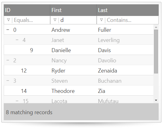
The igTreeGrid features filtering that allows you to see the context of the matching rows. Filtering options include numeric, string and date filters and you can configure the display of results to show matches with or without child rows. Further information regarding the classes, options, events, methods and themes of this API are available under the associated tabs above.
The following code snippet demonstrates how to initialize the igTreeGrid control.
Click here for more information on how to get started using this API. For details on how to reference the required scripts and themes for the igGrid control read, Using JavaScript Resources in Ignite UI and Styling and Theming Ignite UI.
Code Sample
        <!DOCTYPE html>
        <html>
        <head>
            <!-- Infragistics Combined CSS -->
            <link href="css/themes/infragistics/infragistics.theme.css" rel="stylesheet" type="text/css" />
            <link href="css/structure/infragistics.css" rel="stylesheet" type="text/css" />

            <!-- jQuery Core -->
            <script src="js/jquery.js" type="text/javascript"></script>

            <!-- jQuery UI -->
            <script src="js/jquery-ui.js" type="text/javascript"></script>

            <!-- Infragistics Combined Scripts -->
            <script src="js/infragistics.core.js" type="text/javascript"></script>
            <script src="js/infragistics.lob.js" type="text/javascript"></script>

            <script type="text/javascript">
                var employees = [
                    { "employeeId": 0, "supervisorId": -1, "firstName": "Andrew", "lastName": "Fuller" },
                    { "employeeId": 1, "supervisorId": -1, "firstName": "Jonathan", "lastName": "Smith" },
                    { "employeeId": 2, "supervisorId": -1, "firstName": "Nancy", "lastName": "Davolio" },
                    { "employeeId": 3, "supervisorId": -1, "firstName": "Steven", "lastName": "Buchanan" },

                    // Andrew Fuller's direct reports
                    { "employeeId": 4, "supervisorId": 0, "firstName": "Janet", "lastName": "Leverling" },
                    { "employeeId": 5, "supervisorId": 0, "firstName": "Laura", "lastName": "Callahan" },
                    { "employeeId": 6, "supervisorId": 0, "firstName": "Margaret", "lastName": "Peacock" },
                    { "employeeId": 7, "supervisorId": 0, "firstName": "Michael", "lastName": "Suyama" },

                    // Janet Leverling's direct reports
                    { "employeeId": 8, "supervisorId": 4, "firstName": "Anne", "lastName": "Dodsworth" },
                    { "employeeId": 9, "supervisorId": 4, "firstName": "Danielle", "lastName": "Davis" },
                    { "employeeId": 10, "supervisorId": 4, "firstName": "Robert", "lastName": "King" },

                    // Nancy Davolio's direct reports
                    { "employeeId": 11, "supervisorId": 2, "firstName": "Peter", "lastName": "Lewis" },
                    { "employeeId": 12, "supervisorId": 2, "firstName": "Ryder", "lastName": "Zenaida" },
                    { "employeeId": 13, "supervisorId": 2, "firstName": "Wang", "lastName": "Mercedes" },

                    // Steve Buchanan's direct reports
                    { "employeeId": 14, "supervisorId": 3, "firstName": "Theodore", "lastName": "Zia" },
                    { "employeeId": 15, "supervisorId": 3, "firstName": "Lacota", "lastName": "Mufutau" },

                    // Lacota Mufutau's direct reports
                    { "employeeId": 16, "supervisorId": 15, "firstName": "Jin", "lastName": "Elliott" },
                    { "employeeId": 17, "supervisorId": 15, "firstName": "Armand", "lastName": "Ross" },
                    { "employeeId": 18, "supervisorId": 15, "firstName": "Dane", "lastName": "Rodriquez" },

                    // Dane Rodriquez's direct reports
                    { "employeeId": 19, "supervisorId": 18, "firstName": "Declan", "lastName": "Lester" },
                    { "employeeId": 20, "supervisorId": 18, "firstName": "Bernard", "lastName": "Jarvis" },

                    // Bernard Jarvis' direct report
                    { "employeeId": 21, "supervisorId": 20, "firstName": "Jeremy", "lastName": "Donaldson" }
                ];

               $(function () {
                   $("#treegrid").igTreeGrid({
                       dataSource: employees,
                       primaryKey: "employeeId",
                       foreignKey: "supervisorId",
                       autoGenerateColumns: false,
                       columns: [
                           { headerText: "ID", key: "employeeId", width: "150px", dataType: "number" },
                           { headerText: "First", key: "firstName", width: "150px", dataType: "string" },
                           { headerText: "Last", key: "lastName", width: "150px", dataType: "string" }
                       ],
                       features: [{
                           name: "Filtering",
                           displayMode: "showWithAncestors"
                           //displayMode: "showWithAncestorsAndDescendants"
                       }]
                   });
               });
            </script>
        </head>
        <body>
            <div id="treegrid"></div>
        </body>
        </html>
Related Samples
Related Topics
Dependencies
Inherits
-
advancedModeEditorsVisible
- Type:
- bool
- Default:
- false
Defines whether to show/hide editors in advanced mode. If false, no editors will be rendered in the advanced mode.
Code Sample
//Initialize $(".selector").igTreeGrid({ features: [ { name : "Filtering", advancedModeEditorsVisible : true } ] }); //Get var editorsVisible = $(".selector").igTreeGridFiltering("option", "advancedModeEditorsVisible"); //Set $(".selector").igTreeGridFiltering("option", "advancedModeEditorsVisible", true); -
advancedModeHeaderButtonLocation
- Type:
- enumeration
- Default:
- left
location of the advanced filtering button when advancedModeEditorsVisible is false (i.e. when the button is rendered in the header) .
Members
- left
- Type:string
- right
- Type:string
Code Sample
//Initialize $(".selector").igTreeGrid({ features: [ { name : "Filtering", advancedModeHeaderButtonLocation : "right" } ] }); //Get var location = $(".selector").igTreeGridFiltering("option", "advancedModeHeaderButtonLocation"); //Set $(".selector").igTreeGridFiltering("option", "advancedModeHeaderButtonLocation", "right"); -
caseSensitive
- Type:
- bool
- Default:
- false
Enables or disables the filtering case sensitivity. Works only for local filtering.If true, it enables filtering case sensitivity. If false, it disables filtering case sensitivity.
Code Sample
//Initialize $(".selector").igTreeGrid({ features: [ { name : "Filtering", caseSensitive : true } ] }); //Get var caseSensitive = $(".selector").igTreeGridFiltering("option", "caseSensitive"); //Set $(".selector").igTreeGridFiltering("option", "caseSensitive", true); -
columnSettings
- Type:
- array
- Default:
- []
- Elements Type:
- object
A list of column settings that specifies custom filtering options on a per column basis.
Code Sample
//Initialize $(".selector").igTreeGrid({ features: [ { name : "Filtering", columnSettings : [ { columnKey: "ProductDescription", condition: "endsWith" } ] } ] }); //Get var colSettings = $(".selector").igTreeGridFiltering("option", "columnSettings"); //Set $(".selector").igTreeGridFiltering("option", "columnSettings", [{columnKey: "ProductDescription", condition: "endsWith" }] );-
allowFiltering
- Type:
- bool
- Default:
- true
Enables/disables filtering for the column.
Code Sample
//Initialize $(".selector").igTreeGrid({ features: [ { name : "Filtering", columnSettings : [ { columnKey: "ProductDescription", allowFiltering: false } ] } ] }); //Get var colSettings = $(".selector").igTreeGridFiltering("option", "columnSettings"); //Set $(".selector").igTreeGridFiltering("option", "columnSettings", [ { columnKey: "ProductDescription", allowFiltering: false } ] ); -
columnIndex
- Type:
- number
- Default:
- null
Specifies column index. Either key or index must be set in every column setting.
Code Sample
//Initialize $(".selector").igTreeGrid({ features: [ { name : "Filtering", columnSettings : [ { columnIndex: 0, allowFiltering: false } ] } ] }); //Get var colSettings = $(".selector").igTreeGridFiltering("option", "columnSettings"); //Set $(".selector").igTreeGridFiltering("option", "columnSettings", [ { columnIndex: 0, allowFiltering: false } ] ); -
columnKey
- Type:
- string
- Default:
- null
Specifies column key. Either key or index must be set in every column setting.
Code Sample
//Initialize $(".selector").igTreeGrid({ features: [ { name : "Filtering", columnSettings : [ { columnKey: "ProductDescription", allowFiltering: false } ] } ] }); //Get var colSettings = $(".selector").igTreeGridFiltering("option", "columnSettings"); //Set $(".selector").igTreeGridFiltering("option", "columnSettings", [ { columnKey: "ProductDescription", allowFiltering: false } ] ); -
condition
- Type:
- enumeration
- Default:
- null
default filtering condition for the column.
Members
- empty
- Type:string
- notEmpty
- Type:string
- null
- Type:string
- notNull
- Type:string
- equals
- Type:string
- doesNotEqual
- Type:string
- startsWith
- Type:string
- contains
- Type:string
- doesNotContain
- Type:string
- endsWith
- Type:string
- greaterThan
- Type:string
- lessThan
- Type:string
- greaterThanOrEqualTo
- Type:string
- lessThanOrEqualTo
- Type:string
- true
- Type:bool
- false
- Type:bool
- on
- Type:string
- notOn
- Type:string
- before
- Type:string
- after
- Type:string
- today
- Type:string
- yesterday
- Type:string
- thisMonth
- Type:string
- lastMonth
- Type:string
- nextMonth
- Type:string
- thisYear
- Type:string
- nextYear
- Type:string
- lastYear
- Type:string
Code Sample
//Initialize $(".selector").igTreeGrid({ features: [ { name : "Filtering", columnSettings : [ { columnKey: "ProductDescription", condition: "startsWith" } ] } ] }); //Get var colSettings = $(".selector").igTreeGridFiltering("option", "columnSettings"); //Set $(".selector").igTreeGridFiltering("option", "columnSettings", [{columnKey: "ProductDescription", condition: "startsWith" }] ); -
defaultExpressions
- Type:
- object
- Default:
- []
Initial filtering expressions - if set they will be applied on initialization.
Code Sample
            //Initialize
            $(".selector").igTreeGrid({
                features: [
                    {
                        name : "Filtering",
                        columnSettings : [
                            {
                                columnKey: "Name",
                                defaultExpressions: [
                                    { expr: "B", cond: "startsWith" }
                                ]
                            }
                        ]
                    }
                ]
            });

            //Get
            var defaultExpressions = $(".selector").igTreeGridFiltering("option", "columnSettings")[0].defaultExpressions;
-
displayMode
- Type:
- enumeration
- Default:
- showwithancestors
If displayMode is showWithAncestorsAndDescendants, show all records that match filtering conditions and their child records, even if child records don't match filtering conditions. If displayMode is showWithAncestors show only those records that match filtering conditions and do not show child records(if any) that don't match filtering conditions.
Code Sample
//Initialize $(".selector").igTreeGrid({ features: [ { name : "Filtering", displayMode : "showWithAncestorsAndDescendants" } ] }); //Get var displayMode = $(".selector").igTreeGridFiltering("option", "displayMode"); -
featureChooserText
- Type:
- string
- Default:
- ""
Feature chooser text when filter is shown and filter mode is simple.
Code Sample
//Initialize $(".selector").igTreeGrid({ features: [ { name : "Filtering", featureChooserText : "Hide Filter" } ] }); //Get var text = $(".selector").igTreeGridFiltering("option", "featureChooserText"); //Set $(".selector").igTreeGridFiltering("option", "featureChooserText", "Hide Filter"); -
featureChooserTextAdvancedFilter
- Type:
- string
- Default:
- ""
Feature chooser text when filter mode is advanced.
Code Sample
//Initialize $(".selector").igTreeGrid({ features: [ { name : "Filtering", featureChooserTextAdvancedFilter : "Advanced Filter" } ] }); //Get var text = $(".selector").igTreeGridFiltering("option", "featureChooserTextAdvancedFilter"); //Set $(".selector").igTreeGridFiltering("option", "featureChooserTextAdvancedFilter", "Advanced Filter"); -
featureChooserTextHide
- Type:
- string
- Default:
- ""
Feature chooser text when filter is hidden and filter mode is simple.
Code Sample
//Initialize $(".selector").igTreeGrid({ features: [ { name : "Filtering", featureChooserTextHide : "Show Filter" } ] }); //Get var text = $(".selector").igTreeGridFiltering("option", "featureChooserTextHide"); //Set $(".selector").igTreeGridFiltering("option", "featureChooserTextHide", "Show Filter"); -
filterButtonLocation
- Type:
- enumeration
- Default:
- left
the filtering button for filter dropdowns can be rendered either on the left of the filter editor or on the right .
Members
- left
- Type:string
- right
- Type:string
Code Sample
//Initialize $(".selector").igTreeGrid({ features: [ { name : "Filtering", filterButtonLocation : "right" } ] }); //Get var location = $(".selector").igTreeGridFiltering("option", "filterButtonLocation"); //Set $(".selector").igTreeGridFiltering("option", "filterButtonLocation", "right"); -
filterDelay
- Type:
- number
- Default:
- 500
Time in milliseconds for which widget will wait for keystrokes before sending filtering request.
Code Sample
//Initialize $(".selector").igTreeGrid({ features: [ { name : "Filtering", filterDelay : 1000 } ] }); //Get var delay = $(".selector").igTreeGridFiltering("option", "filterDelay"); //Set $(".selector").igTreeGridFiltering("option", "filterDelay", 1000); -
filterDialogAddButtonWidth
- Type:
- enumeration
- Default:
- 100
add button width - in the advanced filter dialog .
Members
- string
- The dialog Add button width in pixels (100px).
- number
- The dialog Add button width as a number (100).
Code Sample
//Initialize $(".selector").igTreeGrid({ features: [ { name : "Filtering", filterDialogAddButtonWidth : 75 } ] }); //Get var width = $(".selector").igTreeGridFiltering("option", "filterDialogAddButtonWidth"); //Set $(".selector").igTreeGridFiltering("option", "filterDialogAddButtonWidth", 75); -
filterDialogAddConditionDropDownTemplate
- Type:
- string
- Default:
- null
Custom template for options in dropdown in add condition area in the filter dialog.
The default template is "<option value='${value}'>${text}</option>".Code Sample
//Initialize $(".selector").igTreeGrid({ features: [ { name : "Filtering", filterDialogAddConditionDropDownTemplate: "<option value='${text}'>${text}</option>" } ] }); //Get var dropDownTemplate = $(".selector").igTreeGridFiltering("option", "filterDialogAddConditionDropDownTemplate"); //Set $(".selector").igTreeGridFiltering("option", "filterDialogAddConditionDropDownTemplate", "<option value='${text}'>${text}</option>"); -
filterDialogAddConditionTemplate
- Type:
- string
- Default:
- null
Custom template for add condition area in the filter dialog.
The default template is "<div><span>${label1}</span><div><select></select></div><span>${label2}</span></div>".Code Sample
//Initialize $(".selector").igTreeGrid({ features: [ { name : "Filtering", filterDialogAddConditionTemplate: "<div><div><select></select></div><span>${label1}</span><span>${label2}</span></div>" } ] }); //Get var addConditionTemplate = $(".selector").igTreeGridFiltering("option", "filterDialogAddConditionTemplate"); //Set $(".selector").igTreeGridFiltering("option", "filterDialogAddConditionTemplate", "<div><div><select></select></div><span>${label1}</span><span>${label2}</span></div>"); -
filterDialogColumnDropDownDefaultWidth
- Type:
- enumeration
- Default:
- null
Width of the column chooser dropdowns in the advanced filter dialog .
Members
- string
- The column chooser dropdowns width in pixels (80px).
- number
- The column chooser dropdowns width as a number (80).
Code Sample
//Initialize $(".selector").igTreeGrid({ features: [ { name : "Filtering", filterDialogColumnDropDownDefaultWidth : 100 } ] }); //Get var width = $(".selector").igTreeGridFiltering("option", "filterDialogColumnDropDownDefaultWidth"); //Set $(".selector").igTreeGridFiltering("option", "filterDialogColumnDropDownDefaultWidth", 100); -
filterDialogContainment
- Type:
- string
- Default:
- owner
Controls containment behavior.
owner The filter dialog will be draggable only in the grid area
window The filter dialog will be draggable in the whole window area.Code Sample
//Initialize $(".selector").igTreeGrid({ features: [ { name : "Filtering", filterDialogContainment : "window" } ] }); //Get var filterDialogContainment = $(".selector").igTreeGridFiltering("option", "filterDialogContainment"); -
filterDialogExprInputDefaultWidth
- Type:
- enumeration
- Default:
- 130
width of the filtering expression input boxes in the advanced filter dialog .
Members
- string
- The filtering expression input boxes width in pixels (80px).
- number
- The filtering expression input boxes width as a number (80).
Code Sample
//Initialize $(".selector").igTreeGrid({ features: [ { name : "Filtering", filterDialogExprInputDefaultWidth : 100 } ] }); //Get var width = $(".selector").igTreeGridFiltering("option", "filterDialogExprInputDefaultWidth"); //Set $(".selector").igTreeGridFiltering("option", "filterDialogExprInputDefaultWidth", 100); -
filterDialogFilterConditionTemplate
- Type:
- string
- Default:
- null
Custom template for options in condition list in filter dialog
The default template is "<option value='${conditionName}'>${conditionLabel}</option>".Code Sample
//Initialize $(".selector").igTreeGrid({ features: [ { name : "Filtering", filterDialogFilterConditionTemplate: "<option value='${conditionName}'>${conditionLabel}</option>" } ] }); //Get var filterConditionTemplate = $(".selector").igTreeGridFiltering("option", "filterDialogFilterConditionTemplate"); //Set $(".selector").igTreeGridFiltering("option", "filterDialogFilterConditionTemplate", "<option value='${conditionName}'>${conditionLabel}</option>"); -
filterDialogFilterDropDownDefaultWidth
- Type:
- enumeration
- Default:
- 80
Width of the filtering condition dropdowns in the advanced filter dialog .
Members
- string
- The filtering condition dropdowns width in pixels (80px).
- number
- The filtering condition dropdowns width as a number (80).
Code Sample
//Initialize $(".selector").igTreeGrid({ features: [ { name : "Filtering", filterDialogFilterDropDownDefaultWidth : 100 } ] }); //Get var width = $(".selector").igTreeGridFiltering("option", "filterDialogFilterDropDownDefaultWidth"); //Set $(".selector").igTreeGridFiltering("option", "filterDialogFilterDropDownDefaultWidth", 100); -
filterDialogFilterTemplate
- Type:
- string
- Default:
- null
Custom template for filter dialog
The default template is "<tr><td><input/></td><td><select></select></td><td><input /> </td><td><span></span></td></tr>".Code Sample
//Initialize $(".selector").igTreeGrid({ features: [ { name : "Filtering", filterDialogFilterTemplate: "<tr><td>Choose column<input/></td><td>Condition<select></select></td><td>Search value<input /> </td><td><span></span></td></tr>" } ] }); //Get var dialogFilterTemplate = $(".selector").igTreeGridFiltering("option", "filterDialogFilterTemplate"); //Set $(".selector").igTreeGridFiltering("option", "filterDialogFilterTemplate", "<tr><td>Choose column<input/></td><td>Condition<select></select></td><td>Search value<input /> </td><td><span></span></td></tr>"); -
filterDialogHeight
- Type:
- enumeration
- Default:
- ""
default filter dialog height (used for Advanced filtering) .
Members
- string
- The dialog window height in pixels (350px).
- number
- The dialog window height as a number (350).
Code Sample
//Initialize $(".selector").igTreeGrid({ features: [ { name : "Filtering", filterDialogHeight : 30 } ] }); //Get var height = $(".selector").igTreeGridFiltering("option", "filterDialogHeight"); //Set $(".selector").igTreeGridFiltering("option", "filterDialogHeight", 30); -
filterDialogMaxFilterCount
- Type:
- number
- Default:
- 5
Maximum number of filter rows in the advanced filtering dialog. if this number is exceeded, an error message will be rendered.
Code Sample
//Initialize $(".selector").igTreeGrid({ features: [ { name : "Filtering", filterDialogMaxFilterCount : 3 } ] }); //Get var count = $(".selector").igTreeGridFiltering("option", "filterDialogMaxFilterCount"); //Set $(".selector").igTreeGridFiltering("option", "filterDialogMaxFilterCount", 3); -
filterDialogOkCancelButtonWidth
- Type:
- enumeration
- Default:
- 120
Width of the Ok and Cancel buttons in the advanced filtering dialogs .
Members
- string
- The advanced filter dialog Ok and Cancel buttons width in pixels (120px).
- number
- The advanced filter dialog Ok and Cancel buttons width as a number (120).
Code Sample
//Initialize $(".selector").igTreeGrid({ features: [ { name : "Filtering", filterDialogOkCancelButtonWidth : 120 } ] }); //Get var width = $(".selector").igTreeGridFiltering("option", "filterDialogOkCancelButtonWidth"); //Set $(".selector").igTreeGridFiltering("option", "filterDialogOkCancelButtonWidth", 120); -
filterDialogWidth
- Type:
- enumeration
- Default:
- 430
default filter dialog width (used for Advanced filtering) .
Members
- string
- The dialog window width in pixels (370px).
- number
- The dialog window width as a number (370).
Code Sample
//Initialize $(".selector").igTreeGrid({ features: [ { name : "Filtering", filterDialogWidth : 500 } ] }); //Get var width = $(".selector").igTreeGridFiltering("option", "filterDialogWidth"); //Set $(".selector").igTreeGridFiltering("option", "filterDialogWidth", 500); -
filterDropDownAnimationDuration
- Type:
- number
- Default:
- 500
Animation duration in milliseconds for the filter dropdown animations.
Code Sample
//Initialize $(".selector").igTreeGrid({ features: [ { name : "Filtering", filterDropDownAnimationDuration : 300 } ] }); //Get var duration = $(".selector").igTreeGridFiltering("option", "filterDropDownAnimationDuration"); //Set $(".selector").igTreeGridFiltering("option", "filterDropDownAnimationDuration", 300); -
filterDropDownAnimations
- Type:
- enumeration
- Default:
- linear
type of animations for the column filter dropdowns.
Members
- linear
- Type:string
- none
- Type:string
Code Sample
//Initialize $(".selector").igTreeGrid({ features: [ { name : "Filtering", filterDropDownAnimations : "none" } ] }); //Get var animation = $(".selector").igTreeGridFiltering("option", "filterDropDownAnimations"); //Set $(".selector").igTreeGridFiltering("option", "filterDropDownAnimations", "none"); -
filterDropDownHeight
- Type:
- object
- Default:
- 0
Height of the column filter dropdowns
string The height of the column filter dropdowns in pixels (0px).
number The height of the column filter dropdowns as a number (0).Code Sample
//Initialize $(".selector").igTreeGrid({ features: [ { name : "Filtering", filterDropDownHeight : 30 } ] }); //Get var height = $(".selector").igTreeGridFiltering("option", "filterDropDownHeight"); //Set $(".selector").igTreeGridFiltering("option", "filterDropDownHeight", 30); -
filterDropDownItemIcons
- Type:
- enumeration
- Default:
- true
Enable/disable filter icons visibility.
Members
- true
- Type:bool
- all predefined filters in the filter dropdowns will have icons rendered in front of the text.
- false
- Type:bool
Code Sample
//Initialize $(".selector").igTreeGrid({ features: [ { name : "Filtering", filterDropDownItemIcons : false } ] }); //Get var showIcons = $(".selector").igTreeGridFiltering("option", "filterDropDownItemIcons"); //Set $(".selector").igTreeGridFiltering("option", "filterDropDownItemIcons", false); -
filterDropDownWidth
- Type:
- enumeration
- Default:
- 0
width of the column filter dropdowns.
Members
- string
- The width in pixels (0px).
- number
- The width as a number (0).
Code Sample
//Initialize $(".selector").igTreeGrid({ features: [ { name : "Filtering", filterDropDownWidth : 100 } ] }); //Get var width = $(".selector").igTreeGridFiltering("option", "filterDropDownWidth"); //Set $(".selector").igTreeGridFiltering("option", "filterDropDownWidth", 100); -
filterExprUrlKey
- Type:
- string
- Default:
- null
URL key name that specifies how the filtering expressions will be encoded for remote requests, e.g. &filter('col') = startsWith. Default is OData.
Code Sample
//Initialize $(".selector").igTreeGrid({ features: [ { name : "Filtering", filterExprUrlKey : "filter" } ] }); //Get var key = $(".selector").igTreeGridFiltering("option", "filterExprUrlKey"); //Set $(".selector").igTreeGridFiltering("option", "filterExprUrlKey", "filter"); -
filterSummaryAlwaysVisible
- Type:
- bool
- Default:
- true
Enable/disable footer visibility with summary info about the filter.
When false, the filter summary row (in the footer) will only be visible when paging is enabled (or some other feature that renders a footer).
When true, the filter summary row will only be visible when a filter is applied i.e. it's not visible by default.Code Sample
//Initialize $(".selector").igTreeGrid({ features: [ { name : "Filtering", filterSummaryAlwaysVisible : false } ] }); //Get var showSummary = $(".selector").igTreeGridFiltering("option", "filterSummaryAlwaysVisible"); //Set $(".selector").igTreeGridFiltering("option", "filterSummaryAlwaysVisible", false); -
filterSummaryTemplate
- Type:
- string
- Default:
- ""
Summary template that will appear in the bottom left corner of the footer. Has the format '${matches} matching records'.
Code Sample
//Initialize $(".selector").igTreeGrid({ features: [ { name : "Filtering", filterSummaryTemplate: "${matches} products found" } ] }); //Get var summaryTemplate = $(".selector").igTreeGridFiltering("option", "filterSummaryTemplate"); //Set $(".selector").igTreeGridFiltering("option", "filterSummaryTemplate", "${matches} products found"); -
fromLevel
- Type:
- number
- Default:
- 0
Specifies from which data bound level to be applied filtering - 0 is the first level.
Code Sample
//Initialize $(".selector").igTreeGrid({ features: [ { name : "Filtering", fromLevel: 1 } ] }); //Get var fromLevel = $(".selector").igTreeGridFiltering("option", "fromLevel"); -
inherit
- Type:
- bool
- Default:
- false
Enables/disables feature inheritance for the child layouts. NOTE: It only applies for igHierarchicalGrid.
-
labels
- Type:
- object
- Default:
- {}
A list of configurable and localized labels that are used for the predefined filtering conditions in the filter dropdowns.
Code Sample
//Initialize $(".selector").igTreeGrid({ features: [ { name : "Filtering", labels: { advancedButtonLabel: "Advanced", after: "After", before: "Before", clear: "Clear Filter", contains: "Contains" //... } } ] }); //Get var filteringLabels = $(".selector").igTreeGridFiltering("option", "labels"); //Set $(".selector").igTreeGridFiltering("option", "labels", { advancedButtonLabel: "Advanced", after: "After", before: "Before", clear: "Clear Filter", contains: "Contains" //... });-
advancedButtonLabel
- Type:
- string
- Default:
- ""
-
after
- Type:
- string
- Default:
- ""
-
before
- Type:
- string
- Default:
- ""
-
clear
- Type:
- string
- Default:
- ""
-
contains
- Type:
- string
- Default:
- ""
-
doesNotContain
- Type:
- string
- Default:
- ""
-
doesNotEqual
- Type:
- string
- Default:
- ""
-
empty
- Type:
- string
- Default:
- ""
-
endsWith
- Type:
- string
- Default:
- ""
-
equals
- Type:
- string
- Default:
- ""
-
false
- Type:
- string
- Default:
- ""
-
falseLabel
- Type:
- string
- Default:
- ""
-
filterDialogAddLabel
- Type:
- string
- Default:
- ""
-
filterDialogAllLabel
- Type:
- string
- Default:
- ""
-
filterDialogAnyLabel
- Type:
- string
- Default:
- ""
-
filterDialogCancelLabel
- Type:
- string
- Default:
- ""
-
filterDialogCaptionLabel
- Type:
- string
- Default:
- ""
-
filterDialogClearAllLabel
- Type:
- string
- Default:
- ""
-
filterDialogConditionLabel1
- Type:
- string
- Default:
- ""
-
filterDialogConditionLabel2
- Type:
- string
- Default:
- ""
-
filterDialogErrorLabel
- Type:
- string
- Default:
- ""
-
filterDialogOkLabel
- Type:
- string
- Default:
- ""
-
filterSummaryTitleLabel
- Type:
- string
- Default:
- ""
-
greaterThan
- Type:
- string
- Default:
- ""
-
greaterThanOrEqualTo
- Type:
- string
- Default:
- ""
-
lastMonth
- Type:
- string
- Default:
- ""
-
lastYear
- Type:
- string
- Default:
- ""
-
lessThan
- Type:
- string
- Default:
- ""
-
lessThanOrEqualTo
- Type:
- string
- Default:
- ""
-
nextMonth
- Type:
- string
- Default:
- ""
-
nextYear
- Type:
- string
- Default:
- ""
-
noFilter
- Type:
- string
- Default:
- ""
-
notEmpty
- Type:
- string
- Default:
- ""
-
notNull
- Type:
- string
- Default:
- ""
-
notOn
- Type:
- string
- Default:
- ""
-
nullLabel
- Type:
- string
- Default:
- ""
-
on
- Type:
- string
- Default:
- ""
-
startsWith
- Type:
- string
- Default:
- ""
-
thisMonth
- Type:
- string
- Default:
- ""
-
thisYear
- Type:
- string
- Default:
- ""
-
today
- Type:
- string
- Default:
- ""
-
true
- Type:
- string
- Default:
- ""
-
trueLabel
- Type:
- string
- Default:
- ""
-
yesterday
- Type:
- string
- Default:
- ""
-
matchFiltering
- Type:
- string
- Default:
- __matchfiltering
Specifies the name of a boolean property in the dataRecord object that indicates whether the dataRow matches the filtering conditions.
When filtering a boolean flag with the specified name is added on each data record object with a value of true if it matches the condition or false if it doesn't.
This is used mainly for internal purposes.Code Sample
//Initialize $(".selector").igTreeGrid({ features: [ { name : "Filtering", matchFiltering: "matchFiltering1" } ] }); //Get var matchFiltering = $(".selector").igTreeGridFiltering("option", "matchFiltering"); -
mode
- Type:
- enumeration
- Default:
- null
Default is 'simple' for non-virtualized grids, and 'advanced' when virtualization is enabled .
Members
- simple
- Type:string
- renders just a filter row.
- advanced
- Type:string
- allows to configure multiple filters from a dialog - Excel style.
Code Sample
//Initialize $(".selector").igTreeGrid({ features: [ { name : "Filtering", mode : "advanced" } ] }); //Get var filterMode = $(".selector").igTreeGridFiltering("option", "mode"); //Set $(".selector").igTreeGridFiltering("option", "mode", "advanced"); -
nullTexts
- Type:
- object
- Default:
- {}
List of configurable and localized null texts that will be used for the filter editors.
Code Sample
//Initialize $(".selector").igTreeGrid({ features: [ { name : "Filtering", nullTexts: { contains: "Contains...", doesNotContain: "Does not contain...", doesNotEqual: "Does not equal...", empty: "Empty", endsWith: "Ends with..." //... } } ] }); //Get var filteringNullTexts = $(".selector").igTreeGridFiltering("option", "nullTexts"); //Set $(".selector").igTreeGridFiltering("option", "nullTexts", { contains: "Contains...", doesNotContain: "Does not contain...", doesNotEqual: "Does not equal...", empty: "Empty", endsWith: "Ends with..." //... });-
after
- Type:
- string
- Default:
- ""
-
before
- Type:
- string
- Default:
- ""
-
contains
- Type:
- string
- Default:
- ""
-
doesNotContain
- Type:
- string
- Default:
- ""
-
doesNotEqual
- Type:
- string
- Default:
- ""
-
empty
- Type:
- string
- Default:
- ""
-
endsWith
- Type:
- string
- Default:
- ""
-
equals
- Type:
- string
- Default:
- ""
-
greaterThan
- Type:
- string
- Default:
- ""
-
greaterThanOrEqualTo
- Type:
- string
- Default:
- ""
-
lastMonth
- Type:
- string
- Default:
- ""
-
lastYear
- Type:
- string
- Default:
- ""
-
lessThan
- Type:
- string
- Default:
- ""
-
lessThanOrEqualTo
- Type:
- string
- Default:
- ""
-
nextMonth
- Type:
- string
- Default:
- ""
-
nextYear
- Type:
- string
- Default:
- ""
-
notEmpty
- Type:
- string
- Default:
- ""
-
notNull
- Type:
- string
- Default:
- ""
-
notOn
- Type:
- string
- Default:
- ""
-
null
- Type:
- string
- Default:
- ""
-
on
- Type:
- string
- Default:
- ""
-
startsWith
- Type:
- string
- Default:
- ""
-
thisMonth
- Type:
- string
- Default:
- ""
-
thisYear
- Type:
- string
- Default:
- ""
-
persist
- Type:
- bool
- Default:
- true
Enables / disables filtering persistence between states.
Code Sample
//Initialize $(".selector").igTreeGrid({ features : [ { name : "Filtering", persist : false } ] }); //Get var persist = $(".selector").igTreeGridFiltering("option", "persist"); //Set $(".selector").igTreeGridFiltering("option", "persist", false); -
renderFC
- Type:
- bool
- Default:
- true
Render in feature chooser. Feature chooser is dialog which lists all the enabled features (like Sorting, Filtering, Hiding etc.) of igGrid.
Code Sample
//Initialize $(".selector").igTreeGrid({ features: [ { name : "Filtering", renderFC: false } ] }); //Get var filteringRenderFC = $(".selector").igTreeGridFiltering("option", "renderFC"); //Set $(".selector").igTreeGridFiltering("option", "renderFC", false); -
renderFilterButton
- Type:
- bool
- Default:
- true
Enable/disable filter button visibility. If false,no filter dropdown buttons will be rendered and predefined list of filters will not be rendered for the columns.
Code Sample
//Initialize $(".selector").igTreeGrid({ features: [ { name : "Filtering", renderFilterButton : false } ] }); //Get var showButton = $(".selector").igTreeGridFiltering("option", "renderFilterButton"); //Set $(".selector").igTreeGridFiltering("option", "renderFilterButton", false); -
showEmptyConditions
- Type:
- bool
- Default:
- false
Enable/disable empty condition visibility in the filter. If true, shows empty and not empty filtering conditions in the dropdowns.
Code Sample
//Initialize $(".selector").igTreeGrid({ features: [ { name : "Filtering", showEmptyConditions : true } ] }); //Get var showConditions = $(".selector").igTreeGridFiltering("option", "showEmptyConditions"); //Set $(".selector").igTreeGridFiltering("option", "showEmptyConditions", true); -
showNullConditions
- Type:
- bool
- Default:
- false
Enable/disable visibility of null and not null filtering conditions in the dropdowns. If true, shows null and not null filtering conditions in the dropdowns.
Code Sample
//Initialize $(".selector").igTreeGrid({ features: [ { name : "Filtering", showNullConditions : true } ] }); //Get var showConditions = $(".selector").igTreeGridFiltering("option", "showNullConditions"); //Set $(".selector").igTreeGridFiltering("option", "showNullConditions", true); -
toLevel
- Type:
- number
- Default:
- -1
Specifies to which data bound level to be applied filtering - if -1 filtering should be applied to the last data bound level.
Code Sample
//Initialize $(".selector").igTreeGrid({ features: [ { name : "Filtering", toLevel: 0 } ] }); //Get var toLevel = $(".selector").igTreeGridFiltering("option", "toLevel"); -
tooltipTemplate
- Type:
- string
- Default:
- ""
Custom tooltip template for the filter button, when a filter is applied.
Code Sample
//Initialize $(".selector").igTreeGrid({ features: [ { name : "Filtering", tooltipTemplate: "${condition} filter applied" } ] }); //Get var template = $(".selector").igTreeGridFiltering("option", "tooltipTemplate"); //Set $(".selector").igTreeGridFiltering("option", "tooltipTemplate", "${condition} filter applied"); -
type
- Type:
- enumeration
- Default:
- null
Type of filtering. Delegates all filtering functionality to the $.ig.DataSource.
Members
- remote
- Type:string
- local
- Type:string
Code Sample
        //Initialize
        $(".selector").igTreeGrid({
            features: [
                {
                    name : "Filtering",
                    type : "local"
                }
            ]
        });

        //Get
        var filterType = $(".selector").igTreeGridFiltering("option", "type");

        //Set
        $(".selector").igTreeGridFiltering("option", "type", "local");
For more information on how to interact with the Ignite UI controls' events, refer to
Using Events in Ignite UI.
-
dataFiltered
- Cancellable:
- false
Event fired after the filtering has been executed and results are rendered.
Function takes arguments evt and ui.
Use ui.owner to get reference to igGridFiltering.
Use ui.owner.grid to get reference to igGrid.
Use ui.columnIndex to get column index.
Use ui.columnKey to get column key.Code Sample
//Delegate $(document).delegate(".selector", "igtreegridfilteringdatafiltered", function (evt, ui) { //return column key ui.columnKey; //return column index ui.columnIndex; //return reference to igGridFiltering ui.owner; //return reference to igGrid ui.owner.grid; }); //Initialize $(".selector").igTreeGrid({ features: [ { name : "Filtering", dataFiltered: function (evt, ui) {...} } ] }); -
dataFiltering
- Cancellable:
- true
Event fired before a filtering operation is executed (remote request or local).
Return false in order to cancel filtering operation.
Function takes arguments evt and ui.
Use ui.owner to get reference to igGridFiltering.
Use ui.owner.grid to get reference to igGrid.
Use ui.columnIndex to get column index.
Use ui.columnKey to get column key.
Use ui.expressions to get filtering expressions. Filtering expressions could be changed in this event handler and after that data binding is applied. In this way the user could control filtering more easily before applying data-binding.Code Sample
//Delegate $(document).delegate(".selector", "igtreegridfilteringdatafiltering", function (evt, ui) { //return column key ui.columnKey; //return column index ui.columnIndex; //return reference to igGridFiltering ui.owner; //return reference to igGrid ui.owner.grid; }); //Initialize $(".selector").igTreeGrid({ features: [ { name : "Filtering", dataFiltering: function (evt, ui) {...} } ] }); -
dropDownClosed
- Cancellable:
- false
Event fired after a filter column dropdown is completely closed.
Function takes arguments evt and ui.
Use ui.owner to get reference to igGridFiltering.
Use ui.owner.grid to get reference to igGrid.
Use ui.dropDown to get reference to dropdown DOM element.Code Sample
//Delegate $(document).delegate(".selector", "igtreegridfilteringdropdownclosed", function (evt, ui) { //return reference to igGridFiltering ui.owner; //return reference to igGrid ui.owner.grid; //return dropdown html element in the DOM ui.dropDown; }); //Initialize $(".selector").igTreeGrid({ features: [ { name : "Filtering", dropDownClosed: function (evt, ui) {...} } ] }); -
dropDownClosing
- Cancellable:
- true
Event fired before the filter dropdown starts closing.
Return false in order to cancel dropdown closing.
Function takes arguments evt and ui.
Use ui.owner to get reference to igGridFiltering.
Use ui.owner.grid to get reference to igGrid.
Use ui.dropDown to get reference to dropdown DOM element.Code Sample
//Delegate $(document).delegate(".selector", "igtreegridfilteringdropdownclosing", function (evt, ui) { //return reference to igGridFiltering ui.owner; //return reference to igGrid ui.owner.grid; //return dropdown html element in the DOM ui.dropDown; }); //Initialize $(".selector").igTreeGrid({ features: [ { name : "Filtering", dropDownClosing: function (evt, ui) {...} } ] }); -
dropDownOpened
- Cancellable:
- false
Event fired after the filter dropdown is opened for a specific column.
Function takes arguments evt and ui.
Use ui.owner to get reference to igGridFiltering.
Use ui.owner.grid to get reference to igGrid.
Use ui.dropDown to get reference to dropdown DOM element.Code Sample
//Delegate $(document).delegate(".selector", "igtreegridfilteringdropdownopened", function (evt, ui) { //return reference to igGridFiltering ui.owner; //return reference to igGrid ui.owner.grid; //return dropdown html element in the DOM ui.dropDown; }); //Initialize $(".selector").igTreeGrid({ features: [ { name : "Filtering", dropDownOpened: function (evt, ui) {...} } ] }); -
dropDownOpening
- Cancellable:
- true
Event fired before the filter dropdown is opened for a specific column.
Return false in order to cancel dropdown opening.
Function takes arguments evt and ui.
Use ui.owner to get reference to igGridFiltering.
Use ui.owner.grid to get reference to igGrid.
Use ui.dropDown to get reference to dropdown DOM element.Code Sample
//Delegate $(document).delegate(".selector", "igtreegridfilteringdropdownopening", function (evt, ui) { //return reference to igGridFiltering ui.owner; //return reference to igGrid ui.owner.grid; //return dropdown html element in the DOM ui.dropDown; }); //Initialize $(".selector").igTreeGrid({ features: [ { name : "Filtering", dropDownOpening: function (evt, ui) {...} } ] }); -
filterDialogClosed
- Cancellable:
- false
Event fired after the advanced filter dialog has been closed.
Function takes arguments evt and ui.
Use ui.owner to get reference to igGridFiltering.
Use ui.owner.grid to get reference to igGrid.Code Sample
//Delegate $(document).delegate(".selector", "igtreegridfilteringfilterdialogclosed", function (evt, ui) { //return reference to igGridFiltering ui.owner; //return reference to igGrid ui.owner.grid; }); //Initialize $(".selector").igTreeGrid({ features: [ { name : "Filtering", filterDialogClosed: function (evt, ui) {...} } ] }); -
filterDialogClosing
- Cancellable:
- true
Event fired before the advanced filter dialog is closed.
Return false in order to cancel filtering dialog closing.
Function takes arguments evt and ui.
Use ui.owner to get reference to igGridFiltering.
Use ui.owner.grid to get reference to igGrid.Code Sample
//Delegate $(document).delegate(".selector", "igtreegridfilteringfilterdialogclosing", function (evt, ui) { //return reference to igGridFiltering ui.owner; //return reference to igGrid ui.owner.grid; }); //Initialize $(".selector").igTreeGrid({ features: [ { name : "Filtering", filterDialogClosing: function (evt, ui) {...} } ] }); -
filterDialogContentsRendered
- Cancellable:
- false
Event fired after the contents of the advanced filter dialog are rendered.
Function takes arguments evt and ui.
Use ui.owner to get reference to igGridFiltering.
Use ui.owner.grid to get reference to igGrid.
Use ui.dialogElement to get reference to filtering dialog DOM element.Code Sample
//Delegate $(document).delegate(".selector", "igtreegridfilteringfilterdialogcontentsrendered", function (evt, ui) { //return reference to igGridFiltering ui.owner; //return reference to igGrid ui.owner.grid; //return dialog html element in the DOM ui.dialogElement; }); //Initialize $(".selector").igTreeGrid({ features: [ { name : "Filtering", filterDialogContentsRendered: function (evt, ui) {...} } ] }); -
filterDialogContentsRendering
- Cancellable:
- true
Event fired before the contents of the advanced filter dialog are rendered.
Return false in order to cancel filtering dialog rendering.
Function takes arguments evt and ui.
Use ui.owner to get reference to igGridFiltering.
Use ui.owner.grid to get reference to igGrid.
Use ui.dialogElement to get reference to filtering dialog DOM element.Code Sample
//Delegate $(document).delegate(".selector", "igtreegridfilteringfilterdialogcontentsrendering", function (evt, ui) { //return reference to igGridFiltering ui.owner; //return reference to igGrid ui.owner.grid; //return dialog html element in the DOM ui.dialogElement; }); //Initialize $(".selector").igTreeGrid({ features: [ { name : "Filtering", filterDialogContentsRendering: function (evt, ui) {...} } ] }); -
filterDialogFilterAdded
- Cancellable:
- false
Event fired after a filter row is added to the advanced filter dialog.
Function takes arguments evt and ui.
Use ui.owner to get reference to igGridFiltering.
Use ui.owner.grid to get reference to igGrid.
Use ui.filter to get reference to filters table row DOM element.Code Sample
//Delegate $(document).delegate(".selector", "igtreegridfilteringfilterdialogfilteradded", function (evt, ui) { //return reference to igGridFiltering ui.owner; //return reference to igGrid ui.owner.grid; //return filters table row element in the DOM ui.filter; }); //Initialize $(".selector").igTreeGrid({ features: [ { name : "Filtering", filterDialogFilterAdded: function (evt, ui) {...} } ] }); -
filterDialogFilterAdding
- Cancellable:
- true
Event fired before a filter row is added to the advanced filter dialog.
Return false in order to cancel filter adding to the advanced filtering dialog.
Function takes arguments evt and ui.
Use ui.owner to get reference to igGridFiltering.
Use ui.owner.grid to get reference to igGrid.
Use ui.filtersTableBody to get reference to filters table body DOM element.Code Sample
//Delegate $(document).delegate(".selector", "igtreegridfilteringfilterdialogfilteradding", function (evt, ui) { //return reference to igGridFiltering ui.owner; //return reference to igGrid ui.owner.grid; //return filters table body element in the DOM ui.filtersTableBody; }); //Initialize $(".selector").igTreeGrid({ features: [ { name : "Filtering", filterDialogFilterAdding: function (evt, ui) {...} } ] }); -
filterDialogFiltering
- Cancellable:
- true
Event fired when the OK button in the advanced filter dialog is pressed.
Function takes arguments evt and ui.
Use ui.owner to get reference to igGridFiltering.
Use ui.owner.grid to get reference to igGrid.
Use ui.dialog to get reference to filtering dialog DOM element.Code Sample
//Delegate $(document).delegate(".selector", "igtreegridfilteringfilterdialogfiltering", function (evt, ui) { //return reference to igGridFiltering ui.owner; //return reference to igGrid ui.owner.grid; //return dialog html element in the DOM ui.dialog; }); //Initialize $(".selector").igTreeGrid({ features: [ { name : "Filtering", filterDialogFiltering: function (evt, ui) {...} } ] }); -
filterDialogMoving
- Cancellable:
- true
Event fired every time the advanced filter dialog changes its position.
Function takes arguments evt and ui.
Use ui.owner to get reference to igGridFiltering.
Use ui.owner.grid to get reference to igGrid.
Use ui.dialog to get reference to filtering dialog DOM element.
Use ui.originalPosition to get the original position of the groupby dialog div as { top, left } object, relative to the page.
Use ui.position to get the current position of the groupby dialog div as { top, left } object, relative to the page.Code Sample
//Delegate $(document).delegate(".selector", "igtreegridfilteringfilterdialogmoving", function (evt, ui) { //return reference to igGridFiltering ui.owner; //return reference to igGrid ui.owner.grid; //return dialog html element in the DOM ui.dialog; }); //Initialize $(".selector").igTreeGrid({ features: [ { name : "Filtering", filterDialogMoving: function (evt, ui) {...} } ] }); -
filterDialogOpened
- Cancellable:
- false
Event fired after the advanced filter dialog is already opened.
Function takes arguments evt and ui.
Use ui.owner to get reference to igGridFiltering.
Use ui.owner.grid to get reference to igGrid.
Use ui.dialog to get reference to filtering dialog DOM element.Code Sample
//Delegate $(document).delegate(".selector", "igtreegridfilteringfilterdialogopened", function (evt, ui) { //return reference to igGridFiltering ui.owner; //return reference to igGrid ui.owner.grid; //return dialog html element in the DOM ui.dialog; }); //Initialize $(".selector").igTreeGrid({ features: [ { name : "Filtering", filterDialogOpened: function (evt, ui) {...} } ] }); -
filterDialogOpening
- Cancellable:
- true
Event fired before the advanced filtering dialog is opened.
Return false in order to cancel filter dialog opening.
Function takes arguments evt and ui.
Use ui.owner to get reference to igGridFiltering.
Use ui.owner.grid to get reference to igGrid.
Use ui.dialog to get reference to filtering dialog DOM element.Code Sample
		    //Delegate
		    $(document).delegate(".selector", "igtreegridfilteringfilterdialogopening", function (evt, ui) {
			    //return reference to igGridFiltering
			    ui.owner;
			    //return reference to igGrid
			    ui.owner.grid;
			    //return dialog html element in the DOM
			    ui.dialog;
		    });

		    //Initialize
		    $(".selector").igTreeGrid({
			    features: [
				    {
					    name : "Filtering",
					    filterDialogOpening: function (evt, ui) {...}
				    }
			    ]
		    });
-
destroy
- .igTreeGridFiltering( "destroy" );
Code Sample
$(".selector").igTreeGridFiltering("destroy"); -
filter
- .igTreeGridFiltering( "filter", expressions:array, [updateUI:bool] );
Applies filtering programmatically and updates the UI by default.
- expressions
- Type:array
- An array of filtering expressions, each one having the format {fieldName: , expr: , cond: , logic: } where fieldName is the key of the column, expr is the actual expression string with which we would like to filter, logic is 'AND' or 'OR', and cond is one of the following strings: "equals", "doesNotEqual", "contains", "doesNotContain", "greaterThan", "lessThan", "greaterThanOrEqualTo", "lessThanOrEqualTo", "true", "false", "null", "notNull", "empty", "notEmpty", "startsWith", "endsWith", "today", "yesterday", "on", "notOn", "thisMonth", "lastMonth", "nextMonth", "before", "after", "thisYear", "lastYear", "nextYear". The difference between the empty and null filtering conditions is that empty includes null, NaN, and undefined, as well as the empty string.
- updateUI
- Type:bool
- Optional
- specifies whether the filter row should be also updated once the grid is filtered .
Code Sample
/* Expressions is an array of individual filtering expressions that the grid uses when filtering. If you only want to execute one filter criteria, then you add a single filtering expression to the array, otherwise you can add additional constraints to the filter by adding more expressions into the array. For example: [{ fieldname: "title", expr: "introduction", cond: "contains", logic: "OR" }, { fieldname: "description", expr: "introduction", cond: "contains", logic: "OR" }] Using the expressions above the applied filter returns records in the grid where either the "title" or "description" fields have values that contain the string "introduction". Note: The available values for the filtering condition are: - equals - doesNotEqual - contains - doesNotContain - greaterThan - lessThan - greaterThanOrEqualTo - lessThanOrEqualTo - true - false - null - notNull - empty - notEmpty - startsWith - endsWith - today - yesterday - on - notOn - thisMonth - lastMonth - nextMonth - before - after - this year - last year - nextYear The difference between the "empty" and "null" filtering conditions is that "empty" includes "null", "NaN", "undefined" and empty strings. Note: Available values for "logic" are "OR" and "AND". The default logic is "AND". */ $(".selector").igTreeGridFiltering("filter", ([{fieldName: "Name", expr: "Adjustable Race", cond: "equals", logic: "OR"}])); -
getFilteringMatchesCount
- .igTreeGridFiltering( "getFilteringMatchesCount" );
- Return Type:
- number
- Return Type Description:
- count of filtered records.
Returns the count of data records that match filtering conditions.
Code Sample
$(".selector").igTreeGridFiltering("getFilteringMatchesCount"); -
toggleFilterRowByFeatureChooser
- .igTreeGridFiltering( "toggleFilterRowByFeatureChooser", event:string );
Toggle filter row when mode is simple or advancedModeEditorsVisible is TRUE. Otherwise show/hide advanced dialog.
- event
- Type:string
- Column key.
Code Sample
			  $(".buttonSelector").igButton({ labelText: $(".buttonSelector").val(), click: function (event) {
			    $(".gridSelector").igTreeGridFiltering("toggleFilterRowByFeatureChooser", event);
		    }
	    });
-
ui-widget-overlay ui-iggrid-blockarea
- Classes applied to the filtering block area, when the advanced filter dialog is opened and the area behind it is grayed out (that's the block area).
-
ig-igtreegrid-filter-matching-cell
- Classes applied to the cell that matches the filtering condition.
-
ui-icon ui-iggrid-icon-advanced-filter
- Classes applied to the feature chooser icon when filter shows advanced dialog.
-
ui-iggrid-filterbutton ui-corner-all ui-icon ui-icon-triangle-1-s
- Classes applied to every filtering dropdown button.
-
ui-iggrid-filterbuttonactive ui-state-active
- Classes applied to the filter button when it is selected.
-
ui-iggrid-filterbutton ui-iggrid-filterbuttonadvanced ui-icon ui-icon-search
- Classes applied to the button when mode = advanced. This also applies to the button when it's rendered in the header (which is the default behavior).
-
ui-iggrid-filterbuttonadvancedactive ui-state-active
- Classes applied on the advanced button when it is selected.
-
ui-iggrid-filterbuttonadvanceddisabled ui-state-disabled
- Classes applied on the advanced button when it is disabled.
-
ui-iggrid-filterbuttonadvancedfocus ui-state-focus
- Classes applied on the advanced button when it has focus.
-
ui-iggrid-filterbuttonadvancedhover ui-state-hover
- Classes applied on the advanced button when it is hovered.
-
ui-iggrid-filterbuttonright ui-iggrid-filterbuttonadvanced ui-icon ui-icon-search
- Classes applied to the advanced filtering button when it is rendered on the right.
-
ui-iggrid-filterbuttonbool
- Classes applied to the filter button when a boolean filter is applied for the column (default).
-
ui-iggrid-filterbuttondate
- Classes applied to the filter button when a date filter is defined for the column.
-
ui-iggrid-filterbuttondisabled ui-state-disabled
- Classes applied to the filtering button when it is disabled.
-
ui-iggrid-filterbuttonfocus ui-state-focus
- Classes applied to the filter button when it has focus but is not selected.
-
ui-iggrid-filterbuttonhover ui-state-hover
- Classes applied to the filter button when it is hovered.
-
ui-iggrid-filterbuttonnumber
- Classes applied to the filter button when a number filter is applied for the column (default).
-
ui-iggrid-filterbuttonstring
- Classes applied to the filter button when a string filter is applied for the column (default).
-
ui-iggrid-filtercell
- Classes applied to every filter cell TH.
-
ui-iggrid-filtereditor
- Classes applied to every filter editor element (igEditor).
-
ui-dialog ui-draggable ui-resizable ui-iggrid-dialog ui-widget ui-widget-content ui-corner-all
- Classes applied to the filter dialog element.
-
ui-iggrid-filterdialogaddbuttoncontainer ui-helper-reset
- Classes applied to the filter dialog add button.
-
ui-iggrid-filterdialogaddcondition
- Classes applied to the filter dialog add condition area.
-
ui-iggrid-filterdialogaddconditionlist
- Classes applied to the filter dialog add condition SELECT dropdown.
-
ui-iggrid-filterdialogclearall
- Classes applied to the filter dialog "Clear All" button.
-
ui-icon ui-icon-closethick
- Classes applied to the "X" button used to remove filters from the filters table.
-
ui-iggrid-filtertable ui-helper-reset
- Classes applied to the filter dialog filters table.
-
ui-dialog-titlebar ui-iggrid-filterdialogcaption ui-widget-header ui-corner-all ui-helper-reset ui-helper-clearfix
- Classes applied to the filter dialog header caption area.
-
ui-dialog-title
- Class applied to the filter dialog header caption title.
-
ui-dialog-buttonpane ui-widget-content ui-helper-clearfix ui-iggrid-filterdialogokcancelbuttoncontainer
- Classes applied to the filter dialog OK and Cancel buttons.
-
ui-iggrid-filterdd
- Classes applied to the DIV which wraps the dropdown UL.
-
ui-menu ui-widget ui-widget-content ui-iggrid-filterddlist ui-corner-all
- Classes applied to the UL filter dropdown list.
-
ui-iggrid-filterddlistitem
- Classes applied to each filter dropdown list item (LI).
-
ui-iggrid-filterddlistitemactive ui-state-active
- Classes applied to the list item when it is selected.
-
ui-iggrid-filterddlistitemadvanced
- Class applied to the list item that holds the Advanced button, if options are configured such that editors are shown when mode = "advanced".
-
ui-iggrid-filterddlistitemclear
- Classes applied to the "clear" filter list item.
-
ui-iggrid-filterddlistitemhover ui-state-hover
- Classes applied to the list item when it is hovered.
-
ui-iggrid-filterddlistitemcontainer
- Classes applied to the element that holds the text in every filter list item (LI).
-
ui-iggrid-filterddlistitemicons ui-state-default
- Classes applied to the list item when filtering icons are visible for it.
-
ui-iggrid-filtericon
- Classes applied to every filter dropdown list item's image icon area.
-
ui-iggrid-filtericonafter
- Classes applied to the item icon's span when the item holds an after condition.
-
ui-iggrid-filtericonbefore
- Classes applied to the item icon's span when the item holds a before condition.
-
ui-iggrid-filtericonclear
- Classes applied to the item icon's span when the item holds a clear condition.
-
ui-iggrid-filtericoncontainer
- Classes applied to the item icon's container element.
-
ui-iggrid-filtericoncontains
- Classes applied to the item icon's span when the item holds a contains condition.
-
ui-iggrid-filtericondoesnotcontain
- Classes applied to the item icon's span when the item holds a doesNotContain condition.
-
ui-iggrid-filtericondoesnotequal
- Classes applied to the item icon's span when the item holds a doesNotEqual condition.
-
ui-iggrid-filtericonendswith
- Classes applied to the item icon's span when the item holds an endsWith condition.
-
ui-iggrid-filtericonequals
- Classes applied to the item icon's span when the item holds a contains condition.
-
ui-iggrid-filtericonfalse
- Classes applied to the item icon's span when the item holds a false condition.
-
ui-iggrid-filtericongreaterthan
- Classes applied to the item icon's span when the item holds a greaterThan condition.
-
ui-iggrid-filtericongreaterthanorequalto
- Classes applied to the item icon's span when the item holds a greaterThanOrEqualTo condition.
-
ui-iggrid-filtericonlastmonth
- Classes applied to the item icon's span when the item holds a lastMonth condition.
-
ui-iggrid-filtericonlastyear
- Classes applied to the item icon's span when the item holds a lastYear condition.
-
ui-iggrid-filtericonlessthan
- Classes applied to the item icon's span when the item holds a lessThan condition.
-
ui-iggrid-filtericonlessthanorequalto
- Classes applied to the item icon's span when the item holds a lessThanOrEqualTo condition.
-
ui-iggrid-filtericonnextmonth
- Classes applied to the item icon's span when the item holds a nextMonth condition.
-
ui-iggrid-filtericonnextyear
- Classes applied to the item icon's span when the item holds a nextYear condition.
-
ui-iggrid-filtericonnoton
- Classes applied to the item icon's span when the item holds a notOn condition.
-
ui-iggrid-filtericonon
- Classes applied to the item icon's span when the item holds an on condition.
-
ui-iggrid-filtericonstartswith
- Classes applied to the item icon's span when the item holds a startsWith condition.
-
ui-iggrid-filtericonthismonth
- Classes applied to the item icon's span when the item holds a thisMonth condition.
-
ui-iggrid-filtericonthisyear
- Classes applied to the item icon's span when the item holds a thisYear condition.
-
ui-iggrid-filtericontoday
- Classes applied to the item icon's span when the item holds a today condition.
-
ui-iggrid-filtericontrue
- Classes applied to the item icon's span when the item holds a true condition.
-
ui-iggrid-filtericonyesterday
- Classes applied to the item icon's span when the item holds a yesterday condition.
-
ui-iggrid-filterrow ui-widget
- Classes applied to the filter row TR in the headers table.
-
ig-igtreegrid-filter-matching-row
- Classes applied to the row that matches filtering condition.
-
ui-igtreegrid-record-not-matchfiltering
- Classes applied to the row that does not match filtering condition.