
ui.igGridUpdating
Both the igGrid and igHierarchicalGrid controls feature data updating in the grid. The updating features of the grid provide a wide array of adding and editing values of the underling set of data bound to the grid. Further information regarding the classes, options, events, methods and themes of this API are available under the associated tabs above.
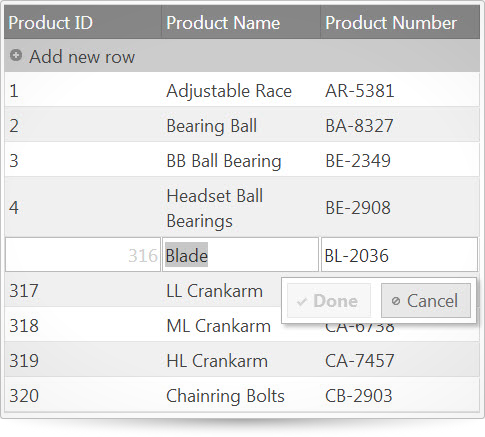
The following code snippet demonstrates how to initialize the igGrid control.
Click here for more information on how to get started using this API. For details on how to reference the required scripts and themes for the igGrid control read, Using JavaScript Resources in Ignite UI and Styling and Theming Ignite UI.Code Sample
<!doctype html>
<html>
<head>
    <!-- Infragistics Combined CSS -->
    <link href="css/themes/infragistics/infragistics.theme.css" rel="stylesheet" type="text/css" />
    <link href="css/structure/infragistics.css" rel="stylesheet" type="text/css" />
    <!-- jQuery Core -->
    <script src="js/jquery.js" type="text/javascript"></script>
    <!-- jQuery UI -->
    <script src="js/jquery-ui.js" type="text/javascript"></script>
    <!-- Infragistics Combined Scripts -->
	  <script src="js/infragistics.core.js" type="text/javascript"></script>
	  <script src="js/infragistics.lob.js" type="text/javascript"></script>
    <script type="text/javascript">
    $(function () {
        var ds = [
    	    { "ProductID": 1, "Name": "Adjustable Race", "ProductNumber": "AR-5381" },
    	    { "ProductID": 2, "Name": "Bearing Ball", "ProductNumber": "BA-8327" },
    	    { "ProductID": 3, "Name": "BB Ball Bearing", "ProductNumber": "BE-2349" },
    	    { "ProductID": 4, "Name": "Headset Ball Bearings", "ProductNumber": "BE-2908" },
    	    { "ProductID": 316, "Name": "Blade", "ProductNumber": "BL-2036" },
    	    { "ProductID": 317, "Name": "LL Crankarm", "ProductNumber": "CA-5965" },
    	    { "ProductID": 318, "Name": "ML Crankarm", "ProductNumber": "CA-6738" },
    	    { "ProductID": 319, "Name": "HL Crankarm", "ProductNumber": "CA-7457" },
    	    { "ProductID": 320, "Name": "Chainring Bolts", "ProductNumber": "CB-2903" }
        ];

        $("#gridUpdating").igGrid({
            primaryKey: "ProductID",
            columns: [
		        { headerText: "Product ID", key: "ProductID", dataType: "number" },
		        { headerText: "Product Name", key: "Name", dataType: "string" },
		        { headerText: "Product Number", key: "ProductNumber", dataType: "string" }
	        ],
            dataSource: ds,
            features: [
            {
                name: "Updating",
                enableAddRow: true,
                editMode: "row",
                enableDeleteRow: true,
                columnSettings: [
                    { columnKey: "ProductID", editorOptions: { type: "numeric", disabled: true} },
                ]
            }]
        });
    });
    </script>
</head>
<body>
	<table id="gridUpdating"></table>
</body>
</html>
Related Samples
Related Topics
Dependencies
Inherits
-
addRowLabel
- Type:
- string
- Default:
- null
Sets gets text for add-new-row button. If that is not set, then $.ig.GridUpdating.locale.addRowLabel is used.
Code Sample
//Initialize $("#grid").igGrid({ features: [ { name: "Updating", addRowLabel: "Add a row here" } ] }); //Get var label = $("#grid").igGridUpdating("option", "addRowLabel"); //Set $("#grid").igGridUpdating("option", "addRowLabel", "Add a row here"); -
addRowTooltip
- Type:
- string
- Default:
- null
Sets gets text for title of add-new-row button. If that is not set, then $.ig.GridUpdating.locale.addRowTooltip is used.
Code Sample
//Initialize $("#grid").igGrid({ features: [ { name: "Updating", addRowTooltip: "Add a row here" } ] }); //Get var label = $("#grid").igGridUpdating("option", "addRowTooltip"); //Set $("#grid").igGridUpdating("option", "addRowTooltip", "Add a row here"); -
cancelLabel
- Type:
- string
- Default:
- null
Sets gets text for Cancel editing button. If that is not set, then $.ig.GridUpdating.locale.cancelLabel is used.
Code Sample
//Initialize $("#grid").igGrid({ features: [ { name: "Updating", cancelLabel: "Click to cancel" } ] }); //Get var label = $("#grid").igGridUpdating("option", "cancelLabel"); //Set $("#grid").igGridUpdating("option", "cancelLabel", "Click to cancel"); -
cancelTooltip
- Type:
- string
- Default:
- null
Sets gets text for title of Cancel editing button. If that is not set, then $.ig.GridUpdating.locale.cancelTooltip is used.
Code Sample
//Initialize $("#grid").igGrid({ features: [ { name: "Updating", cancelTooltip: "Click to cancel" } ] }); //Get var label = $("#grid").igGridUpdating("option", "cancelTooltip"); //Set $("#grid").igGridUpdating("option", "cancelTooltip", "Click to cancel"); -
columnSettings
- Type:
- array
- Default:
- []
- Elements Type:
- object
Sets gets array of settings for each column.
Code Sample
//Initialize $("#grid").igGrid({ features: [ { name: "Updating", columnSettings: [ { columnKey : "Name", defaultValue: "Infragistics", editorType: "text", editorOptions: { buttonType: "dropdown", listItems: names, readOnly: true }, required: true, validation: true } ] } ] }); //Get var columnSettings = $("#grid").igGridUpdating("option", "columnSettings");-
columnKey
- Type:
- string
- Default:
- null
Sets gets identifier for column. That value should correspond to the "key" of a column in the "columns" of igGrid.
Code Sample
//Initialize $("#grid").igGrid({ features: [ { name: "Updating", columnSettings: [ { columnKey : "Name", defaultValue: "Infragistics" } ] } ] }); //Get var columnSettings = $("#grid").igGridUpdating("option", "columnSettings")[0].columnKey; //Set $("#grid").igGridUpdating("option", "columnSettings", columnSettings); -
defaultValue
- Type:
- object
- Default:
- null
Sets gets default value in cell for add-new-row. That can be string, number, Date or boolean.
Code Sample
//Initialize $("#grid").igGrid({ features: [ { name: "Updating", columnSettings: [ { columnKey : "Name", defaultValue: "Infragistics" } ] } ] }); //Get var columnSettings = $("#grid").igGridUpdating("option", "columnSettings")[0].defaultValue; //Set $("#grid").igGridUpdating("option", "columnSettings", columnSettings); -
editorOptions
- Type:
- object
- Default:
- null
Sets gets options supported by corresponding editor such as igEditor, igCombo, or custom editor defined by editorProvider option.
In addition to specific editor options, it may contain the member "id", which will be set to the element of editor.
That "id" can be usefull to link cascading igCombo editors.Code Sample
//Initialize $("#grid").igGrid({ features: [ { name: "Updating", columnSettings: [ { columnKey : "Name", editorType: "text", editorOptions: { buttonType: "dropdown", listItems: names, readOnly: true } } ] } ] }); //Get var columnSettings = $("#grid").igGridUpdating("option", "columnSettings")[0].editorOptions; //Set $("#grid").igGridUpdating("option", "columnSettings", columnSettings); -
editorProvider
- Type:
- object
- Default:
- null
Sets gets custom editor provider instance (it"s an entry point for implementing your custom editors).
It should extend $.ig.EditorProviderDefault or it should have definitions of all its methods:
$.ig.EditorProviderDefault = $.ig.EditorProviderDefault || $.ig.EditorProvider.extend({
createEditor: function (updating, key, columnSetting, tabIndex, format, dataType, cellValue, element) {},
getValue: function () {},
setValue: function (val) {},
setSize: function (width, height) {},
setFocus: function () {},
removeFromParent: function () {},
destroy: function () {},
validator: function () {},
validate: function (noLabel) {},
isValid: function () {}
});.Code Sample
// This editor provider demonstrates how to wrap HTML 5 number INPUT into editor provider for the igGridUpdating $.ig.EditorProviderNumber = $.ig.EditorProviderNumber || $.ig.EditorProvider.extend({ // initialize the editor createEditor: function (callbacks, key, editorOptions, tabIndex, format, element) { element = element || $('<input type="number" />'); /* call parent createEditor */ this._super(callbacks, key, editorOptions, tabIndex, format, element); element.on("keydown", $.proxy(this.keyDown, this)); element.on("change", $.proxy(this.change, this)); this.editor = {}; this.editor.element = element; return element; }, keyDown: function(evt) { var ui = {}; ui.owner = this.editor.element; ui.owner.element = this.editor.element; this.callbacks.keyDown(evt, ui, this.columnKey); // enable "Done" button only for numeric character if ((evt.keyCode >= 48 && evt.keyCode <= 57) || (evt.keyCode >= 96 && evt.keyCode <= 105)) { this.callbacks.textChanged(evt, ui, this.columnKey); } }, change: function (evt) { var ui = {}; ui.owner = this.editor.element; ui.owner.element = this.editor.element; this.callbacks.textChanged(evt, ui, this.columnKey); }, // get editor value getValue: function () { return parseFloat(this.editor.element.val()); }, // set editor value setValue: function (val) { return this.editor.element.val(val || 0); }, // size the editor into the TD cell setSize: function (width, height) { this.editor.element.css({ width: width - 2, height: height - 2, borderWidth: "1px", backgroundPositionY: "9px" }); }, // focus the editor setFocus: function () { this.editor.element.select(); }, // validate the editor validator: function () { // no validator return null; }, // destroy the editor destroy: function () { this.editor.remove(); } }); //Initialize $("#grid").igGrid({ features: [ { name: "Updating", columnSettings: [ { columnKey : "SafetyStockLevel", editorProvider: new $.ig.EditorProviderNumber() } ] } ] }); //Get var columnSettings = $("#grid").igGridUpdating("option", "columnSettings")[0].editorProvider; -
editorType
- Type:
- enumeration
- Default:
- null
Sets type of editor.
Members
- text
- Type:string
- an igTextEditor will be created.
- mask
- Type:string
- an igMaskEditor will be created.
- date
- Type:string
- an igDateEditor will be created.
- datepicker
- Type:string
- an igDatePicker will be created.
- numeric
- Type:string
- an igNumericEditor will be created.
- checkbox
- Type:string
- an igCheckboxEditor will be created.
- currency
- Type:string
- an igCurrencyEditor will be created.
- percent
- Type:string
- an igPercentEditor will be created.
- combo
- Type:string
- the igCombo editor is created. Note: the css and js files used by ui.igCombo should be available.
- rating
- Type:string
- the igRating editor is created. Note: the css and js files used by ui.igRating should be available.
Code Sample
//Initialize $("#grid").igGrid({ features: [ { name: "Updating", columnSettings: [ { columnKey : "BirthDate", editorType: "datepicker" } ] } ] }); //Get var columnSettings = $("#grid").igGridUpdating("option", "columnSettings")[0].editorType; //Set $("#grid").igGridUpdating("option", "columnSettings", columnSettings); -
readOnly
- Type:
- bool
- Default:
- null
Sets gets read only. If option is enabled, then editor is not used and cells in column are excluded from editing.
Code Sample
//Initialize $("#grid").igGrid({ features: [ { name: "Updating", columnSettings: [ { columnKey : "Name", readOnly: true } ] } ] }); //Get var columnSettings = $("#grid").igGridUpdating("option", "columnSettings")[0].readOnly; //Set $("#grid").igGridUpdating("option", "columnSettings", columnSettings); -
required
- Type:
- bool
- Default:
- null
Sets gets validation for required entry.
Code Sample
//Initialize $("#grid").igGrid({ features: [ { name: "Updating", columnSettings: [ { columnKey : "Name", required: true } ] } ] }); //Get var columnSettings = $("#grid").igGridUpdating("option", "columnSettings")[0].required; //Set $("#grid").igGridUpdating("option", "columnSettings", columnSettings); -
validation
- Type:
- bool
- Default:
- null
Enables disables validation of editor value.
Value true: enable validation according to rules of igEditor.
In case of numeric editors, the validation occurs for min/maxValue including range of values for dataMode, illegal number like "." or "-".
In case of date editors, the validation occurs for min/maxValue and missing fields in "dateInputFormat".
In case of mask editors, the validation occurs for not filled required positions in inputMask.
If "editorOptions" enables "required", then validation for all types of editor has effect.
Value false: do not enable validation.Code Sample
//Initialize
$("#grid").igGrid({
	features: [
        {
		    name: "Updating",
		    columnSettings: [
                {
                    columnKey : "Name",
                    validation: true
                }
            ]
    	}
    ]
});

//Get
var columnSettings = $("#grid").igGridUpdating("option", "columnSettings")[0].validation;

//Set
$("#grid").igGridUpdating("option", "columnSettings", columnSettings);
-
deleteRowLabel
- Type:
- string
- Default:
- null
Sets gets text for Delete row button. If that is not set, then $.ig.GridUpdating.locale.deleteRowLabel is used.
Code Sample
//Initialize $("#grid").igGrid({ features: [ { name: "Updating", deleteRowLabel: "Delete this row" } ] }); //Get var label = $("#grid").igGridUpdating("option", "deleteRowLabel"); //Set $("#grid").igGridUpdating("option", "deleteRowLabel", "Delete this row"); -
deleteRowTooltip
- Type:
- string
- Default:
- null
Sets gets text for title of Delete row button. If that is not set, then $.ig.GridUpdating.locale.deleteRowTooltip is used.
Code Sample
//Initialize $("#grid").igGrid({ features: [ { name: "Updating", deleteRowTooltip: "Delete this row" } ] }); //Get var label = $("#grid").igGridUpdating("option", "deleteRowTooltip"); //Set $("#grid").igGridUpdating("option", "deleteRowTooltip", "Delete this row"); -
doneLabel
- Type:
- string
- Default:
- null
Sets gets text for Done editing button. If that is not set, then $.ig.GridUpdating.locale.doneLabel is used.
Code Sample
//Initialize $("#grid").igGrid({ features: [ { name: "Updating", doneLabel: "Fine" } ] }); //Get var label = $("#grid").igGridUpdating("option", "doneLabel"); //Set $("#grid").igGridUpdating("option", "doneLabel", "Fine"); -
doneTooltip
- Type:
- string
- Default:
- null
Sets gets text for title of Done editing button. If that is not set, then $.ig.GridUpdating.locale.doneTooltip is used.
Code Sample
//Initialize $("#grid").igGrid({ features: [ { name: "Updating", doneTooltip: "Fine" } ] }); //Get var label = $("#grid").igGridUpdating("option", "doneTooltip"); //Set $("#grid").igGridUpdating("option", "doneTooltip", "Fine"); -
editMode
- Type:
- enumeration
- Default:
- row
Sets the edit mode.
Members
- row
- Type:string
- editors for all cells in a row are displayed. The editor of the clicked cell receives focus. Optionally Done and Cancel buttons are displayed.
- cell
- Type:string
- an editor is displayed only for the clicked cell. The Done and Cancel buttons are not supported for this mode.
- dialog
- Type:string
- editors for all cells will be rendered as a popup dialog.
- none
- Type:string
- editing of grid-cells is disabled.
Code Sample
//Initialize $("#grid").igGrid({ features: [ { name: "Updating", editMode: "dialog" } ] }); //Get var mode = $("#grid").igGridUpdating("option", "editMode"); //Set $("#grid").igGridUpdating("option", "editMode", "dialog"); -
enableAddRow
- Type:
- bool
- Default:
- true
Sets gets add-new-row functionality.
Notes: If igGrid has primaryKey, then application should process generatePrimaryKeyValue event and provide value for a cell.
It is also recommended to set readOnly:true for the column (within columnSettings) with the primaryKey or to use editorOptions:{readOnly:true}.
By default the value of a cell with primary key is generated automatically and its value is equal to number of rows in grid plus 1.
Value true: the "Add Row" button is displayed on header, click on that button shows editors in all columns and new row inserted at the end of editing.
Value false: add-row functionality is disabled.Code Sample
//Initialize $("#grid").igGrid({ features: [ { name: "Updating", enableAddRow: false } ] }); //Get var addEnabled = $("#grid").igGridUpdating("option", "enableAddRow"); //Set $("#grid").igGridUpdating("option", "enableAddRow", false); -
enableDataDirtyException
- Type:
- bool
- Default:
- true
Sets gets ability to enable or disable exception, which is raised when grid has pending transaction and may fail to render data correctly.
Code Sample
//Initialize $("#grid").igGrid({ features: [ { name: "Updating", enableDataDirtyException: false } ] }); //Get var isEnabled = $("#grid").igGridUpdating("option", "enableDataDirtyException"); //Set $("#grid").igGridUpdating("option", "enableDataDirtyException", false); -
enableDeleteRow
- Type:
- bool
- Default:
- true
Sets gets delete-row functionality.
Value true: the "Delete" button is displayed on mouse-over a row and all selected rows are deleted by Delete-key.
Value false: delete-row is disabled.Code Sample
//Initialize $("#grid").igGrid({ features: [ { name: "Updating", enableDeleteRow: false } ] }); //Get var isEnabled = $("#grid").igGridUpdating("option", "enableDeleteRow"); //Set $("#grid").igGridUpdating("option", "enableDeleteRow", false); -
excelNavigationMode
- Type:
- bool
- Default:
- false
Enables excel navigating style while editing a cell
Value true: Arrows will not navigate inside the edited cell, but will exit the edit mode
and move the focus to the nearest cell.
Value false: Arrows will navigate the cursor inside the edited cell.Code Sample
//Initialize $("#grid").igGrid({ features: [ { name: "Updating", excelNavigationMode: true } ] }); //Get var isExcelNavMode = $("#grid").igGridUpdating("option", "excelNavigationMode"); //Set $("#grid").igGridUpdating("option", "excelNavigationMode", true); -
horizontalMoveOnEnter
- Type:
- bool
- Default:
- false
Enables horizontal move to the right on Enter while editing a cell.
Value true: Pressing Enter will move the focus to the next edited cell on the right
Value false: Pressing Enter will move the focus to the next edited cell on the row below.Code Sample
//Initialize $("#grid").igGrid({ features: [ { name: "Updating", horizontalMoveOnEnter: true } ] }); //Get var moveOnEnter = $("#grid").igGridUpdating("option", "horizontalMoveOnEnter"); //Set $("#grid").igGridUpdating("option", "horizontalMoveOnEnter", true); -
inherit
- Type:
- bool
- Default:
- false
Enables/disables feature inheritance for the child layouts. NOTE: It only applies for igHierarchicalGrid.
-
rowEditDialogOptions
- Type:
- object
- Default:
- {}
A list of options controlling the rendering behavior of the row edit dialog. If the edit mode is not 'dialog' these have no effect.
Code Sample
<script id="dialogTemplate" type="text/html"> <table> <colgroup> <col></col> <col></col> </colgroup> <tbody data-render-tmpl> </tbody> </table> </script> <script id="editorsTemplate" type="text/html"> <tr> <td><strong>${headerText}</strong></td> <td><input data-editor-for-${key}="true"/></td> </tr> </script> <script> //Initialize $("#grid").igGrid({ features: [ { name: "Updating", rowEditDialogOptions: { width: "530px", height: "350px", dialogTemplateSelector: "#dialogTemplate", editorsTemplateSelector: "#editorsTemplate", showReadonlyEditors: false, } } ] }); </script> //Get var roweditDialogOptions = $("#grid").igGridUpdating("option", "rowEditDialogOptions"); //Set $("#grid").igGridUpdating("option", "rowEditDialogOptions", rowEditorDialogOptions);-
animationDuration
- Type:
- number
- Default:
- 200
Specifies the animation duration for the opening and closing operations.
Code Sample
<script id="dialogTemplate" type="text/html"> <table> <colgroup> <col></col> <col></col> </colgroup> <tbody data-render-tmpl> </tbody> </table> </script> <script id="editorsTemplate" type="text/html"> <tr> <td><strong>${headerText}</strong></td> <td><input data-editor-for-${key}="true"/></td> </tr> </script> //Initialize $("#grid").igGrid({ features: [ { name: "Updating", rowEditDialogOptions: { animationDuration: 400, dialogTemplateSelector: "#dialogTemplate", editorsTemplateSelector: "#editorsTemplate" } } ] }); //Get var animationDuration = $("#grid").igGridUpdating("option", "rowEditDialogOptions").animationDuration; //Set $("#grid").igGridUpdating("option", "rowEditDialogOptions").animationDuration = 400; -
captionLabel
- Type:
- string
- Default:
- null
Specifies the caption of the dialog. If not set $.ig.GridUpdating.locale.rowEditDialogCaptionLabel is used.
Code Sample
<script id="dialogTemplate" type="text/html"> <table> <colgroup> <col></col> <col></col> </colgroup> <tbody data-render-tmpl> </tbody> </table> </script> <script id="editorsTemplate" type="text/html"> <tr> <td><strong>${headerText}</strong></td> <td><input data-editor-for-${key}="true"/></td> </tr> </script> //Initialize $("#grid").igGrid({ features: [ { name: "Updating", rowEditDialogOptions: { captionLabel: "CaptionLabel", dialogTemplateSelector: "#dialogTemplate", editorsTemplateSelector: "#editorsTemplate" } } ] }); //Get var captionLabel = $("#grid").igGridUpdating("option", "rowEditDialogOptions").captionLabel; //Set $("#grid").igGridUpdating("option", "rowEditDialogOptions").captionLabel = "New Caption Label"; -
containment
- Type:
- enumeration
- Default:
- owner
Controls the containment of the dialog's drag operation.
Members
- owner
- Type:string
- The row edit dialog will be draggable only in the grid area.
- window
- Type:string
- The row edit dialog will be draggable in the whole window area.
Code Sample
<script id="dialogTemplate" type="text/html"> <table> <colgroup> <col></col> <col></col> </colgroup> <tbody data-render-tmpl> </tbody> </table> </script> <script id="editorsTemplate" type="text/html"> <tr> <td><strong>${headerText}</strong></td> <td><input data-editor-for-${key}="true"/></td> </tr> </script> //Initialize $("#grid").igGrid({ features: [ { name: "Updating", rowEditDialogOptions: { containment: "window", dialogTemplateSelector: "#dialogTemplate", editorsTemplateSelector: "#editorsTemplate" } } ] }); //Get var captionLabel = $("#grid").igGridUpdating("option", "rowEditDialogOptions").containment; //Set $("#grid").igGridUpdating("option", "rowEditDialogOptions").containment = "window"; -
dialogTemplate
- Type:
- enumeration
- Default:
- null
Specifies a template to be rendered against the currently edited record (or up-to-date key-value pairs in the case of not yet created records). It may contain an element decorated with the 'data-render-tmpl' attribute to specify where the control should render the editors template specified in the editorsTemplate option. For custom dialogs, the elements can be decorated with 'data-editor-for-<columnKey>' attributes where columnKey is the key of the column that editor or input will be used to edit. If both dialogTemplate and dialogTemplateSelector are specified, dialogTemplateSelector will be used. The default template is '<table><colgroup><col></col><col></col></colgroup><tbody data-render-tmpl></tbody></table>'.
Code Sample
<script id="editorsTemplate" type="text/html"> <tr> <td><strong>${headerText}</strong></td> <td><input data-editor-for-${key}="true"/></td> </tr> </script> //Initialize $("#grid").igGrid({ features: [ { name: "Updating", rowEditDialogOptions: { editorsColumnWidth: 100, dialogTemplate: "<table><colgroup><col></col><col></col></colgroup><tbody data-render-tmpl></tbody></table>" , editorsTemplateSelector: "#editorsTemplate" } } ] }); //Get var dialogTemplate = $("#grid").igGridUpdating("option", "rowEditDialogOptions").dialogTemplate; //Set $("#grid").igGridUpdating("option", "rowEditDialogOptions").dialogTemplate = "<table><colgroup><col></col><col></col></colgroup><tbody data-render-tmpl></tbody></table>"; -
dialogTemplateSelector
- Type:
- enumeration
- Default:
- null
Specifies a selector to a template rendered against the currently edited record (or up-to-date key-value pairs in the case of not yet created records). It may contain an element decorated with the 'data-render-tmpl' attribute to specify where the control should render the editors template specified in the editorsTemplate option. For custom dialogs, the elements can be decorated with 'data-editor-for-<columnKey>' attributes where columnKey is the key of the column that editor or input will be used to edit. If both editorsTemplate and editorsTemplateSelector are specified, editorsTemplateSelector will be used. The default template is '<table><colgroup><col></col><col></col></colgroup><tbody data-render-tmpl></tbody></table>'.
Code Sample
<script id="dialogTemplate" type="text/html"> <table> <colgroup> <col></col> <col></col> </colgroup> <tbody data-render-tmpl> </tbody> </table> </script> <script id="editorsTemplate" type="text/html"> <tr> <td><strong>${headerText}</strong></td> <td><input data-editor-for-${key}="true"/></td> </tr> </script> //Initialize $("#grid").igGrid({ features: [ { name: "Updating", rowEditDialogOptions: { dialogTemplateSelector: "#dialogTemplate", editorsTemplateSelector: "#editorsTemplate" } } ] }); //Get var dialogTemplateSelector = $("#grid").igGridUpdating("option", "rowEditDialogOptions").dialogTemplateSelector; //Set $("#grid").igGridUpdating("option", "rowEditDialogOptions").dialogTemplateSelector = "#yourSelector"; -
editorsColumnWidth
- Type:
- enumeration
- Default:
- null
Controls the width of the column containing the editors in the default row edit dialog. null The width of the column will be left empty for the browser to size automatically.
Members
- null
- Type:object
- string
- The width of the column in pixels (100px) or percents (20%).
- number
- The width of the column as a number (100) in pixels.
Code Sample
<script id="dialogTemplate" type="text/html"> <table> <colgroup> <col></col> <col></col> </colgroup> <tbody data-render-tmpl> </tbody> </table> </script> <script id="editorsTemplate" type="text/html"> <tr> <td><strong>${headerText}</strong></td> <td><input data-editor-for-${key}="true"/></td> </tr> </script> //Initialize $("#grid").igGrid({ features: [ { name: "Updating", rowEditDialogOptions: { editorsColumnWidth: 100, dialogTemplateSelector: "#dialogTemplate", editorsTemplateSelector: "#editorsTemplate", } } ] }); //Get var dialogTemplateSelector = $("#grid").igGridUpdating("option", "rowEditDialogOptions").editorsColumnWidth; //Set $("#grid").igGridUpdating("option", "rowEditDialogOptions").editorsColumnWidth = 100; -
editorsTemplate
- Type:
- string
- Default:
- null
Specifies a template to be executed for each column in the grid's column collection (or just the read-write columns if
showReadonlyEditors is false). Decorate the element to be used as an editor with 'data-editor-for-${key}'. The ${key} template tag should
be replaced with the chosen templating engine's syntax for rendering values. If any editors for columns are specified in the dialog markup
they will be exluded from the data the template will be rendered for.
This property is ignored if the dialog template does not include an element with the 'data-render-tmpl' attribute.
If both editorsTemplate and editorsTemplateSelector are specified, editorsTemplateSelector will be used.
The default template is "<tr><td>${headerText}</td><td><input data-editor-for-${key} /></td></tr>".Code Sample
<script id="dialogTemplate" type="text/html"> <table> <colgroup> <col></col> <col></col> </colgroup> <tbody data-render-tmpl> </tbody> </table> </script> //Initialize $("#grid").igGrid({ features: [ { name: "Updating", rowEditDialogOptions: { editorsColumnWidth: 100, dialogTemplateSelector: "#dialogTemplate", editorsTemplate: "<tr><td>${headerText}</td><td><input data-editor /></td></tr>" } } ] }); //Get var editorsTemplate = $("#grid").igGridUpdating("option", "rowEditDialogOptions").editorsTemplate; //Set $("#grid").igGridUpdating("option", "rowEditDialogOptions").editorsTemplate = "<tr><td>${headerText}</td><td><input data-editor /></td></tr>"; -
editorsTemplateSelector
- Type:
- string
- Default:
- null
Specifies a selector to a template to be executed for each column in the grid's column collection.
Decorate the element to be used as an editor with 'data-editor-for-${key}'.
The ${key} template tag should be replaced with the chosen templating engine's syntax for rendering values. If any editors for columns are
specified in the dialog markup they will be exluded from the data the template will be rendered for.
This property is ignored if the dialog markup does not include an element with the 'data-render-tmpl' attribute.
If both editorsTemplate and editorsTemplateSelector are specified, editorsTemplateSelector will be used.
The default template is "<tr><td>${headerText}</td><td><input data-editor-for-${key} /></td></tr>".Code Sample
<script id="dialogTemplate" type="text/html"> <table> <colgroup> <col></col> <col></col> </colgroup> <tbody data-render-tmpl> </tbody> </table> </script> <script id="editorsTemplate" type="text/html"> <tr> <td><strong>${headerText}</strong></td> <td><input data-editor-for-${key}="true"/></td> </tr> </script> //Initialize $("#grid").igGrid({ features: [ { name: "Updating", rowEditDialogOptions: { dialogTemplateSelector: "#dialogTemplate", editorsTemplateSelector: "#editorsTemplate" } } ] }); //Get var editorsTemplateSelector = $("#grid").igGridUpdating("option", "rowEditDialogOptions").editorsTemplateSelector; //Set $("#grid").igGridUpdating("option", "rowEditDialogOptions").editorsTemplateSelector = "#yourSelector"; -
height
- Type:
- enumeration
- Default:
- 350px
Controls the default row edit dialog height.
Members
- string
- The dialog window height in pixels (350px).
- number
- The dialog window height as a number (350).
Code Sample
<script id="dialogTemplate" type="text/html"> <table> <colgroup> <col></col> <col></col> </colgroup> <tbody data-render-tmpl> </tbody> </table> </script> <script id="editorsTemplate" type="text/html"> <tr> <td><strong>${headerText}</strong></td> <td><input data-editor-for-${key}="true"/></td> </tr> </script> //Initialize $("#grid").igGrid({ features: [ { name: "Updating", rowEditDialogOptions: { height: "350px", dialogTemplateSelector: "#dialogTemplate", editorsTemplateSelector: "#editorsTemplate" } } ] }); //Get var height = $("#grid").igGridUpdating("option", "rowEditDialogOptions").height; //Set $("#grid").igGridUpdating("option", "rowEditDialogOptions").height = "350px"; -
namesColumnWidth
- Type:
- enumeration
- Default:
- 150px
Controls the width of the column containing the column names in the default row edit dialog. null The width of the column will be left empty for the browser to size automatically.
Members
- null
- Type:object
- string
- The width of the column in pixels (100px) or percents (20%).
- number
- The width of the column as a number (100) in pixels.
Code Sample
<script id="dialogTemplate" type="text/html"> <table> <colgroup> <col></col> <col></col> </colgroup> <tbody data-render-tmpl> </tbody> </table> </script> <script id="editorsTemplate" type="text/html"> <tr> <td><strong>${headerText}</strong></td> <td><input data-editor-for-${key}="true"/></td> </tr> </script> //Initialize $("#grid").igGrid({ features: [ { name: "Updating", rowEditDialogOptions: { namesColumnWidth: "100px", dialogTemplateSelector: "#dialogTemplate", editorsTemplateSelector: "#editorsTemplate" } } ] }); //Get var namesColumnWidth = $("#grid").igGridUpdating("option", "rowEditDialogOptions").namesColumnWidth; //Set $("#grid").igGridUpdating("option", "rowEditDialogOptions").namesColumnWidth = "100px"; -
showDoneCancelButtons
- Type:
- bool
- Default:
- true
Controls the visibility of the done and cancel buttons for the dialog.
If disabled the end-user will be able to stop editing only with the ENTER and ESC keys.Code Sample
<script id="dialogTemplate" type="text/html"> <table> <colgroup> <col></col> <col></col> </colgroup> <tbody data-render-tmpl> </tbody> </table> </script> <script id="editorsTemplate" type="text/html"> <tr> <td><strong>${headerText}</strong></td> <td><input data-editor-for-${key}="true"/></td> </tr> </script> //Initialize $("#grid").igGrid({ features: [ { name: "Updating", rowEditDialogOptions: { showDoneCancelButtons: false, dialogTemplateSelector: "#dialogTemplate", editorsTemplateSelector: "#editorsTemplate" } } ] }); //Get var showDoneCancelButtons = $("#grid").igGridUpdating("option", "rowEditDialogOptions").showDoneCancelButtons; //Set $("#grid").igGridUpdating("option", "rowEditDialogOptions").showDoneCancelButtons = false; -
showEditorsForHiddenColumns
- Type:
- bool
- Default:
- false
Controls if editors should be rendered for hidden columns.
Code Sample
<script id="dialogTemplate" type="text/html"> <table> <colgroup> <col></col> <col></col> </colgroup> <tbody data-render-tmpl> </tbody> </table> </script> <script id="editorsTemplate" type="text/html"> <tr> <td><strong>${headerText}</strong></td> <td><input data-editor-for-${key}="true"/></td> </tr> </script> //Initialize $("#grid").igGrid({ features: [ { name: "Updating", rowEditDialogOptions: { dialogTemplateSelector: "#dialogTemplate", editorsTemplateSelector: "#editorsTemplate", showEditorsForHiddenColumns: false } } ] }); //Get var showEditorsForHiddenColumns = $("#grid").igGridUpdating("option", "rowEditDialogOptions").showEditorsForHiddenColumns; //Set $("#grid").igGridUpdating("option", "rowEditDialogOptions").showEditorsForHiddenColumns = true; -
showReadonlyEditors
- Type:
- bool
- Default:
- true
Controls if editors should be rendered for read-only columns. If rendered, these editors will be disabled.
Code Sample
<script id="dialogTemplate" type="text/html"> <table> <colgroup> <col></col> <col></col> </colgroup> <tbody data-render-tmpl> </tbody> </table> </script> <script id="editorsTemplate" type="text/html"> <tr> <td><strong>${headerText}</strong></td> <td><input data-editor-for-${key}="true"/></td> </tr> </script> //Initialize $("#grid").igGrid({ features: [ { name: "Updating", rowEditDialogOptions: { dialogTemplateSelector: "#dialogTemplate", editorsTemplateSelector: "#editorsTemplate", showReadonlyEditors: false } } ] }); //Get var showReadonlyEditors = $("#grid").igGridUpdating("option", "rowEditDialogOptions").showReadonlyEditors; //Set $("#grid").igGridUpdating("option", "rowEditDialogOptions").showReadonlyEditors = false; -
width
- Type:
- enumeration
- Default:
- 370px
Controls the default row edit dialog width.
Members
- string
- The dialog window width in pixels (370px).
- number
- The dialog window width as a number (370).
Code Sample
     <script id="dialogTemplate" type="text/html">
       <table>
          <colgroup>
            <col></col>
            <col></col>
          </colgroup>
        <tbody data-render-tmpl>
        </tbody>
       </table>
     </script>
     <script id="editorsTemplate" type="text/html">
       <tr>
       <td><strong>${headerText}</strong></td>
       <td><input data-editor-for-${key}="true"/></td>
       </tr>
     </script>
      //Initialize
      $("#grid").igGrid({
        features: [
          {
            name: "Updating",
            rowEditDialogOptions: {
                    width: 400,
                    dialogTemplateSelector: "#dialogTemplate",
                    editorsTemplateSelector: "#editorsTemplate"
        }
        }
    ]
});

//Get
var width = $("#grid").igGridUpdating("option", "rowEditDialogOptions").width;

//Set
$("#grid").igGridUpdating("option", "rowEditDialogOptions").width = 500;
-
saveChangesErrorHandler
- Type:
- enumeration
- Default:
- null
Specifies a custom function to be called when AJAX request to the updateUrl option fails. Receives three arguments - the jqXHR, string describing the type of error and an optional exception object.
Code Sample
//Initialize $("#grid").igGrid({ features: [ { name: "Updating", saveChangesErrorHandler : function (jqXHR, textStatus, errorThrown) { $("#message").text("An error occurred while saving the changes. Error details: " + textStatus).fadeIn(3000).fadeOut(5000); } } ] }); //Get var errorHandler = $("#grid").igGridUpdating("option", "saveChangesErrorHandler"); //Set $("#grid").igGridUpdating("option", "saveChangesErrorHandler", function(jqXHR, textStatus, errorThrown) { $("#message").text("An error occurred while saving the changes. Error details: " + textStatus).fadeIn(3000).fadeOut(5000); }); -
saveChangesSuccessHandler
- Type:
- enumeration
- Default:
- null
Specifies a custom function to be called when AJAX request to the updateUrl option succeeds. Receives as argument the data returned by the server.
Code Sample
//Initialize $("#grid").igGrid({ features: [ { name: "Updating", saveChangesSuccessHandler : function (data) { $("#message").text("Changes were saved successfully").fadeIn(3000).fadeOut(5000); } } ] }); //Get var successHandler = $("#grid").igGridUpdating("option", "saveChangesSuccessHandler"); //Set $("#grid").igGridUpdating("option", "saveChangesSuccessHandler", function(data) { $("#message").text("Changes were saved successfully").fadeIn(3000).fadeOut(5000); }); -
showDoneCancelButtons
- Type:
- bool
- Default:
- true
Sets gets visibility of the end-edit pop-up dialog with Done/Cancel buttons.
Code Sample
//Initialize $("#grid").igGrid({ features: [ { name: "Updating", showDoneCancelButtons: false } ] }); //Get var showButton = $("#grid").igGridUpdating("option", "showDoneCancelButtons"); //Set $("#grid").igGridUpdating("option", "showDoneCancelButtons", false); -
startEditTriggers
- Type:
- string
- Default:
- "click,F2,enter"
Sets gets triggers for start edit mode.
Possible values: "click", "dblclick", "F2", "enter" and their combinations separated by coma.
Notes:
The array of strings similar to ["dblclick", "f2"] is also supported.
The keyboard triggers have effect only when "Selection" feature of grid is enabled.
If the "dblclick" is included, then "click" has no effect.Code Sample
//Initialize $("#grid").igGrid({ features: [ { name: "Updating", startEditTriggers: "dblclick,F2" } ] }); //Get var triggers = $("#grid").igGridUpdating("option", "startEditTriggers"); //Set $("#grid").igGridUpdating("option", "startEditTriggers", "dblclick,F2"); -
swipeDistance
- Type:
- enumeration
- Default:
- 100px
The swipe distance when on touch to trigger row delete button to appear.
Code Sample
//Initialize $("#grid").igGrid({ features: [ { name: "Updating", swipeDistance: "200px" } ] }); //Get var triggers = $("#grid").igGridUpdating("option", "swipeDistance"); //Set $("#grid").igGridUpdating("option", "swipeDistance", "200px"); -
validation
- Type:
- bool
- Default:
- false
Sets gets option to enable validation for all columns.
Code Sample
//Initialize $("#grid").igGrid({ features: [ { name: "Updating", validation: true } ] }); //Get var isValidating = $("#grid").igGridUpdating("option", "validation"); //Set $("#grid").igGridUpdating("option", "validation", true); -
wrapAround
- Type:
- bool
- Default:
- true
Controls whether the widget will wrap around the grid when editing reaches a cell in one of the edges of the data view.
Code Sample
//Initialize
$("#grid").igGrid({
	features: [
        {
		    name: "Updating",
		    wrapAround: false
    	}
    ]
});

//Get
var wrapAround = $("#grid").igGridUpdating("option", "wrapAround");

//Set
$("#grid").igGridUpdating("option", "wrapAround", false);
For more information on how to interact with the Ignite UI controls' events, refer to
Using Events in Ignite UI.
-
dataDirty
- Cancellable:
- true
Event which is raised when autoCommit of grid is not enabled and grid has pending transaction which may fail to be correctly rendered.
Application should process that event and it may trigger commit of grid.
Return false in order to prevent exception.
Function takes arguments evt and ui.
Use ui.owner to get reference to igGridUpdating.
Use ui.owner.grid to get reference to igGrid.Code Sample
//Bind after initialization $(document).delegate(".selector", "iggridupdatingdatadirty", function (evt, ui) { //return the triggered event evt; // get reference to igGridUpdating widget ui.owner; }); //Initialize $(".selector").igGrid({ features : [ { name : "Updating", dataDirty: function(evt, ui){ ... } } ] }); -
editCellEnded
- Cancellable:
- false
Event which is raised after end cell editing.
Function takes arguments evt and ui.
Use ui.owner to get reference to igGridUpdating.
Use ui.owner.grid to get reference to igGrid.
Use ui.rowID to get key or index of row.
Use ui.columnIndex to get index of column.
Use ui.columnKey to get key of column.
Use ui.editor to get reference to igEditor.
Use ui.value to get value of cell.
Use ui.oldValue to get old value.
Use ui.update to check if cell was modified and data source will be updated.
Use ui.rowAdding to check if that event is raised while new-row-adding.Code Sample
//Bind after initialization $(document).delegate(".selector", "iggridupdatingeditcellended", function (evt, ui) { //return the triggered event evt; // get reference to igGridUpdating widget ui.owner; // to get key or index of row ui.rowID; // get index of column ui.columnIndex; // get key of column ui.columnKey; // get reference to igEditor ui.editor; // get value of cell ui.value; // get old value of cell ui.oldValue; // check if cell was modified and data source will be updated ui.update; }); //Initialize $(".selector").igGrid({ features : [ { name : "Updating", editCellEnded: function(evt, ui){ ... } } ] }); -
editCellEnding
- Cancellable:
- true
Event which is raised before ending cell editing.
Return false in order to prevent the ending of the edit mode.
Function takes arguments evt and ui.
Use ui.owner to get reference to igGridUpdating.
Use ui.owner.grid to get reference to igGrid.
Use ui.rowID to get key or index of row.
Use ui.columnIndex to get index of column.
Use ui.columnKey to get key of column.
Use ui.editor to get reference to igEditor.
Use ui.value to get value of cell/editor. That value can be modified and it will be used to update data source.
Use ui.oldValue to get old value.
Use ui.update to check if value was modified and data source will be updated. Can be set to false in order to prevent the update of the data source.
Use ui.rowAdding to check if that event is raised while new-row-adding.Code Sample
//Bind after initialization $(document).delegate(".selector", "iggridupdatingeditcellending", function (evt, ui) { //return the triggered event evt; // get reference to igGridUpdating widget ui.owner; // to get key or index of row ui.rowID; // get index of column ui.columnIndex; // get key of column ui.columnKey; // get reference to igEditor ui.editor; // get value of cell ui.value; // get old value of cell ui.oldValue; // check if cell was modified and data source will be updated ui.update; // check if that event is raised while new-row-adding ui.rowAdding; }); //Initialize $(".selector").igGrid({ features : [ { name : "Updating", editCellEnding: function(evt, ui){ ... } } ] }); -
editCellStarted
- Cancellable:
- false
Event which is raised after start cell editing.
Function takes arguments evt and ui.
Use ui.owner to get reference to igGridUpdating.
Use ui.owner.grid to get reference to igGrid.
Use ui.rowID to get key or index of row.
Use ui.columnIndex to get index of column.
Use ui.columnKey to get key of column.
Use ui.editor to get reference to igEditor.
Use ui.value to get value of editor.
Use ui.rowAdding to check if that event is raised while new-row-adding.Code Sample
//Bind after initialization $(document).delegate(".selector", "iggridupdatingeditcellstarted", function (evt, ui) { //return the triggered event evt; // get reference to igGridUpdating widget ui.owner; // to get key or index of row ui.rowID; // get index of column ui.columnIndex; // get key of column ui.columnKey; // get reference to igEditor ui.editor; // get value of cell ui.value; // check if that event is raised while new-row-adding ui.rowAdding; }); //Initialize $(".selector").igGrid({ features : [ { name : "Updating", editCellStarted: function(evt, ui){ ... } } ] }); -
editCellStarting
- Cancellable:
- true
Event which is raised before start cell editing.
Return false in order to cancel start editing and do not show editors.
Function takes arguments evt and ui.
Use ui.owner to get reference to igGridUpdating.
Use ui.owner.grid to get reference to igGrid.
Use ui.rowID to get key or index of row.
Use ui.columnIndex to get index of column.
Use ui.columnKey to get key of column.
Use ui.editor to get reference to igEditor.
Use ui.value to get or set value of editor.
Use ui.rowAdding to check if that event is raised while new-row-adding.Code Sample
//Bind after initialization $(document).delegate(".selector", "iggridupdatingeditcellstarting", function (evt, ui) { //return the triggered event evt; // get reference to igGridUpdating widget ui.owner; // to get key or index of row ui.rowID; // get index of column ui.columnIndex; // get key of column ui.columnKey; // get reference to igEditor ui.editor; // get value of cell ui.value; // check if that event is raised while new-row-adding ui.rowAdding; }); //Initialize $(".selector").igGrid({ features : [ { name : "Updating", editCellStarting: function(evt, ui){ ... } } ] }); -
editRowEnded
- Cancellable:
- false
Event which is raised after end row editing.
Function takes arguments evt and ui.
Use ui.owner to get reference to igGridUpdating.
Use ui.owner.grid to get reference to igGrid.
Use ui.rowID to get key or index of row.
Use ui.update to check if value of any cell was modified and data source will be updated.
Use ui.rowAdding to check if that event is raised while new-row-adding.
Use ui.values[key] to get value of cell in column with the key. That is available only when ui.update is true.
Use ui.oldValues[key] to get old value of cell in column with the key. That is available only when ui.update is true.Code Sample
//Bind after initialization $(document).delegate(".selector", "iggridupdatingeditrowended", function (evt, ui) { //return the triggered event evt; // get reference to igGridUpdating widget ui.owner; // to get key or index of row ui.rowID; // check if cell was modified and data source will be updated ui.update; // get value of cell in column with the key ui.values[key]; // to get old value of cell in column with the key ui.oldValues[key]; // check if that event is raised while new-row-adding ui.rowAdding; }); //Initialize $(".selector").igGrid({ features : [ { name : "Updating", editRowEnded: function(evt, ui){ ... } } ] }); -
editRowEnding
- Cancellable:
- true
Event which is raised before ending row editing.
Return false in order to prevent the ending of the edit mode.
Function takes arguments evt and ui.
Use ui.owner to get reference to igGridUpdating.
Use ui.owner.grid to get reference to igGrid.
Use ui.rowID to get key or index of row.
Use ui.update to check if value of any cell was modified and the data source will be updated. Can be set to false in order to prevent the update of the data source.
Use ui.rowAdding to check if that event is raised while new-row-adding.
Use ui.values[key] to get value of cell in column with the key. That is available only when ui.update is true.
Use ui.oldValues[key] to get old value of cell in column with the key. That is available only when ui.update is true.Code Sample
//Bind after initialization $(document).delegate(".selector", "iggridupdatingeditrowending", function (evt, ui) { //return the triggered event evt; // get reference to igGridUpdating widget ui.owner; // to get key or index of row ui.rowID; // check if cell was modified and data source will be updated ui.update; // get value of cell in column with the key ui.values[key]; // to get old value of cell in column with the key ui.oldValues[key]; // check if that event is raised while new-row-adding ui.rowAdding; }); //Initialize $(".selector").igGrid({ features : [ { name : "Updating", editRowEnding: function(evt, ui){ ... } } ] }); -
editRowStarted
- Cancellable:
- false
Event which is raised after start row editing.
Function takes arguments evt and ui.
Use ui.owner to get reference to igGridUpdating.
Use ui.owner.grid to get reference to igGrid.
Use ui.rowID to get key or index of row.
Use ui.rowAdding to check if that event is raised while new-row-adding.Code Sample
//Bind after initialization $(document).delegate(".selector", "iggridupdatingeditrowstarted", function (evt, ui) { //return the triggered event evt; // get reference to igGridUpdating widget ui.owner; // to get key or index of row ui.rowID; // check if that event is raised while new-row-adding ui.rowAdding; }); //Initialize $(".selector").igGrid({ features : [ { name : "Updating", editRowStarted: function(evt, ui){ ... } } ] }); -
editRowStarting
- Cancellable:
- true
Event which is raised before start row editing.
Return false in order to cancel editing and do not show editors in row.
Function takes arguments evt and ui.
Use ui.owner to get reference to igGridUpdating.
Use ui.owner.grid to get reference to igGrid.
Use ui.rowID to get key or index of row.
Use ui.rowAdding to check if that event is raised while new-row-adding.Code Sample
//Bind after initialization $(document).delegate(".selector", "iggridupdatingeditrowstarting", function (evt, ui) { //return the triggered event evt; // get reference to igGridUpdating widget ui.owner; // to get key or index of row ui.rowID; // check if that event is raised while new-row-adding ui.rowAdding; }); //Initialize $(".selector").igGrid({ features : [ { name : "Updating", editRowStarting: function(evt, ui){ ... } } ] }); -
generatePrimaryKeyValue
- Cancellable:
- false
Event which is raised before adding new row to get value of cell for primaryKey column.
Function takes arguments evt and ui.
Use ui.owner to get reference to igGridUpdating.
Use ui.owner.grid to get reference to igGrid.
Use ui.value to set unique record-key-identifier for new row. It is prefilled with suggested value (defaultValue of column or number of rows in data source).Code Sample
//Bind after initialization $(document).delegate(".selector", "iggridupdatinggenerateprimarykeyvalue", function (evt, ui) { //return the triggered event evt; // get reference to igGridUpdating widget ui.owner; // set unique record-key-identifier for new row ui.value; }); //Initialize $(".selector").igGrid({ features : [ { name : "Updating", generatePrimaryKeyValue: function(evt, ui){ ... } } ] }); -
rowAdded
- Cancellable:
- false
Event which is raised after adding new row.
Function takes arguments evt and ui.
Use ui.owner to get reference to igGridUpdating.
Use ui.owner.grid to get reference to igGrid.
Use ui.values[key] to get new value of cell in column with the key.
Use ui.oldValues[key] to get default value (before editing) of cell in column with the key.Code Sample
//Bind after initialization $(document).delegate(".selector", "iggridupdatingrowadded", function (evt, ui) { //return the triggered event evt; // get reference to igGridUpdating widget ui.owner; // get new value of cell in column with the key ui.values[key]; // get default value (before editing) of cell in column with the key ui.oldValues[key]; }); //Initialize $(".selector").igGrid({ features : [ { name : "Updating", rowAdded: function(evt, ui){ ... } } ] }); -
rowAdding
- Cancellable:
- true
Event which is raised before adding new row.
Return false in order to cancel adding new row to data source.
Function takes arguments evt and ui.
Use ui.owner to get reference to igGridUpdating.
Use ui.owner.grid to get reference to igGrid.
Use ui.values[key] to get new value of cell in column with the key.
Use ui.oldValues[key] to get default value (before editing) of cell in column with the key.Code Sample
//Bind after initialization $(document).delegate(".selector", "iggridupdatingrowadding", function (evt, ui) { //return the triggered event evt; // get reference to igGridUpdating widget ui.owner; // get new value of cell in column with the key ui.values[key]; // get default value (before editing) of cell in column with the key ui.oldValues[key]; }); //Initialize $(".selector").igGrid({ features : [ { name : "Updating", rowAdding: function(evt, ui){ ... } } ] }); -
rowDeleted
- Cancellable:
- false
Event which is raised after row deleting.
Function takes arguments evt and ui.
Use ui.owner to get reference to igGridUpdating.
Use ui.owner.grid to get reference to igGrid.
Use ui.element to get reference to jquery object which represents TR of row to delete.
Use ui.rowID to get key or index of row to delete.Code Sample
//Bind after initialization $(document).delegate(".selector", "iggridupdatingrowdeleted", function (evt, ui) { //return the triggered event evt; // get reference to igGridUpdating widget ui.owner; // get reference to jquery object which represents TR of row to delete ui.element; // get key or index of row to delete ui.rowID; }); //Initialize $(".selector").igGrid({ features : [ { name : "Updating", rowDeleted: function(evt, ui){ ... } } ] }); -
rowDeleting
- Cancellable:
- true
Event which is raised before row deleting.
Return false in order to cancel.
Function takes arguments evt and ui.
Use ui.owner to get reference to igGridUpdating.
Use ui.owner.grid to get reference to igGrid.
Use ui.element to get reference to jquery object which represents TR of row to delete.
Use ui.rowID to get key or index of row to delete.Code Sample
//Bind after initialization $(document).delegate(".selector", "iggridupdatingrowdeleting", function (evt, ui) { //return the triggered event evt; // get reference to igGridUpdating widget ui.owner; // get reference to jquery object which represents TR of row to delete ui.element; // get key or index of row to delete ui.rowID; }); //Initialize $(".selector").igGrid({ features : [ { name : "Updating", rowDeleting: function(evt, ui){ ... } } ] }); -
rowEditDialogAfterClose
- Cancellable:
- false
Event fired after the row edit dialog is closed.
Function takes arguments evt and ui.
Use ui.owner to get reference to igGridUpdating.
Use ui.dialogElement to get reference to row edit dialog DOM element.Code Sample
//Bind after initialization $(document).delegate(".selector", "iggridupdatingroweditdialogafterclose", function (evt, ui) { // get reference to igGridUpdating widget ui.owner; // get reference to the row edit dialog DOM element ui.dialogElement; }); //Initialize $(".selector").igGrid({ features : [ { name : "Updating", editMode : "dialog", rowEditDialogAfterClose: function(evt, ui){ ... } } ] }); -
rowEditDialogAfterOpen
- Cancellable:
- false
Event fired after the row edit dialog is opened.
Function takes arguments evt and ui.
Use ui.owner to get reference to igGridUpdating.
Use ui.dialogElement to get reference to row edit dialog DOM element.Code Sample
//Bind after initialization $(document).delegate(".selector", "iggridupdatingroweditdialogafteropen", function (evt, ui) { // get reference to igGridUpdating widget ui.owner; // get reference to the row edit dialog DOM element ui.dialogElement; }); //Initialize $(".selector").igGrid({ features : [ { name : "Updating", editMode : "dialog", rowEditDialogAfterOpen: function(evt, ui){ ... } } ] }); -
rowEditDialogBeforeClose
- Cancellable:
- false
Event fired before the row edit dialog is closed.
Function takes arguments evt and ui.
Use ui.owner to get reference to igGridUpdating.
Use ui.dialogElement to get reference to row edit dialog DOM element.Code Sample
//Bind after initialization $(document).delegate(".selector", "iggridupdatingroweditdialogbeforeclose", function (evt, ui) { // get reference to igGridUpdating widget ui.owner; // get reference to the row edit dialog DOM element ui.dialogElement; }); //Initialize $(".selector").igGrid({ features : [ { name : "Updating", editMode : "dialog", rowEditDialogBeforeClose: function(evt, ui){ ... } } ] }); -
rowEditDialogBeforeOpen
- Cancellable:
- false
Event fired before the row edit dialog is opened.
Function takes arguments evt and ui.
Use ui.owner to get reference to igGridUpdating.
Use ui.dialogElement to get reference to row edit dialog DOM element.Code Sample
//Bind after initialization $(document).delegate(".selector", "iggridupdatingroweditdialogbeforeopen", function (evt, ui) { // get reference to igGridUpdating widget ui.owner; // get reference to the row edit dialog DOM element ui.dialogElement; }); //Initialize $(".selector").igGrid({ features : [ { name : "Updating", editMode : "dialog", rowEditDialogBeforeOpen: function(evt, ui){ ... } } ] -
rowEditDialogContentsRendered
- Cancellable:
- false
Event fired after the row edit dialog is rendered.
Function takes arguments evt and ui.
Use ui.owner to get reference to igGridUpdating.
Use ui.dialogElement to get reference to row edit dialog DOM element.Code Sample
             //Bind after initialization
		$(document).delegate(".selector", "iggridupdatingroweditdialogcontentsrendered", function (evt, ui) {
            //return the triggered event
            evt;

            // get reference to igGridUpdating widget
            ui.owner;

            // get reference to the row edit dialog DOM element
            ui.dialogElement;

            // get reference to the current data row
            ui.dialogElement.data('tr');
        });

        //Initialize
        $(".selector").igGrid({
            features : [
                {
                    name : "Updating",
                    editMode : "rowedittemplate",
					rowEditDialogContentsRendered: function(evt, ui){ ... }
                }
            ]
        });
-
addRow
- .igGridUpdating( "addRow", values:object );
Adds a new row to the grid. It also creates a transaction and updates the UI.
- values
- Type:object
- Pairs of values in the format { column1Key: value1, column2Key: value2, ... } .
Code Sample
$("#grid").igGridUpdating("addRow", {ID: 1, Name: "John"}); -
deleteRow
- .igGridUpdating( "deleteRow", rowId:object );
Deletes a row from the grid. It also creates a transaction and updates the UI.
- rowId
- Type:object
- The primary key of the row to delete.
Code Sample
$("#grid").igGridUpdating("deleteRow", 5); -
destroy
- .igGridUpdating( "destroy" );
- Return Type:
- object
- Return Type Description:
- Returns reference to this igGridUpdating.
Destroys igGridUpdating.
Code Sample
$("#grid").igGridUpdating("destroy"); -
editorForCell
- .igGridUpdating( "editorForCell", cell:jquery, [create:bool] );
- Return Type:
- object
- Return Type Description:
- Returns a reference to the element the editor is initialized on or null.
Gets the editor for a column by the cell it resides in. If allowed the function can create the editor if it has not been created yet.
- cell
- Type:jquery
- Reference to the jQuery-wrapped TD object of the grid that the editor belongs to.
- create
- Type:bool
- Optional
- Requests to create the editor if it has not been created yet.
Code Sample
var editor = $("#grid").igGridUpdating("editorForCell", $(gridTDCell) ); -
editorForKey
- .igGridUpdating( "editorForKey", key:string );
- Return Type:
- object
- Return Type Description:
- Returns a reference to the element the editor is initialized on or null.
Gets the editor for a column by the column key. That method can be used only after editor was already created.
- key
- Type:string
- The key of the column.
Code Sample
var editor = $("#grid").igGridUpdating("editorForKey", "ProductName"); -
endEdit
- .igGridUpdating( "endEdit", [update:bool], [raiseEvents:bool] );
- Return Type:
- bool
- Return Type Description:
- Returns false if the request fails and editing resumes.
Ends the currently active edit mode.
- update
- Type:bool
- Optional
- Specifies if the edit process should accept the current changes. Default is 'false'.
- raiseEvents
- Type:bool
- Optional
- Specifies whether or not updating events should be raised for this operation.
Code Sample
$("#grid").igGridUpdating("endEdit"); -
findInvalid
- .igGridUpdating( "findInvalid" );
- Return Type:
- string
- Return Type Description:
- Return null or key of column which editor has invalid value and validation of column is enabled.
Find column-key which editor has invalid value.
Code Sample
var colKey = $("#grid").igGridUpdating("findInvalid"); -
hideDeleteButton
- .igGridUpdating( "hideDeleteButton" );
Hides the delete button.
Code Sample
$("#grid").igGridUpdating( "hideDeleteButton" ) -
isEditing
- .igGridUpdating( "isEditing" );
- Return Type:
- bool
- Return Type Description:
- Returns true if the grid is in edit mode and false otherwise.
Checks if the grid is in edit mode.
Code Sample
var isEditing = $("#grid").igGridUpdating("isEditing"); -
setCellValue
- .igGridUpdating( "setCellValue", rowId:object, colKey:string, value:object );
Sets a cell value for the specified cell. It also creates a transaction and updates the UI.
If the specified cell is currently in edit mode, the function will set the desired value in the cell's editor instead.- rowId
- Type:object
- The primary key of the row the cell is a child of.
- colKey
- Type:string
- The column key of the cell.
- value
- Type:object
- The new value for the cell.
Code Sample
$("#grid").igGridUpdating("setCellValue", 5, "ProductName", "bologna"); -
showDeleteButtonFor
- .igGridUpdating( "showDeleteButtonFor", row:object );
Shows the delete button for specific row.
- row
- Type:object
- A jQuery object of the targeted row.
Code Sample
var rowObj = $(".selector").igGrid("rowById", 0); $(".selector").igGridUpdating("showDeleteButtonFor", rowObj) -
startAddRowEdit
- .igGridUpdating( "startAddRowEdit", [raiseEvents:bool] );
- Return Type:
- bool
- Return Type Description:
- Returns true if the operation succeeds.
Start for adding a new row.
- raiseEvents
- Type:bool
- Optional
- Specifies whether or not updating events should be raised for this operation.
Code Sample
$("#grid").igGridUpdating("startAddRowEdit"); -
startEdit
- .igGridUpdating( "startEdit", rowId:object, column:object, [raiseEvents:bool] );
- Return Type:
- bool
- Return Type Description:
- Returns true if the operation succeeds.
Starts editing for the row or cell specified.
- rowId
- Type:object
- The row id.
- column
- Type:object
- The column key or index.
- raiseEvents
- Type:bool
- Optional
- Specifies whether or not updating events should be raised for this operation.
Code Sample
$("#grid").igGridUpdating("startEdit", 5, 5); -
updateRow
- .igGridUpdating( "updateRow", rowId:object, values:object );
Sets values for specified cells in a row. It also creates a transaction and updates the UI.
If the specified row is currently in edit mode, the function will set the desired values in the row's editors instead.- rowId
- Type:object
- The primary key of the row to update.
- values
- Type:object
- Pairs of values in the format { column1Key: value1, column2Key: value2, ... } .
Code Sample
$("#grid").igGridUpdating("updateRow", 5, {ProductName: "tuna"});
-
ui-iggrid-addrow ui-widget-header
- Classes applied to the add-new-row button. Default value is "ui-iggrid-addrow ui-widget-header".
-
ui-iggrid-addrowactive ui-state-active
- Classes applied to the add-new-row button in active/focus state. Default value is "ui-iggrid-addrowactive ui-state-active".
-
ui-iggrid-addrowhover ui-state-hover
- Classes applied to the add-new-row button in mouse-over state. Default value is "ui-iggrid-addrowhover ui-state-hover".
-
ui-iggrid-addrowicon ui-icon ui-icon-circle-plus
- Classes applied to the icon on add-new-row button. Default value is "ui-iggrid-addrowicon ui-icon ui-icon-circle-plus".
-
ui-widget-overlay ui-iggrid-blockarea
- Classes applied to the filtering block area, when the advanced row edit dialog is opened and the area behind it is grayed out (that"s the block area).
-
ui-iggrid-button ui-state-default ui-corner-all
- Classes applied to the buttons. Default value is "ui-iggrid-button ui-state-default".
-
ui-iggrid-buttonactive ui-state-active
- Classes applied to buttons in active/focus state. Default value is "ui-iggrid-buttonactive ui-state-active".
-
ui-iggrid-buttoncontainer ui-widget-content ui-corner-all
- Classes applied to the container of Done and Cancel editing buttons. Default value is "ui-iggrid-buttoncontainer ui-widget-content".
-
ui-iggrid-buttondisabled ui-state-disabled
- Classes applied to buttons in disabled state. Default value is "ui-iggrid-buttondisabled ui-state-disabled".
-
ui-iggrid-buttonhover ui-state-hover
- Classes applied to buttons in mouse-over state. Default value is "ui-iggrid-buttonhover ui-state-hover".
-
ui-iggrid-button-icon-only
- Class applied to Done and Cangel buttons when they have no text. Default value is "ui-iggrid-button-icon-only".
-
ui-iggrid-cancelbutton ui-corner-all
- Class applied to the Cancel button. Default value is "ui-iggrid-cancelbutton".
-
ui-iggrid-cancelicon ui-icon ui-icon-cancel
- Classes applied to the icon on Done button. Default value is "ui-iggrid-cancelicon ui-icon ui-icon-cancel".
-
ui-iggrid-deletebutton ui-state-default ui-corner-all
- Classes applied to the Delete button. Default value is "ui-iggrid-deletebutton ui-state-default".
-
ui-iggrid-deleteicon ui-icon ui-icon-circle-close
- Classes applied to the icon on Delete button. Default value is "ui-iggrid-deleteicon ui-icon ui-icon-circle-close".
-
ui-iggrid-donebutton ui-priority-primary ui-corner-all
- Classes applied to the Done button. Default value is "ui-iggrid-donebutton ui-priority-primary".
-
ui-iggrid-doneicon ui-icon ui-icon-check
- Classes applied to the icon on Done button. Default value is "ui-iggrid-doneicon ui-icon ui-icon-check".
-
ui-iggrid-editingcell
- Classes applied to the editing cells. Default value is "ui-iggrid-editingcell".
-
ui-iggrid-editor
- Class applied to editors. Default value is "ui-iggrid-editor".
-
ui-dialog ui-draggable ui-resizable ui-iggrid-dialog ui-widget ui-widget-content ui-corner-all
- Classes applied to the row edit dialog element.
-
ui-dialog-buttonpane ui-widget-content ui-helper-clearfix
- Classes applied to the row edit dialog OK and Cancel buttons.
-
ui-icon ui-icon-close
- Classes applied to the close button of the row edit dialog.
-
ui-dialog-titlebar ui-iggrid-filterdialogcaption ui-widget-header ui-corner-all ui-helper-reset ui-helper-clearfix
- Class applied to editors.
-
ui-dialog-title
- Class applied to editors.
-
ui-iggrid-filtertable ui-helper-reset
- Classes applied to the default row edit dialog table.