
ui.igRadialMenu
Code Sample
<!doctype html>
<html>
<head>
<!-- Infragistics Combined CSS -->
<link href="css/themes/infragistics/infragistics.theme.css" rel="stylesheet" type="text/css" />
<link href="css/structure/infragistics.css" rel="stylesheet" type="text/css" />
<!-- jQuery Core -->
<script src="js/jquery.js" type="text/javascript"></script>
<!-- jQuery UI -->
<script src="js/jquery-ui.js" type="text/javascript"></script>
<!-- Infragistics Combined Scripts -->
<script src="js/infragistics.core.js" type="text/javascript"></script>
<script src="js/infragistics.dv.js" type="text/javascript"></script>
<script type="text/javascript">
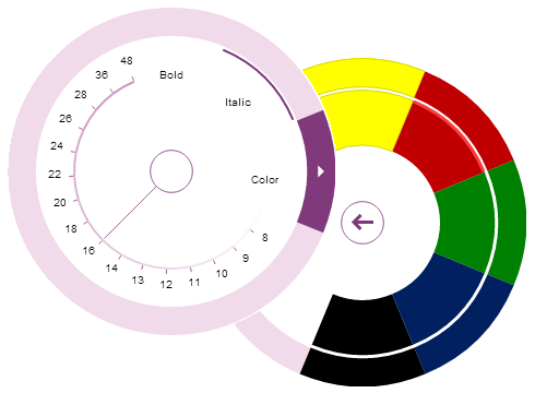
$("#radialMenu").igRadialMenu({
width: "300px",
height: "300px",
items:
[
{
name: "button1",
header: "Bold",
click: function () { alert("Bold pressed"); }
},
{
name: "button2",
header: "Italic",
click: function () { alert("Italic pressed"); }
},
{
type: "coloritem",
header: "Color",
items:
[
{
type: "colorwell",
color: "#FFFF00"
},
{
type: "colorwell",
color: "#C00000"
},
{
type: "colorwell",
color: "#008000"
},
{
type: "colorwell",
color: "#002060"
},
{
type: "colorwell",
color: "#000000"
}
]
},
{
type: "numericgauge",
wedgeSpan: "5",
ticks: "8,9,10,11,12,13,14,16,18,20,22,24,26,28,36,48",
value: "16"
}
]
});
</script>
</head>
<body>
<div id="radialMenu"></div>
</body>
</html>
Dependencies
Inherits
-
centerButtonClosedFill
- Type:
- string
- Default:
- null
Returns or sets the background of the center button of the menu when the IsOpen property is false.
Code Sample
//Initialize $(".selector").igRadialMenu({ centerButtonClosedFill : "#FF0000" }); //Get var color = $(".selector").igRadialMenu("option", "centerButtonClosedFill"); //Set $(".selector").igRadialMenu("option", "centerButtonClosedFill", "#FF0000"); -
centerButtonClosedStroke
- Type:
- string
- Default:
- null
Returns or sets the brush used for the outline of the ring of the center button when the IsOpen property is false.
Code Sample
//Initialize $(".selector").igRadialMenu({ centerButtonClosedStroke : "#FF0000" }); //Get var color = $(".selector").igRadialMenu("option", "centerButtonClosedStroke"); //Set $(".selector").igRadialMenu("option", "centerButtonClosedStroke", "#FF0000"); -
centerButtonContentHeight
- Type:
- number
- Default:
- 28
Returns or sets the height of the center button content.
Code Sample
//Initialize $(".selector").igRadialMenu({ centerButtonContentHeight : 30 }); //Get var height = $(".selector").igRadialMenu("option", "centerButtonContentHeight"); //Set $(".selector").igRadialMenu("option", "centerButtonContentHeight", 30); -
centerButtonContentWidth
- Type:
- number
- Default:
- 28
Returns or sets the width of the center button content.
Code Sample
//Initialize $(".selector").igRadialMenu({ centerButtonContentWidth : 30 }); //Get var width = $(".selector").igRadialMenu("option", "centerButtonContentWidth"); //Set $(".selector").igRadialMenu("option", "centerButtonContentWidth", 30); -
centerButtonFill
- Type:
- string
- Default:
- null
Returns or sets the background of the center button of the menu when the IsOpen property is true.
Code Sample
//Initialize $(".selector").igRadialMenu({ centerButtonFill : "#FF0000" }); //Get var color = $(".selector").igRadialMenu("option", "centerButtonFill"); //Set $(".selector").igRadialMenu("option", "centerButtonFill", "#FF0000"); -
centerButtonHotTrackFill
- Type:
- string
- Default:
- null
Returns or sets the background of the center button of the menu when under the pointer.
Code Sample
//Initialize $(".selector").igRadialMenu({ centerButtonHotTrackFill : "#FF0000" }); //Get var color = $(".selector").igRadialMenu("option", "centerButtonHotTrackFill"); //Set $(".selector").igRadialMenu("option", "centerButtonHotTrackFill", "#FF0000"); -
centerButtonHotTrackStroke
- Type:
- string
- Default:
- null
Returns or sets the brush used for the outline of the ring of the center button when under the pointer.
Code Sample
//Initialize $(".selector").igRadialMenu({ centerButtonHotTrackStroke : "#FF0000" }); //Get var color = $(".selector").igRadialMenu("option", "centerButtonHotTrackStroke"); //Set $(".selector").igRadialMenu("option", "centerButtonHotTrackStroke", "#FF0000"); -
centerButtonStroke
- Type:
- string
- Default:
- null
Returns or sets the brush used for the outline of the ring of the center button when the IsOpen is true.
Code Sample
//Initialize $(".selector").igRadialMenu({ centerButtonStroke : "#FF0000" }); //Get var color = $(".selector").igRadialMenu("option", "centerButtonStroke"); //Set $(".selector").igRadialMenu("option", "centerButtonStroke", "#FF0000"); -
centerButtonStrokeThickness
- Type:
- number
- Default:
- 0
Returns or sets the width of the outline of the inner rings of the menu.
Code Sample
//Initialize $(".selector").igRadialMenu({ centerButtonStrokeThickness : 3 }); //Get var thickness = $(".selector").igRadialMenu("option", "centerButtonStrokeThickness"); //Set $(".selector").igRadialMenu("option", "centerButtonStrokeThickness", 3); -
currentOpenMenuItemName
- Type:
- string
- Default:
- null
Gets or sets the name of the item within the menu whose children are currently displayed.
Code Sample
//Initialize $(".selector").igRadialMenu({ currentOpenMenuItemName : "button1" }); //Get var currentItem = $(".selector").igRadialMenu("option", "currentOpenMenuItemName"); //Set $(".selector").igRadialMenu("option", "currentOpenMenuItemName", "button1"); -
font
- Type:
- string
- Default:
- null
The font for the control.
Code Sample
//Initialize $(".selector").igRadialMenu({ font : "Arial" }); //Get var f = $(".selector").igRadialMenu("option", "font"); //Set $(".selector").igRadialMenu("option", "font", "Arial"); -
isOpen
- Type:
- bool
- Default:
- false
Returns or sets a boolean indicating whether the items of the menu are currently displayed. When closed, only the center button is rendered.
Code Sample
//Initialize $(".selector").igRadialMenu({ isOpen : true }); //Get var is_open = $(".selector").igRadialMenu("option", "isOpen"); //Set $(".selector").igRadialMenu("option", "isOpen", true); -
items
- Type:
- array
- Default:
- []
- Elements Type:
- object
Gets or sets the items in the menu.
Code Sample
//Initialize $(".selector").igRadialMenu({ items: [ { name: "button1", header: "Button 1" }, { name: "button2", header: "Button 2" } ] }); //Get var items = $(".selector").igRadialMenu("option", "items"); //Set $(".selector").igRadialMenu("option", "items", [ { name: "button1", header: "Button 1" }, { name: "button2", header: "Button 2" } ]);-
autoRotateChildren
- Type:
- bool
- Default:
- true
Returns or sets a boolean indicating if the children should be rotated to align with the location of this element.
Code Sample
//Initialize $(".selector").igRadialMenu({ autoRotateChildren : true }); //Get var auto_rotate = $(".selector").igRadialMenu("option", "autoRotateChildren"); //Set $(".selector").igRadialMenu("option", "autoRotateChildren", true); -
autoUpdateRecentItem
- Type:
- bool
- Default:
- null
Returns or sets a boolean indicating if the RecentItem property is updated when a child item is clicked.
Code Sample
//Initialize $(".selector").igRadialMenu({ autoUpdateRecentItem : true }); //Get var auto_update = $(".selector").igRadialMenu("option", "autoUpdateRecentItem"); //Set $(".selector").igRadialMenu("option", "autoUpdateRecentItem", true); -
checkBehavior
- Type:
- enumeration
- Default:
- none
Returns or sets a value indicating how the IsChecked property may be changed.
Members
- none
- Type:string
- The item is not checkable.
- checkBox
- Type:string
- The item is checkable and may be independantly checked or unchecked without affecting other items.
- radioButton
- Type:string
- The item is checkable. Only 1 item from the items with the same GroupName may be checked at a time and the checked item may not be unchecked.
- radioButtonAllowAllUp
- Type:string
- The item is checkable. Only 1 item from the items with the same GroupName may be checked at a time and the checked item may not be checked allowing all items to be unchecked.
Code Sample
//Initialize $(".selector").igRadialMenu({ items: [ { name: "item1", checkBehavior: "checkBox" } ] }); //Get var value = $(".selector").igRadialMenu("itemOption", "item1", "checkBehavior"); //Set $(".selector").igRadialMenu("itemOption", "item1", "checkBehavior", "checkBox"); -
checked
- Type:
- object
- Default:
- null
Cancel="false" Occurs when the IsChecked is changed to true.
Function takes a first argument ui.
Use ui.owner to obtain reference to menu widget.
Use ui.item to obtain reference to the item.Code Sample
//Initialize $(".selector").igRadialMenu({ items: [ { name: "button1", checked: function (evt) { // Get reference to the menu item object evt.item; } } ] }); -
checkedHighlightBrush
- Type:
- string
- Default:
- null
Returns or sets the brush used for the arc displayed within the tool when checked.
Code Sample
//Initialize $(".selector").igRadialMenu({ checkedHighlightBrush : "#FF0000" }); //Get var color = $(".selector").igRadialMenu("option", "checkedHighlightBrush"); //Set $(".selector").igRadialMenu("option", "checkedHighlightBrush", "#FF0000"); -
childItemPlacement
- Type:
- enumeration
- Default:
- asChildren
Returns or sets an enumeration indicating where the child items are displayed.
Members
- asChildren
- Type:string
- The Items are displayed within a separate level that is accessed by clicking on the button in the outer ring of the xamRadialMenu for the parent.
- asSiblingsWhenChecked
- Type:string
- The items are displayed as siblings of the parent as long as the IsChecked is set to true.
- none
- Type:string
- The child items are not displayed.
Code Sample
//Initialize $(".selector").igRadialMenu({ childItemPlacement : "asChildren" }); //Get var placement = $(".selector").igRadialMenu("option", "childItemPlacement"); //Set $(".selector").igRadialMenu("option", "childItemPlacement", "asChildren"); -
click
- Type:
- object
- Default:
- null
Cancel="false" Occurs when the item area is clicked.
Function takes a first argument ui.
Use ui.owner to obtain reference to menu widget.
Use ui.item to obtain reference to the item.Code Sample
//Initialize $(".selector").igRadialMenu({ items: [ { name: "button1", click: function (evt) { // Get reference to the menu item object evt.item; } } ] }); -
closed
- Type:
- object
- Default:
- null
Cancel="false" Invoked when one navigates back to the item after viewing the child items.
Function takes a first argument ui.
Use ui.owner to obtain reference to menu widget.
Use ui.item to obtain reference to the item.Code Sample
//Initialize $(".selector").igRadialMenu({ items: [ { name: "button1", closed: function (evt) { // Get reference to the menu item object evt.item; } } ] }); -
color
- Type:
- object
- Default:
- null
Returns or sets the color that the item represents.
Note: When the Color property is set, several of the brush properties are changed.Code Sample
//Initialize $(".selector").igRadialMenu({ items: [ { name: "item1", color: "#FF0000" } ] }); //Get var color = $(".selector").igRadialMenu("itemOption", "item1", "color"); //Set $(".selector").igRadialMenu("itemOption", "item1", "color", "#FF0000"); -
colorChanged
- Type:
- object
- Default:
- null
Cancel="false" Event invoked when the Color property is changed.
Function takes a first argument ui.
Use ui.owner to obtain reference to menu widget.
Use ui.oldValue to obtain the previous value.
Use ui.newValue to obtain the new value.
Use ui.item to obtain reference to the item.Code Sample
//Initialize $(".selector").igRadialMenu({ items: [ { name: "button1", colorChanged: function (evt) { // Get reference to the menu item object evt.item; } } ] }); -
colorWellClick
- Type:
- object
- Default:
- null
Cancel="false" Occurs when the item area of a descendant color well is clicked.
Function takes a first argument ui.
Use ui.owner to obtain reference to menu widget.
Use ui.item to obtain reference to the item.Code Sample
//Initialize $(".selector").igRadialMenu({ items: [ { name: "button1", colorWellClick: function (evt) { // Get reference to the menu item object evt.item; } } ] }); -
foreground
- Type:
- string
- Default:
- null
Returns or sets the foreground for the inner area of the item.
Code Sample
//Initialize $(".selector").igRadialMenu({ items: [ { name: "item1", foreground: "#FF0000" } ] }); //Get var color = $(".selector").igRadialMenu("itemOption", "item1", "foreground"); //Set $(".selector").igRadialMenu("itemOption", "item1", "foreground", "#FF0000"); -
groupName
- Type:
- string
- Default:
- null
Returns or sets the name used to identify which RadioButton type items will be grouped together when determining the item to uncheck when the item is checked.
Code Sample
//Initialize $(".selector").igRadialMenu({ items: [ { name: "item1", groupName: "group1" } ] }); //Get var color = $(".selector").igRadialMenu("itemOption", "item1", "groupName"); //Set $(".selector").igRadialMenu("itemOption", "item1", "groupName", "group1"); -
header
- Type:
- object
- Default:
- null
Returns or sets the header of the menu item.
Code Sample
//Initialize $(".selector").igRadialMenu({ items: [ { name: "item1", header: "Click Me" } ] }); //Get var value = $(".selector").igRadialMenu("itemOption", "item1", "header"); //Set $(".selector").igRadialMenu("itemOption", "item1", "header", "Click Me"); -
highlightBrush
- Type:
- string
- Default:
- null
Returns or sets the brush used for the arc displayed within the tool when hot tracked.
Code Sample
//Initialize $(".selector").igRadialMenu({ highlightBrush : "#FF0000" }); //Get var color = $(".selector").igRadialMenu("option", "highlightBrush"); //Set $(".selector").igRadialMenu("option", "highlightBrush", "#FF0000"); -
iconUri
- Type:
- string
- Default:
- null
Returns or sets the uri of the image for the item.
Code Sample
//Initialize $(".selector").igRadialMenu({ items: [ { name: "item1", iconUri: "../folder/image.png" } ] }); //Get var imgPath = $(".selector").igRadialMenu("itemOption", "item1", "iconUri"); //Set $(".selector").igRadialMenu("itemOption", "item1", "iconUri", "../folder/image.png"); -
innerAreaFill
- Type:
- string
- Default:
- null
Returns or sets the background of the inner area of the menu item.
Code Sample
//Initialize $(".selector").igRadialMenu({ innerAreaFill : "#FF0000" }); //Get var color = $(".selector").igRadialMenu("option", "innerAreaFill"); //Set $(".selector").igRadialMenu("option", "innerAreaFill", "#FF0000"); -
innerAreaHotTrackFill
- Type:
- string
- Default:
- null
Returns or sets the brush for the background of the inner area of the menu item that is under the pointer.
Code Sample
//Initialize $(".selector").igRadialMenu({ innerAreaHotTrackFill : "#FF0000" }); //Get var color = $(".selector").igRadialMenu("option", "innerAreaHotTrackFill"); //Set $(".selector").igRadialMenu("option", "innerAreaHotTrackFill", "#FF0000"); -
innerAreaHotTrackStroke
- Type:
- string
- Default:
- null
Returns or sets the brush for the default border of the inner area for the menu item that is under the pointer.
Code Sample
//Initialize $(".selector").igRadialMenu({ innerAreaHotTrackStroke : "#FF0000" }); //Get var color = $(".selector").igRadialMenu("option", "innerAreaHotTrackStroke"); //Set $(".selector").igRadialMenu("option", "innerAreaHotTrackStroke", "#FF0000"); -
innerAreaStroke
- Type:
- string
- Default:
- null
Returns or sets the brush for the default border of the inner area for the menu item.
Code Sample
//Initialize $(".selector").igRadialMenu({ innerAreaStroke : "#FF0000" }); //Get var color = $(".selector").igRadialMenu("option", "innerAreaStroke"); //Set $(".selector").igRadialMenu("option", "innerAreaStroke", "#FF0000"); -
innerAreaStrokeThickness
- Type:
- number
- Default:
- 1
Returns or sets the thickness of the border for the inner area for the menu item.
Code Sample
//Initialize $(".selector").igRadialMenu({ innerAreaStrokeThickness : 3 }); //Get var thickness = $(".selector").igRadialMenu("option", "innerAreaStrokeThickness"); //Set $(".selector").igRadialMenu("option", "innerAreaStrokeThickness", 3); -
isChecked
- Type:
- bool
- Default:
- false
Returns or sets a boolean indicating if the item is displayed as checked.
Code Sample
//Initialize $(".selector").igRadialMenu({ items: [ { name: "item1", isChecked: true } ] }); //Get var ch = $(".selector").igRadialMenu("itemOption", "item1", "isChecked"); //Set $(".selector").igRadialMenu("itemOption", "item1", "isChecked", true); -
isEnabled
- Type:
- bool
- Default:
- true
Returns or sets a boolean indicating whether the item is enabled.
Code Sample
//Initialize $(".selector").igRadialMenu({ items: [ { name: "item1", isEnabled: true } ] }); //Get var en = $(".selector").igRadialMenu("itemOption", "item1", "isEnabled"); //Set $(".selector").igRadialMenu("itemOption", "item1", "isEnabled", true); -
isToolTipEnabled
- Type:
- bool
- Default:
- true
Returns or sets a boolean indicating if a tooltip may be displayed for the item.
Code Sample
//Initialize $(".selector").igRadialMenu({ items: [ { name: "item1", isToolTipEnabled: true } ] }); //Get var value = $(".selector").igRadialMenu("itemOption", "item1", "isToolTipEnabled"); //Set $(".selector").igRadialMenu("itemOption", "item1", "isToolTipEnabled", true); -
name
- Type:
- string
- Default:
- null
Gets or sets the unique name of the item within the menu.
Code Sample
//Initialize $(".selector").igRadialMenu({ items: [ { name: "item1", } ] }); //Set $(".selector").igRadialMenu("itemOption", "item1", "name", "item2"); -
opened
- Type:
- object
- Default:
- null
Cancel="false" Invoked when one navigates to the view the child items.
Function takes a first argument ui.
Use ui.owner to obtain reference to menu widget.
Use ui.item to obtain reference to the item.Code Sample
//Initialize $(".selector").igRadialMenu({ items: [ { name: "button1", opened: function (evt) { // Get reference to the menu item object evt.item; } } ] }); -
outerRingButtonFill
- Type:
- string
- Default:
- null
Returns or sets the default background of the button within the outer ring for a menu item.
Code Sample
//Initialize $(".selector").igRadialMenu({ outerRingButtonFill : "#FF0000" }); //Get var color = $(".selector").igRadialMenu("option", "outerRingButtonFill"); //Set $(".selector").igRadialMenu("option", "outerRingButtonFill", "#FF0000"); -
outerRingButtonForeground
- Type:
- string
- Default:
- null
Returns or sets the brush for the foreground of the buttons in the outer ring of the menu.
Code Sample
//Initialize $(".selector").igRadialMenu({ outerRingButtonForeground : "#FF0000" }); //Get var color = $(".selector").igRadialMenu("option", "outerRingButtonForeground"); //Set $(".selector").igRadialMenu("option", "outerRingButtonForeground", "#FF0000"); -
outerRingButtonHotTrackFill
- Type:
- string
- Default:
- null
Returns or sets the brush for the background of the button within the outer ring for a menu item that is under the pointer.
Code Sample
//Initialize $(".selector").igRadialMenu({ outerRingButtonHotTrackFill : "#FF0000" }); //Get var color = $(".selector").igRadialMenu("option", "outerRingButtonHotTrackFill"); //Set $(".selector").igRadialMenu("option", "outerRingButtonHotTrackFill", "#FF0000"); -
outerRingButtonHotTrackForeground
- Type:
- string
- Default:
- null
Returns or sets the foreground of the buttons in the outer ring of the menu that is under the pointer.
Code Sample
//Initialize $(".selector").igRadialMenu({ outerRingButtonHotTrackForeground : "#FF0000" }); //Get var color = $(".selector").igRadialMenu("option", "outerRingButtonHotTrackForeground"); //Set $(".selector").igRadialMenu("option", "outerRingButtonHotTrackForeground", "#FF0000"); -
outerRingButtonHotTrackStroke
- Type:
- string
- Default:
- null
Returns or sets the brush for the default border of the button within the outer ring for a menu item that is under the pointer.
Code Sample
//Initialize $(".selector").igRadialMenu({ outerRingButtonHotTrackStroke : "#FF0000" }); //Get var color = $(".selector").igRadialMenu("option", "outerRingButtonHotTrackStroke"); //Set $(".selector").igRadialMenu("option", "outerRingButtonHotTrackStroke", "#FF0000"); -
outerRingButtonStroke
- Type:
- string
- Default:
- null
Returns or sets the brush for the default border of the button within the outer ring for a menu item.
Code Sample
//Initialize $(".selector").igRadialMenu({ outerRingButtonStroke : "#FF0000" }); //Get var color = $(".selector").igRadialMenu("option", "outerRingButtonStroke"); //Set $(".selector").igRadialMenu("option", "outerRingButtonStroke", "#FF0000"); -
outerRingButtonStrokeThickness
- Type:
- number
- Default:
- 1
Returns or sets the width of the outline of a button in the outer ring of the menu.
Code Sample
//Initialize $(".selector").igRadialMenu({ outerRingButtonStrokeThickness : 3 }); //Get var thickness = $(".selector").igRadialMenu("option", "outerRingButtonStrokeThickness"); //Set $(".selector").igRadialMenu("option", "outerRingButtonStrokeThickness", 3); -
pendingValue
- Type:
- object
- Default:
- ""
Returns or sets the value while the user is interacting with the element.
Code Sample
//Initialize $(".selector").igRadialMenu({ items: [ { name: "item1", pendingValue: 5 } ] }); //Get var pv = $(".selector").igRadialMenu("itemOption", "item1", "pendingValue"); //Set $(".selector").igRadialMenu("itemOption", "item1", "pendingValue", 5); -
pendingValueChanged
- Type:
- object
- Default:
- null
Cancel="false" Event invoked when the PendingValue property is changed.
Function takes a first argument ui.
Use ui.owner to obtain reference to menu widget.
Use ui.oldValue to obtain the previous value.
Use ui.newValue to obtain the new value.
Use ui.item to obtain reference to the item.Code Sample
//Initialize $(".selector").igRadialMenu({ items: [ { name: "button1", pendingValueChanged: function (evt) { // Get reference to the menu item object evt.item; // Get the old value evt.oldItem // Get the new value evt.newItem } } ] }); -
pendingValueNeedleBrush
- Type:
- string
- Default:
- null
Returns or sets the brush used to render the line that represents the PendingValue.
Code Sample
//Initialize $(".selector").igRadialMenu({ pendingValueNeedleBrush : "#FF0000" }); //Get var color = $(".selector").igRadialMenu("option", "pendingValueNeedleBrush"); //Set $(".selector").igRadialMenu("option", "pendingValueNeedleBrush", "#FF0000"); -
recentItemName
- Type:
- string
- Default:
- null
Gets or sets the name of the child item that represents the most recently interacted with item. Note other item properties may be set to "{RecentItem}" to have them automatically set to values of the associated recent child item.
Code Sample
//Initialize $(".selector").igRadialMenu({ recentItemName : "botton1" }); //Get var ri = $(".selector").igRadialMenu("option", "recentItemName"); //Set $(".selector").igRadialMenu("option", "recentItemName", "botton1"); -
reserveFirstSlice
- Type:
- bool
- Default:
- false
Returns or sets a boolean indicating whether space should be left before the first tickmark.
Code Sample
//Initialize $(".selector").igRadialMenu({ reserveFirstSlice : true }); //Get var is_open = $(".selector").igRadialMenu("option", "reserveFirstSlice"); //Set $(".selector").igRadialMenu("option", "reserveFirstSlice", true); -
smallIncrement
- Type:
- number
- Default:
- 1
Returns or sets the amount that the PendingValue should be adjusted when incrementing or decrementing the value.
Code Sample
//Initialize $(".selector").igRadialMenu({ smallIncrement : 2 }); //Get var value = $(".selector").igRadialMenu("option", "smallIncrement"); //Set $(".selector").igRadialMenu("option", "smallIncrement", 2); -
tickBrush
- Type:
- string
- Default:
- null
Returns or sets the brush used to render the tick marks.
Code Sample
//Initialize $(".selector").igRadialMenu({ tickBrush : "#FF0000" }); //Get var color = $(".selector").igRadialMenu("option", "tickBrush"); //Set $(".selector").igRadialMenu("option", "tickBrush", "#FF0000"); -
ticks
- Type:
- object
- Default:
- null
Returns or sets the values of the ticks.
Code Sample
//Initialize $(".selector").igRadialMenu({ items: [ { name: "item1", ticks: "5px,6px,8px,10px,12px" } ] }); //Get var t = $(".selector").igRadialMenu("itemOption", "item1", "ticks"); //Set $(".selector").igRadialMenu("itemOption", "item1", "ticks", 5); -
toolTip
- Type:
- object
- Default:
- null
Returns or sets the tooltip to be displayed for the radial menu item.
Code Sample
//Initialize $(".selector").igRadialMenu({ items: [ { name: "item1", toolTip: "This is item 1" } ] }); //Get var tt = $(".selector").igRadialMenu("itemOption", "item1", "toolTip"); //Set $(".selector").igRadialMenu("itemOption", "item1", "toolTip", "This is item 1"); -
trackEndColor
- Type:
- object
- Default:
- null
Returns or sets the ending color for the track.
Code Sample
//Initialize $(".selector").igRadialMenu({ items: [ { name: "item1", trackEndColor: "#FF0000" } ] }); //Get var color = $(".selector").igRadialMenu("itemOption", "item1", "trackEndColor"); //Set $(".selector").igRadialMenu("itemOption", "item1", "trackEndColor", "#FF0000"); -
trackStartColor
- Type:
- object
- Default:
- null
Returns or sets the starting color for the track.
Code Sample
//Initialize $(".selector").igRadialMenu({ items: [ { name: "item1", trackStartColor: "#FF0000" } ] }); //Get var color = $(".selector").igRadialMenu("itemOption", "item1", "trackStartColor"); //Set $(".selector").igRadialMenu("itemOption", "item1", "trackStartColor", "#FF0000"); -
type
- Type:
- enumeration
- Default:
- button
Gets or sets a value indicating what type of item is being provided.
Members
- button
- Type:string
- .
- coloritem
- Type:string
- .
- colorwell
- Type:string
- .
- list
- Type:string
- .
- numericitem
- Type:string
- .
- numericgauge
- Type:string
Code Sample
//Initialize $(".selector").igRadialMenu({ items: [ { name: "item1", type: "colorwell" } ] }); //Get var t = $(".selector").igRadialMenu("itemOption", "item1", "type"); //Set $(".selector").igRadialMenu("itemOption", "item1", "type", "colorwell"); -
unchecked
- Type:
- object
- Default:
- null
Cancel="false" Occurs when the IsChecked is changed to false.
Function takes a first argument ui.
Use ui.owner to obtain reference to menu widget.
Use ui.item to obtain reference to the item.Code Sample
//Initialize $(".selector").igRadialMenu({ items: [ { name: "button1", unchecked: function (evt) { // Get reference to the menu item object evt.item; } } ] }); -
value
- Type:
- number
- Default:
- ""
Returns or sets the value of the numeric item.
Code Sample
//Initialize $(".selector").igRadialMenu({ items: [ { name: "item1", value: 5 } ] }); //Get var t = $(".selector").igRadialMenu("itemOption", "item1", "value"); //Set $(".selector").igRadialMenu("itemOption", "item1", "value", 5); -
valueChanged
- Type:
- object
- Default:
- null
Cancel="false" Event invoked when the Value property is changed.
Function takes a first argument ui.
Use ui.owner to obtain reference to menu widget.
Use ui.oldValue to obtain the previous value.
Use ui.newValue to obtain the new value.
Use ui.item to obtain reference to the item.Code Sample
//Initialize $(".selector").igRadialMenu({ items: [ { name: "button1", valueChanged: function (evt) { // Get reference to the menu item object evt.item; } } ] }); -
valueNeedleBrush
- Type:
- string
- Default:
- null
Returns or sets the brush used to represent the Value.
Code Sample
//Initialize $(".selector").igRadialMenu({ items: [ { name: "item1", valueNeedleBrush: "#FF0000" } ] }); //Get var color = $(".selector").igRadialMenu("itemOption", "item1", "valueNeedleBrush"); //Set $(".selector").igRadialMenu("itemOption", "item1", "valueNeedleBrush", "#FF0000"); -
wedgeIndex
- Type:
- number
- Default:
- -1
Returns or sets the wedge at which the item should be positioned.
Code Sample
//Initialize $(".selector").igRadialMenu({ items: [ { name: "item1", wedgeIndex: 3 } ] }); //Get var wIndex = $(".selector").igRadialMenu("itemOption", "item1", "wedgeIndex"); //Set $(".selector").igRadialMenu("itemOption", "item1", "wedgeIndex", 3); -
wedgeSpan
- Type:
- number
- Default:
- 1
Returns or sets the number of wedges that the item should occupy.
Code Sample
//Initialize
$(".selector").igRadialMenu({
    items:
    [
      {
        name: "item1",
        wedgeSpan: 4
      }
    ]
});

//Get
var wSpan = $(".selector").igRadialMenu("itemOption", "item1", "wedgeSpan");

//Set
$(".selector").igRadialMenu("itemOption", "item1", "wedgeSpan", 4);
-
menuBackground
- Type:
- string
- Default:
- null
Returns or sets the brush for the backing of the radial menu.
Code Sample
//Initialize $(".selector").igRadialMenu({ menuBackground : "#FF0000" }); //Get var color = $(".selector").igRadialMenu("option", "menuBackground"); //Set $(".selector").igRadialMenu("option", "menuBackground", "#FF0000"); -
menuItemOpenCloseAnimationDuration
- Type:
- number
- Default:
- 250
Returns or sets the duration of the animation performed when the IsOpen property is changed.
Code Sample
//Initialize $(".selector").igRadialMenu({ menuItemOpenCloseAnimationDuration : 350 }); //Get var duration_ms = $(".selector").igRadialMenu("option", "menuItemOpenCloseAnimationDuration"); //Set $(".selector").igRadialMenu("option", "menuItemOpenCloseAnimationDuration", 350); -
menuItemOpenCloseAnimationEasingFunction
- Type:
- object
- Default:
- null
Returns or sets the easing function applied to the animation that occurs when the IsOpen property is changed.
Code Sample
//Initialize $(".selector").igRadialMenu({ items: [ { name: "button1", menuItemOpenCloseAnimationEasingFunction: function (evt) { // Get reference to the menu item object evt.item; } } ] }); -
menuOpenCloseAnimationDuration
- Type:
- number
- Default:
- 250
Returns or sets the duration of the animation performed when the IsOpen property is changed.
Code Sample
//Initialize $(".selector").igRadialMenu({ menuOpenCloseAnimationDuration : 350 }); //Get var duration_ms = $(".selector").igRadialMenu("option", "menuOpenCloseAnimationDuration"); //Set $(".selector").igRadialMenu("option", "menuOpenCloseAnimationDuration", 350); -
menuOpenCloseAnimationEasingFunction
- Type:
- object
- Default:
- null
Returns or sets the easing function applied to the animation that occurs when the IsOpen property is changed.
Code Sample
//Initialize $(".selector").igRadialMenu({ items: [ { name: "button1", menuOpenCloseAnimationEasingFunction: function (evt) { // Get reference to the menu item object evt.item; } } ] }); -
minWedgeCount
- Type:
- number
- Default:
- 8
Returns or sets the minimum number of wedges displayed by the menu.
Code Sample
//Initialize $(".selector").igRadialMenu({ minWedgeCount : 5 }); //Get var min_wedges = $(".selector").igRadialMenu("option", "minWedgeCount"); //Set $(".selector").igRadialMenu("option", "minWedgeCount", 5); -
outerRingFill
- Type:
- string
- Default:
- null
Returns or sets the background of the outer ring of the menu.
Code Sample
//Initialize $(".selector").igRadialMenu({ outerRingFill : "#FF0000" }); //Get var color = $(".selector").igRadialMenu("option", "outerRingFill"); //Set $(".selector").igRadialMenu("option", "outerRingFill", "#FF0000"); -
outerRingStroke
- Type:
- string
- Default:
- null
Returns or sets the brush used for the outline of the outer ring.
Code Sample
//Initialize $(".selector").igRadialMenu({ outerRingStroke : "#FF0000" }); //Get var color = $(".selector").igRadialMenu("option", "outerRingStroke"); //Set $(".selector").igRadialMenu("option", "outerRingStroke", "#FF0000"); -
outerRingStrokeThickness
- Type:
- number
- Default:
- 0
Returns or sets the width of the outline of the outer ring of the menu.
Code Sample
//Initialize $(".selector").igRadialMenu({ outerRingStrokeThickness : 3 }); //Get var thickness = $(".selector").igRadialMenu("option", "outerRingStrokeThickness"); //Set $(".selector").igRadialMenu("option", "outerRingStrokeThickness", 3); -
outerRingThickness
- Type:
- number
- Default:
- 26
Returns or sets the thickness of the outer ring of the menu.
Code Sample
//Initialize $(".selector").igRadialMenu({ outerRingThickness : 35 }); //Get var thickness = $(".selector").igRadialMenu("option", "outerRingThickness"); //Set $(".selector").igRadialMenu("option", "outerRingThickness", 35); -
rotationAsPercentageOfWedge
- Type:
- number
- Default:
- -0.5
Returns or sets the starting angle of the items expressed as the percentage of the width of a single wedge/slice.
Code Sample
//Initialize $(".selector").igRadialMenu({ rotationAsPercentageOfWedge : 0.5 }); //Get var degree = $(".selector").igRadialMenu("option", "rotationAsPercentageOfWedge"); //Set $(".selector").igRadialMenu("option", "rotationAsPercentageOfWedge", 0.5); -
rotationInDegrees
- Type:
- number
- Default:
- -90
Returns or sets the starting angle of the items in degrees.
Code Sample
//Initialize $(".selector").igRadialMenu({ rotationInDegrees : -180 }); //Get var degree = $(".selector").igRadialMenu("option", "rotationInDegrees"); //Set $(".selector").igRadialMenu("option", "rotationInDegrees", -180); -
wedgePaddingInDegrees
- Type:
- number
- Default:
- 0
Returns or sets the amount of padding around each wedge in degrees.
Code Sample
//Initialize
$(".selector").igRadialMenu({
    wedgePaddingInDegrees : 15
});

//Get
var degree = $(".selector").igRadialMenu("option", "wedgePaddingInDegrees");

//Set
$(".selector").igRadialMenu("option", "wedgePaddingInDegrees", 15);
For more information on how to interact with the Ignite UI controls' events, refer to
Using Events in Ignite UI.
-
closed
- Cancellable:
- false
Invoked when the IsOpen property is changed to false.
Function takes a first argument ui.
Use ui.owner to obtain reference to menu widget.Code Sample
//Initialize $(".selector").igRadialMenu({ items: [ { name: "button1", closed: function (evt) { // Get reference to the menu item object evt.item; } } ] }); -
opened
- Cancellable:
- false
Invoked when the IsOpen property is changed to true.
Function takes a first argument ui.
Use ui.owner to obtain reference to menu widget.Code Sample
//Initialize
$(".selector").igRadialMenu({
    items:
    [
        {
            name: "button1",
            opened: function (evt) {
                // Get reference to the menu item object
                evt.item;
            }
        }
    ]
});
-
destroy
- .igRadialMenu( "destroy" );
Destroys the widget.
Code Sample
$(".selector").igRadialMenu("destroy"); -
exportVisualData
- .igRadialMenu( "exportVisualData" );
Exports visual data from the radial menu to aid in unit testing.
Code Sample
var data = $(".selector").igRadialMenu("exportVisualData"); -
flush
- .igRadialMenu( "flush" );
Forces any pending deferred work to render on the radial menu before continuing.
Code Sample
$(".selector").igRadialMenu("flush"); -
itemOption
- .igRadialMenu( "itemOption", itemKey:string, key:string, value:object );
- Return Type:
- object
- Return Type Description:
- The value of the property if the value parameter is undefined otherwise a boolean indicating if the property was changed.
Gets or sets the value of a property for the item created with the specified key.
- itemKey
- Type:string
- The name of the item.
- key
- Type:string
- The name of the property/option.
- value
- Type:object
- The new value for the property or undefined to obtain the current value.
Code Sample
//Get var value = $(".selector").igRadialMenu("itemOption", "optionName"); //Set $(".selector").igRadialMenu("itemOption", "optionName", "optionValue"); -
styleUpdated
- .igRadialMenu( "styleUpdated" );
Notify the radial menu that style information used for rendering the menu may have been updated.
Code Sample
var response = $(".selector").igRadialMenu("styleUpdated");
-
ui-radialmenu
- Get the class applied to main element: ui-radialMenu.
-
ui-radialmenu-tooltip ui-corner-all
- Class applied to the tooltip element: ui-radialmenu-tooltip ui-corner-all.
-
ui-html5-non-html5-supported-message ui-helper-clearfix ui-html5-non-html5
- Get the class applied to main element, shown when the radialMenu is opened in a non HTML5 compatible browser.