ui.igNotifier
コード サンプル
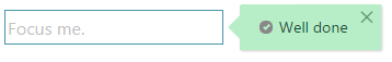
    <!DOCTYPE html>
    <html>
    <head>
         <!--Ignite UI Required Combined CSS Files-->
        <link href="css/themes/infragistics/infragistics.theme.css" rel="stylesheet" type="text/css" />
        <link href="css/structure/infragistics.css" rel="stylesheet" type="text/css" />

        <script src="js/modernizr-latest.js"></script>
        <script src="js/jquery.js"></script>
        <script src="js/jquery-ui.js"></script>

         <!--Ignite UI Required Combined JavaScript Files-->
        <script src="js/infragistics.core.js"></script>
        <script src="js/infragistics.lob.js"></script>

        <script type="text/javascript">

            $(document).ready(function () {

               $("#successEditor").igTextEditor({
                    placeHolder:"Focus me."
                });

                $("#successEditor").igNotifier({
                    showOn: "focus",
                    state: "success" ,
                    direction: "right",
                    showIcon: true,
                    mode:"popover",
                    messages: {
                        info: "Information about the state of the input.",
                        success: "Well done",
                        warning: "Warning",
                        error: "Error!"
                    }
                });
            });

        </script>
    </head>
    <body>
        <div id="successEditor"></div>
    </body>
    </html>
関連サンプル
関連トピック
依存関係
-
allowCSSOnTarget
- タイプ:
- bool
- デフォルト:
- true
各状態の CSS をターゲット要素に設定することを許可します (デフォルトで境界線の色を適用するために使用します)。
コード サンプル
//Initialize $('.selector').igNotifier({ allowCSSOnTarget: true }); //Get var allowCSSOnTarget = $(".selector").igNotifier("option", "allowCSSOnTarget"); //Set $(".selector").igNotifier("option", "allowCSSOnTarget", false); -
animationDuration
- タイプ:
- number
- デフォルト:
- 250
通知が表示/非表示するときのフェード時間をミリ秒で取得または設定します。
コード サンプル
//Initialize $('.selector').igNotifier({ animationDuration: 300 }); //Get var animationDuration = $(".selector").igNotifier("option", "animationDuration"); //Set $(".selector").igNotifier("option", "animationDuration", 300); -
animationSlideDistance
- タイプ:
- number
- デフォルト:
- 5
表示するとき、通知ポップオーバーが外部にスライドする距離をピクセルで取得または設定します。
コード サンプル
//Initialize $('.selector').igNotifier({ animationSlideDistance: 5 //Get var animationSlideDistance = $(".selector").igNotifier("option", "animationSlideDistance"); //Set $(".selector").igNotifier("option", "animationSlideDistance", 5); -
appendTo
- タイプ:
- enumeration
- デフォルト:
- body
ポップオーバー DOM に添付する要素を制御します (ポップオーバーのみに適用します)。
メンバー
- string
- タイプ:string
- 要素の有効な jQuery セレクター。
- object
- タイプ:object
- 親 jQuery オブジェクトへの参照。
コード サンプル
//Initialize $('.selector').igNotifier({ appendTo: "body" }); //Get var appendTo = $(".selector").igNotifier("option", "appendTo"); -
closeOnBlur
- タイプ:
- bool
- デフォルト:
- false
ポップオーバーがぼかしで閉じるかどうかを制御します。このオプションは、対応する showOn を設定 (通常は手動) した場合のみ効果があります。
コード サンプル
//Initialize $('.selector').igNotifier({ closeOnBlur: true }); //Get var closeOnBlur = $(".selector").igNotifier("option", "closeOnBlur"); //Set $(".selector").igNotifier("option", "closeOnBlur", true); -
containment
継承- タイプ:
- object
- デフォルト:
- null
ポップオーバーのコンテインメントを設定します。jQuery オブジェクトを受け付けます。
コード サンプル
//Initialize $(".selector").igNotifier({ containment: $( '#notifierDivElement' ) }); // Get var containment = $(".selector").igNotifier("option", "containment"); // Set $(".selector").igNotifier("option", "containment", $( '#notifierDivElement' )); -
contentTemplate
- タイプ:
- enumeration
- デフォルト:
- <span class={0}><span class={1}></span></span>{2}
ポップオーバー コンテナーのコンテンツを設定します。デフォルトではパラメーターでテンプレート化されます。{0} - アイコン コンテナー クラス、{1} - アイコン クラス、{2} - メッセージのテキスト。
メンバー
- string
- タイプ:string
- ポップオーバー コンテナーの文字列コンテンツ。
- function
- タイプ:function
- コンテンツを返すコールバックである関数。対象の DOM 要素および状態値の渡された引数にアクセスするには、'this' 値を使用します。結果は同じテンプレート パラメーターを含むことができます。
コード サンプル
//Initialize // string content for the popover container $(".selector").igNotifier({ contentTemplate:"<img src='http://www.infragistics.com/assets/images/logo.png' title='IG logo' /> {1}" }); //Get var contentFunction = $(".selector").igNotifier("option", "contentTemplate"); // Set // Accepts setting the value only if string type is passed $(".selector").igNotifier("option", "contentTemplate", "<img src='http://www.infragistics.com/assets/images/logo.png' title='IG logo' /> {1}"); -
direction
継承- タイプ:
- enumeration
- デフォルト:
- auto
ターゲット要素に相対してコントロールの表示方向を制御します。
メンバー
- auto
- タイプ:string
- directionPriority プロパティで指定した優先順序で、利用可能なスペースがある側にコントロールを表示します。
- left
- タイプ:string
- ポップオーバーはターゲットの要素の左側に表示されます。
- right
- タイプ:string
- ポップオーバーはターゲットの要素の右側に表示されます。
- top
- タイプ:string
- ポップオーバーはターゲットの要素の上側に表示されます。
- bottom
- タイプ:string
- ポップオーバーはターゲットの要素の下側に表示されます。
コード サンプル
//Initialize $(".selector").igNotifier({ direction: "right" }); // Get var direction = $(".selector").igNotifier("option", "direction"); // Set $(".selector").igNotifier("option", "direction", "top"); -
directionPriority
継承- タイプ:
- array
- デフォルト:
- []
- 要素タイプ:
- string
ターゲット要素に相対するコントロールが表示スペースを検索する優先度を制御します。
このプロパティは、direction プロパティ値が "auto" または設定されていない場合のみに使用されます。 -
headerTemplate
- タイプ:
- object
- デフォルト:
- {}
ポップオーバー ヘッダーのコンテンツを取得または設定します。
コード サンプル
//Initialize $(".selector").igNotifier({ headerTemplate: { closeButton: false } }); //Get var headerTemplate = $(".selector").igNotifier("option", "headerTemplate");-
closeButton
- タイプ:
- bool
- デフォルト:
- true
ポップオーバーが [閉じる] ボタンを描画するかどうかを制御します。
コード サンプル
//Initialize $(".selector").igNotifier({ headerTemplate: { closeButton : false, title : null } }); //Get var title = $(".selector").igNotifier("option", "headerTemplate"); -
title
- タイプ:
- string
- デフォルト:
- null
ポップオーバー ヘッダーのコンテンツを設定します。
コード サンプル
				//Initialize
				$(".selector").igNotifier({
					headerTemplate: {
						closeButton : false,
						title : null
					}
				});

				//Get
				var title = $(".selector").igNotifier("option", "headerTemplate");
-
height
継承- タイプ:
- enumeration
- デフォルト:
- null
ポップオーバーの高さを定義します。null を指定すると、auto に解決します。
メンバー
- number
- 高さを数字に設定できます。
- string
- 高さをピクセル (px) に設定できます。
コード サンプル
//Initialize $(".selector").igNotifier({ height: 200 }); // Get var height = $(".selector").igNotifier("option", "height"); -
maxHeight
継承- タイプ:
- enumeration
- デフォルト:
- 200
高さが設定されなくても、ポップオーバーの最大高さを定義します。
メンバー
- number
- 最大の高さは数値として設定できます。
- string
- 最大の高さはピクセル (px) として設定できます。
コード サンプル
//Initialize $(".selector").igNotifier({ maxHeight: 200 }); // Get var maxHeight = $(".selector").igNotifier("option", "maxHeight"); -
maxWidth
継承- タイプ:
- enumeration
- デフォルト:
- 200
幅が設定されなくても、ポップオーバーの最大幅を定義します。
メンバー
- number
- maxWidth を数字に設定できます。
- string
- maxWidth をピクセル (px) に設定できます。
コード サンプル
//Initialize $(".selector").igNotifier({ maxWidth: 300 }); // Get var maxWidth = $(".selector").igNotifier("option", "maxWidth"); -
messages
- タイプ:
- object
- デフォルト:
- {}
各状態のデフォルト メッセージのセット
コード サンプル
//Initialize $(".selector").igNotifier({ messages: { success:"Well done!", info: "Info about the input status.", warning: "Warning", error: "Error" } }); //Get var messages = $(".selector").igNotifier("option", "messages"); //Set $(".selector").igNotifier("option", "messages", {success: "Well done!"});-
error
- タイプ:
- string
- デフォルト:
- "Error"
コード サンプル
//Initialize $(".selector").igNotifier({ messages: { error: "Error" } }); //Get var messages = $(".selector").igNotifier("option", "messages"); //Set $(".selector").igNotifier("option", "messages", {error: "Something went wrong!"}); -
info
- タイプ:
- string
- デフォルト:
- ""
コード サンプル
//Initialize $(".selector").igNotifier({ messages: { info: "Info" } }); //Get var messages = $(".selector").igNotifier("option", "messages"); //Set $(".selector").igNotifier("option", "messages", {info: "Info"}); -
success
- タイプ:
- string
- デフォルト:
- "Success"
コード サンプル
//Initialize $(".selector").igNotifier({ messages: { success:"Well done!" } }); //Get var messages = $(".selector").igNotifier("option", "messages"); //Set $(".selector").igNotifier("option", "messages", {success: "Well done!"}); -
warning
- タイプ:
- string
- デフォルト:
- "Warning"
コード サンプル
				//Initialize
				$(".selector").igNotifier({
					messages: {
						warning: "Warning"
					}
				});

				//Get
				var messages = $(".selector").igNotifier("option", "messages");

				//Set
				$(".selector").igNotifier("option", "messages", {warning: "Warning"});
-
minWidth
継承- タイプ:
- enumeration
- デフォルト:
- 60
幅が設定されなくても、ポップオーバーの最小幅を定義します。
メンバー
- number
- minWidth を数字に設定できます。
- string
- minWidth をピクセル (px) に設定できます。
コード サンプル
//Initialize $('.selector').igNotifier({ minWidth: "50px" //Get var minWidth = $(".selector").igNotifier("option", "minWidth"); //Set $(".selector").igNotifier("option", "minWidth", 50) -
mode
- タイプ:
- enumeration
- デフォルト:
- auto
メッセージの配置モードを制御します。モードを設定すると、デフォルトの動作「自動」がオーバーライドされます。注: インライン要素はブロック コンテナーを使用し、常にターゲット要素の後に配置されます。
メンバー
- auto
- タイプ:string
- 情報および警告メッセージでポップオーバーを使用し、エラーおよび成功メッセージでインライン スタイルを使用します。
- popover
- タイプ:string
- メッセージを構成可能なポップオーバーに表示します。
- inline
- タイプ:string
- メッセージをターゲットの下に簡易通知テキストで表示します。
コード サンプル
//Initialize $(".selector").igNotifier({ mode: "inline" }); //Get var mode = $(".selector").igNotifier("option", "mode"); //Set $(".selector").igNotifier("option", "mode", "popover"); -
notifyLevel
- タイプ:
- enumeration
- デフォルト:
- success
notify メソッドを使用して自動および手動メッセージに表示される通知のレベルを制御します。レベルを無視するには、show を使用します。
メンバー
- success
- タイプ:string
- すべてのメッセージ タイプを表示します。
- info
- タイプ:string
- 情報レベルのメッセージからすべての表示。
- warning
- タイプ:string
- 警告レベルのメッセージからすべての表示。
- error
- タイプ:string
- エラー メッセージのみの表示。
コード サンプル
//Initialize $(".selector").igNotifier({ notifyLevel: "error" }); //Get var notifyLevel = $(".selector").igNotifier("option", "notifyLevel"); //Set $(".selector").igNotifier("option", "notifyLevel", "info"); -
position
継承- タイプ:
- enumeration
- デフォルト:
- auto
配置する側でポップオーバーがターゲットの要素より大きいの場合、ターゲット要素に対してポップオーバーの配置を制御します。ポップオーバーがターゲットの要素より小さい場合、表示可能な領域の中央に配置されます。
メンバー
- auto
- タイプ:string
- 「中央 > 終了 > 開始」の優先順序で、利用可能なスペースに基づいて、コントロールは位置を自動的に選択します。
- balanced
- タイプ:string
- ポップオーバーはターゲットの要素の中央に配置されます。
- start
- タイプ:string
- ポップオーバーはターゲットの要素の開始に配置されます。
- end
- タイプ:string
- ポップオーバーはターゲットの要素の終了に配置されます。
コード サンプル
//Initialize $(".selector").igNotifier({ position: "balanced" }); // Get var position = $(".selector").igNotifier("option", "position"); // Set $(".selector").igNotifier("option", "position", "start"); -
showIcon
- タイプ:
- bool
- デフォルト:
- false
jQuery UI フレームワークのアイコンを表示するために相対する状態の CSS を持つスパンの描画を許可します。
コード サンプル
//Initialize $('.selector').igNotifier({ showIcon: true //Get var showIcon = $(".selector").igNotifier("option", "showIcon"); //Set $(".selector").igNotifier("option", "showIcon", true); -
showOn
- タイプ:
- enumeration
- デフォルト:
- manual
通知が表示されるイベントを設定します。定義済みの値は mouseenter、click、および focus です。
メンバー
- mouseenter
- タイプ:string
- ポップオーバーはターゲットの要素のマウス入りで表示されます。
- click
- タイプ:string
- ポップオーバーはターゲット要素のクリックで表示されます。
- focus
- タイプ:string
- ポップオーバーはターゲット要素のフォーカスで表示されます。
- manual
- タイプ:string
- ポップオーバーは手動的に表示されます。
コード サンプル
//Initialize $(".selector").igNotifier({ showOn: "focus" }); //Get var showOn = $(".selector").igNotifier("option", "showOn"); -
state
- タイプ:
- enumeration
- デフォルト:
- info
igNotifier メッセージの現在の状態を取得または設定します。状態は、メッセージおよびターゲット要素に適用される CSS クラスを制御し、その他のオプションも影響します。
メンバー
- success
- タイプ:string
- メッセージおよびターゲット CSS に成功スタイルが適用されます。
- info
- タイプ:string
- メッセージに情報スタイルが適用されます。ターゲットは影響されません。
- warning
- タイプ:string
- メッセージおよびターゲット CSS に警告スタイルが適用されます。
- error
- タイプ:string
- メッセージおよびターゲット CSS にエラー スタイルが適用されます。
コード サンプル
//Initialize $(".selector").igNotifier({ state: "success" }); //Get var state = $(".selector").igNotifier("option", "state"); //Set $(".selector").igNotifier("option", "state", "success"); -
width
継承- タイプ:
- enumeration
- デフォルト:
- null
ポップオーバーの幅を定義します。null を指定すると、auto に解決します。
メンバー
- number
- 幅を数字で設定できます。
- string
- 幅をピクセル (px) で設定できます。
コード サンプル
      //Initialize
      $(".selector").igNotifier({
            width: "200px"
      });

      // Get
      var width = $(".selector").igNotifier("option", "width");
Ignite UI コントロール イベントの詳細については、
Ignite UI でイベントを使用するを参照してください。
-
hidden
継承- キャンセル可能:
- false
ポップオーバーが非表示された後に発生するイベント。
コード サンプル
///EVENTS //Bind after initialization $(document).delegate(".selector", "ignotifierhidden", function (evt, ui) { //return the triggered event evt; // reference to the igNotifier widget. ui.owner; // reference the element the popover hid for. ui.element; // reference the current content displayed in the popover as a string. ui.content; // reference the popover element hidden. ui.popover; }); //Initialize $(".selector").igNotifier({ hidden: function (evt, ui) { ... } }) -
hiding
継承- キャンセル可能:
- true
ポップオーバーが非表示する前に発生するイベント。
コード サンプル
//Bind after initialization $(document).delegate(".selector", "ignotifierhiding", function (evt, ui) { //return the triggered event evt; // reference to the igNotifier widget. ui.owner; // reference the element the popover will hide for. ui.element; // reference the current content in the popover as a string. ui.content; // reference the popover element hiding. ui.popover; }); //Initialize $(".selector").igNotifier({ hiding: function (evt, ui) { ... } }); -
showing
継承- キャンセル可能:
- true
ポップオーバーが表示する前に発生するイベント。
コード サンプル
//Bind after initialization $(document).delegate(".selector", "ignotifiershowing", function (evt, ui) { //return the triggered event evt; // reference to the igNotifier widget. ui.owner; // reference the element the popover will show for. ui.element; // reference the current content to be shown as a string. ui.content; // reference the popover element showing. ui.popover; }); //Initialize $(".selector").igNotifier({ showing: function (evt, ui) { ... } }); -
shown
継承- キャンセル可能:
- false
ポップオーバーが表示された後に発生するイベント。
コード サンプル
        //Bind after initialization
        $(document).delegate(".selector", "ignotifiershown", function (evt, ui) {
            //return the triggered event
            evt;

            // reference to the igNotifier widget.
            ui.owner;

            // reference the element the popover showed for.
            ui.element;

            // reference the content that was shown as a string.
            ui.content;

            // reference the popover element shown.
            ui.popover;
        });

        //Initialize
        $(".selector").igNotifier({
            shown: function (evt, ui) {
                ...
           }
        });
-
container
継承- .igNotifier( "container" );
- 返却型:
- object
ポップオーバー コンテンツのコンテナーを返します。
コード サンプル
$( ".selector" ).igNotifier( "destroy" );
-
destroy
- .igNotifier( "destroy" );
ウィジェットを破棄します。
コード サンプル
$( ".selector" ).igNotifier( "destroy" );
-
getContent
継承- .igNotifier( "getContent" );
- 返却型:
- string
- 返却型の説明:
- ポップオーバー コンテンツ。
ポップオーバー コンテナーの設定されているコンテンツを取得します。
コード サンプル
var currentContent = $( ".selector" ).igNotifier( "getContent" );
-
getCoordinates
継承- .igNotifier( "getCoordinates" );
- 返却型:
- object
- 返却型の説明:
- ポップオーバーの座標 (ピクセル)。
ポップオーバーの現在の座標を取得します。
コード サンプル
var coordinates = $( ".selector" ).igNotifier( "getCoordinates" );
-
hide
継承- .igNotifier( "hide" );
指定されたターゲットにポップオーバーを非表示します。
コード サンプル
$( ".selector" ).igNotifier( "hide" );
-
id
継承- .igNotifier( "id" );
- 返却型:
- string
ポップオーバーにアタッチされた要素の ID を返します。
コード サンプル
var notifierID = $( ".selector" ).igNotifier( "id" );
-
isVisible
- .igNotifier( "isVisible" );
通知が現在表示されている場合、True を返します。
コード サンプル
var isVisible = $( ".selector" ).igNotifier( "isVisible" );
-
notify
- .igNotifier( "notify", state:object, [message:string] );
特定の状態およびオプションのメッセージをもつ通知をトリガーします。notifyLevel オプションは通知が表示されるかどうかを決定します。
- state
- タイプ:object
- 通知が表示される状態。
- message
- タイプ:string
- オプション
- 表示されるオプションのメッセージ。デフォルトがオーバーライドされます。
コード サンプル
$( ".selector" ).igNotifier( "notify", "success", "Well Done");
-
setContent
継承- .igNotifier( "setContent", newCnt:string );
ポップオーバー コンテナーのコンテンツを設定します。
- newCnt
- タイプ:string
- 設定するポップオーバー コンテンツ。
コード サンプル
$( ".selector" ).igNotifier( "setContent" , "New Content To be Set");
-
setCoordinates
継承- .igNotifier( "setCoordinates", pos:object );
ポップオーバーの現在の座標を設定します。
- pos
- タイプ:object
- ポップオーバーの座標 (ピクセル)。
コード サンプル
var position = {top: 300, left: 450}; $( ".selector" ).igNotifier( "setCoordinates" , position); -
show
継承- .igNotifier( "show", [trg:domelement], [content:string] );
指定されたターゲットにポップオーバーを表示します。
- trg
- タイプ:domelement
- オプション
- ポップオーバーで表示する要素。
- content
- タイプ:string
- オプション
- ポップオーバーを表示するために設定する文字列。
コード サンプル
// show the notifier for the target it has been initialized before $( ".selector" ).igNotifier( "show" ); // show the notifier for a new target and with s new content to be displayed $( ".selector" ).igNotifier( "show", $( "#notifier_target" ), "Content to be displayed in the notifier"); -
target
継承- .igNotifier( "target" );
- 返却型:
- object
- 返却型の説明:
- 現在のターゲット。
ポップオーバーの現在のターゲットを取得します。
コード サンプル
var target = $( ".selector" ).igNotifier( "target" );
-
ui-igpopover-arrow ui-igpopover-arrow-
- ポップオーバーの矢印に適用されるクラス (ui-igpopover-arrow-top、ui-igpopover-arrow-left など)。
-
ui-widget ui-igpopover ui-ignotify
- メインのポップオーバー コンテナーに適用するクラス。
-
ui-icon ui-icon-closethick ui-igpopover-close-button
- [閉じる] ボタンに適用されるクラス。
-
ui-ignotify-content
- 内部通知コンテナーに適用されるクラス。
-
ui-icon ui-icon-circle-close
- エラー状態のための JQuery UI アイコン クラス。
-
ui-ignotify-error
- エラー状態の場合、メインのポップオーバー コンテナーおよびターゲットに適用されるクラス。
-
ui-ignotify-icon-container
- 内部アイコン コンテナー SPAN に適用されるクラス。
-
ui-icon ui-icon-info
- 情報状態のための JQuery UI アイコン クラス。
-
ui-ignotify-info
- 情報状態の場合、メインのポップオーバー コンテナーおよびターゲットに適用されるクラス。
-
ui-ignotify-inline
- インライン通知のためにメイン コンテナーに適用されるクラス。
-
ui-icon ui-icon-circle-check
- 成功状態のための JQuery UI アイコン クラス。
-
ui-ignotify-success
- 成功状態の場合、メインのポップオーバー コンテナーおよびターゲットに適用されるクラス。
-
ui-igpopover-title
- タイトルがオプションで定義される場合、タイトル コンテナーに適用されるクラス。
-
ui-icon ui-icon-alert
- 成功状態のための JQuery UI アイコン クラス。
-
ui-ignotify-warn
- 警戒状態の場合、メインのポップオーバー コンテナーおよびターゲットに適用されるクラス。