
ui.igGridRowSelectors
igGrid コントロールおよび igHierarchicalGrid コントロールはどちらも、グリッド内の行セレクター機能を備えています。行セレクターを使用すると、グリッド内の 単一または複数の行を選択するようコントロールを構成できます。オプションで、行セレクターとともに行の番号付けを有効にできます。この API のクラス、オプション、イベント、メソッド、およびテーマに関するさらに詳しい情報は上の関連するタブの下で入手可能です。
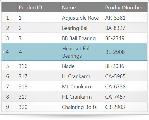
次のコード スニペットは、igGrid コントロールを初期化する方法を示します。
この API を使用した作業方法の詳細についてはここをクリックしてください。をクリックしてください。igGrid コントロールの必要なスクリプトおよびテーマを参照する方法については、 「Ignite UI で JavaScript リソースを使用する」および Ignite UI のスタイル設定とテーマを参照してください。コード サンプル
<!doctype html>
<html>
<head>
    <!-- Infragistics Combined CSS -->
    <link href="css/themes/infragistics/infragistics.theme.css" rel="stylesheet" type="text/css" />
    <link href="css/structure/infragistics.css" rel="stylesheet" type="text/css" />
    <!-- jQuery Core -->
    <script src="js/jquery.js" type="text/javascript"></script>
    <!-- jQuery UI -->
    <script src="js/jquery-ui.js" type="text/javascript"></script>
    <!-- Infragistics Combined Scripts -->
    <script src="js/infragistics.core.js" type="text/javascript"></script>
    <script src="js/infragistics.lob.js" type="text/javascript"></script>
    <script type="text/javascript">
    $(function () {
        var ds = [
            { "ProductID": 1, "Name": "Adjustable Race", "ProductNumber": "AR-5381" },
            { "ProductID": 2, "Name": "Bearing Ball", "ProductNumber": "BA-8327" },
            { "ProductID": 3, "Name": "BB Ball Bearing", "ProductNumber": "BE-2349" },
            { "ProductID": 4, "Name": "Headset Ball Bearings", "ProductNumber": "BE-2908" },
            { "ProductID": 316, "Name": "Blade", "ProductNumber": "BL-2036" },
            { "ProductID": 317, "Name": "LL Crankarm", "ProductNumber": "CA-5965" },
            { "ProductID": 318, "Name": "ML Crankarm", "ProductNumber": "CA-6738" },
            { "ProductID": 319, "Name": "HL Crankarm", "ProductNumber": "CA-7457" },
            { "ProductID": 320, "Name": "Chainring Bolts", "ProductNumber": "CB-2903" }
        ];

        $("#gridRowSelectors").igGrid({
            width: "600px",
            autoGenerateColumns: true,
            dataSource: ds,
            features: [
                {
                    name: "RowSelectors"
                },
                {
                    name: "Selection"
                }
            ]
        });
    });
    </script>
</head>
<body>
    <table id="gridRowSelectors"></table>
</body>
</html>
関連サンプル
関連トピック
依存関係
-
deselectAllForPagingTemplate
- タイプ:
- string
- デフォルト:
- null
ページングの「すべて選択解除」オーバーレイのカスタム テンプレート。
すべてのレコードを選択するために data-rs-deselect-all 属性を持つ要素が使用されます。
オーバーレイを閉じるために data-rs-close-all 属性を持つ要素が使用されます。
デフォルト テンプレートは「<div class='ui-widget-header ui-priority-secondary' tabindex='0'><div>${unchecked} レコードを選択解除しました。<a href='#' tabindex='0' data-rs-deselect-all>すべての ${totalRecordsCount} レコードを選択解除</a><div style='float:right;'><span data-rs-close-all class='ui-icon-close ui-icon ui-button' tabindex='0'></div></span></div></div>」。
デフォルトのテンプレートで使用されていない ${allCheckedRecords} パラメーターもありますが、すべてのページのチェックしたレコードを表します。コード サンプル
//Initialize $(".selector").igGrid({ features : [ { name : "RowSelectors", enableCheckBoxes: true, enableSelectAllForPaging: true, deselectAllForPagingTemplate: "<div class='ui-widget-header ui-priority-secondary' tabindex='0'><div><a href='#' tabindex='0' data-rs-deselect-all>Deselect all ${totalRecordsCount} records</a><div style='float:right;'><span data-rs-close-all class='ui-icon-close ui-icon ui-button' tabindex='0'></div></span></div></div>" }, { name: "Selection", multipleSelection: true }, { name: 'Paging', type: "local", pageSize: 10 } ] }); //Get var template = $(".selector").igGridRowSelectors("option", "deselectAllForPagingTemplate"); -
enableCheckBoxes
- タイプ:
- bool
- デフォルト:
- false
行セレクター列にチェックボックスを含めるかどうかを決定します。
コード サンプル
//Initialize $(".selector").igGrid({ features : [ { name : "RowSelectors", enableCheckBoxes: true }, { name: "Selection" } ] }); //Get var checkboxes = $(".selector").igGridRowSelectors("option", "enableCheckBoxes"); -
enableRowNumbering
- タイプ:
- bool
- デフォルト:
- true
行セレクター列に行番号を含めるかどうかを決定します。
コード サンプル
//Initialize $(".selector").igGrid({ features : [ { name : "RowSelectors", enableRowNumbering: true }, { name: "Selection" } ] }); //Get var rowNumbering = $(".selector").igGridRowSelectors("option", "enableRowNumbering"); -
enableSelectAllForPaging
- タイプ:
- bool
- デフォルト:
- true
ヘッダー チェックボックスをクリックした後、すべてのページからすべてのレコードの選択を許可するオーバーレイの表示を有効/無効にします。
コード サンプル
//Initialize $(".selector").igGrid({ features : [ { name : "RowSelectors", enableCheckBoxes: true, enableSelectAllForPaging: true }, { name: "Selection", multipleSelection: true }, { name: 'Paging', type: "local", pageSize: 10 } ] }); //Get var enableSelectAll = $(".selector").igGridRowSelectors("option", "enableSelectAllForPaging"); -
inherit
- タイプ:
- bool
- デフォルト:
- false
子レイアウトで機能継承を有効または無効にします。注: igHierarchicalGrid のみに適用します。
-
locale
- タイプ:
- object
- デフォルト:
- {}
-
deselectAllText
- タイプ:
- string
- デフォルト:
- ""
すべて選択/すべて選択解除オーバーレイのすべて選択解除テキスト。
コード サンプル
//Initialize $(".selector").igGrid({ features: [{ name: "RowSelectors", locale: { deselectAllText: "Deselect all ${totalRecordsCount} records" } }] }); // Get var text = $(".selector").igGridRowSelectors("option", "locale").deselectAllText; // Set $(".selector").igGridRowSelectors("option", "locale", { deselectAllText: "Deselect all ${totalRecordsCount} records"}); -
deselectedRecordsText
- タイプ:
- string
- デフォルト:
- ""
すべて選択/すべて選択解除オーバーレイの選択解除されたレコード。
コード サンプル
//Initialize $(".selector").igGrid({ features: [{ name: "RowSelectors", locale: { deselectedRecordsText: "You have deselected ${unchecked} records." } }] }); // Get var text = $(".selector").igGridRowSelectors("option", "locale").deselectedRecordsText; // Set $(".selector").igGridRowSelectors("option", "locale", { deselectedRecordsText: "You have deselected ${unchecked} records." }); -
selectAllText
- タイプ:
- string
- デフォルト:
- ""
すべて選択/すべて選択解除オーバーレイのすべて選択テキスト。
コード サンプル
//Initialize $(".selector").igGrid({ features: [{ name: "RowSelectors", locale: { selectAllText: "Select all ${totalRecordsCount} records" } }] }); // Get var text = $(".selector").igGridRowSelectors("option", "locale").selectAllText; // Set $(".selector").igGridRowSelectors("option", "locale", { selectAllText: "Select all ${totalRecordsCount} records."}); -
selectedRecordsText
- タイプ:
- string
- デフォルト:
- ""
すべて選択/すべて選択解除オーバーレイの選択されたレコード。
コード サンプル
				//Initialize
				$(".selector").igGrid({
					features: [{
						name: "RowSelectors",
						locale: {
							selectedRecordsText: "You have selected ${checked} records."
						}
					}]
				});

				//	Get
				var text = $(".selector").igGridRowSelectors("option", "locale").selectedRecordsText;

				//	Set
				$(".selector").igGridRowSelectors("option", "locale", { selectedRecordsText: "You have selected ${checked} records." });
-
requireSelection
- タイプ:
- bool
- デフォルト:
- true
選択機能が行セレクターに必要かどうかを決定します。「false」に設定する場合、
ウィジェットは Selection の可用性をチェックしません。「true」に設定する場合、Selection が使用できないと、
例外をスローします。コード サンプル
//Initialize $(".selector").igGrid({ features : [ { name : "RowSelectors", requireSelection: true }, { name: "Selection" } ] }); //Get var requireSelection = $(".selector").igGridRowSelectors("option", "requireSelection"); -
rowNumberingSeed
- タイプ:
- number
- デフォルト:
- 0
デフォルト ナンバリングに追加するシード。
コード サンプル
//Initialize $(".selector").igGrid({ features : [ { name : "RowSelectors", rowNumberingSeed: 5 }, { name: "Selection" } ] }); //Get var rowNumberingSeed = $(".selector").igGridRowSelectors("option", "rowNumberingSeed"); -
rowSelectorColumnWidth
- タイプ:
- enumeration
- デフォルト:
- null
行セレクターの列幅をピクセルまたはパーセントで定義します。
メンバー
- string
- タイプ:string
- 行セレクターの列幅はピクセル (px) およびパーセント (%) で設定できます。
- number
- タイプ:number
- 行セレクターの幅は数値として設定できます。
- null
- タイプ:object
- 機能が、有効なコンテンツに応じて最適な幅を決定します。
コード サンプル
//Initialize $(".selector").igGrid({ features : [ { name : "RowSelectors", rowSelectorColumnWidth: 40 }, { name: "Selection" } ] }); //Get var width = $(".selector").igGridRowSelectors("option", "rowSelectorColumnWidth"); -
selectAllForPagingTemplate
- タイプ:
- string
- デフォルト:
- null
ページングの「すべて選択」オーバーレイのカスタム テンプレート。
すべてのレコードを選択するために data-rs-select-all 属性を持つ要素は使用されます。
オーバーレイを閉じるために data-rs-close-all 属性を持つ要素が使用されます。
デフォルト テンプレートは「<div class='ui-widget-header ui-priority-secondary' tabindex='0'><div>${checked} レコードを選択しました。<a href='#' tabindex='0' data-rs-select-all>すべての ${totalRecordsCount} レコードを選択</a><div style='float:right;'><span data-rs-close-all class='ui-icon-close ui-icon ui-button' tabindex='0'></div></span></div></div>」。
デフォルトのテンプレートで使用されていない ${allCheckedRecords} パラメーターもありますが、すべてのページのチェックしたレコードを表します。コード サンプル
//Initialize $(".selector").igGrid({ features : [ { name : "RowSelectors", enableCheckBoxes: true, enableSelectAllForPaging: true, selectAllForPagingTemplate: "<a data-rs-select-all>Click here if you want to select all ${totalRecordsCount} records</a><span data-rs-close-all></span>" }, { name: "Selection", multipleSelection: true }, { name: 'Paging', type: "local", pageSize: 10 } ] }); //Get var template = $(".selector").igGridRowSelectors("option", "selectAllForPagingTemplate"); //Set var templateStr = "<a data-rs-select-all>Click here if you want to select all ${totalRecordsCount} records</a><span data-rs-close-all></span>"; $(".selector").igGridRowSelectors("option", "selectAllForPagingTemplate", templateStr); -
showCheckBoxesOnFocus
- タイプ:
- bool
- デフォルト:
- false
行セレクターにフォーカスが置かれている/選択されている場合に限ってチェックボックスを表示するかどうかを決定します。
コード サンプル
				//Initialize
				$(".selector").igGrid({
					features : [
						{
							name : "RowSelectors",
							showCheckBoxesOnFocus: true
						},
						{
							name: "Selection"
						}
					]
				});

				//Get
				var showCheckboxes = $(".selector").igGridRowSelectors("option", "showCheckBoxesOnFocus");
Ignite UI コントロール イベントの詳細については、
Ignite UI でイベントを使用するを参照してください。
-
checkBoxStateChanged
- キャンセル可能:
- false
行セレクター チェックボックスの状態が変更した後に発生するイベント。
-
evtタイプ: Event
jQuery イベント オブジェクト。
-
uiタイプ: Object
-
rowタイプ: jQuery
クリックされた行セレクターが置かれている行への参照を取得します。
-
rowIndexタイプ: Number
クリックされた行セレクターが置かれている行インデックスを取得します。
-
rowKeyタイプ: String
クリックされた行セレクターが置かれている行キーを取得します。
-
rowSelectorタイプ: jQuery
行セレクターのセルへの参照を取得します。
-
ownerタイプ: Object
igRowSelectors への参照を取得します。
-
gridタイプ: Object
igGridRowSelectors が初期化される igGrid への参照を取得します。
-
stateタイプ: String
チェックボックスの状態 (「on」、「off」) を取得します。
-
isHeaderタイプ: Bool
ヘッダーのチェック ボックスがクリックされているかどうかを確認します。この場合、行に関連する引数は渡されません。
-
コード サンプル
//Bind after initialization $(document).on("iggridrowselectorscheckboxstatechanged", ".selector", function (evt, ui) { //return the triggered event evt; // reference to the row the clicked row selector resides in ui.row; // get the index of the row the clicked row selector resides in ui.rowIndex; // get the key of the row the clicked row selector resides in ui.rowKey; // get reference to the row selector cell ui.rowSelector; // get reference to the grid the RowSelectors are initialized for ui.grid; // get the state of the checkbox ("on","off") ui.state; // check if the header row checkbox is clicked ui.isHeader; }); //Initialize $(".selector").igGrid({ features : [ { name : "RowSelectors", checkBoxStateChanged: function(evt, ui){ ... } } ] }); -
checkBoxStateChanging
- キャンセル可能:
- true
行セレクターのチェックボックスが変更しているときに発生するイベント。
-
evtタイプ: Event
jQuery イベント オブジェクト。
-
uiタイプ: Object
-
rowタイプ: jQuery
クリックされた行セレクターが置かれている行への参照を取得します。
-
rowIndexタイプ: Number
クリックされた行セレクターが置かれている行インデックスを取得します。
-
rowKeyタイプ: Object
クリックされた行セレクターが置かれている行キーを取得します。
-
rowSelectorタイプ: jQuery
行セレクターのセルへの参照を取得します。
-
ownerタイプ: Object
igRowSelectors への参照を取得します。
-
gridタイプ: Object
igGridRowSelectors が初期化される igGrid への参照を取得します。
-
currentStateタイプ: String
チェックボックスの現在の状態 (「on」、「off」) を取得します。
-
newStateタイプ: String
チェックボックスの新しい状態 (「on」、「off」) を取得します。
-
isHeaderタイプ: Bool
ヘッダーのチェック ボックスがクリックされているかどうかを確認します。この場合、行に関連する引数は渡されません。
-
コード サンプル
//Bind after initialization $(document).on("iggridrowselectorscheckboxstatechanging", ".selector", function (evt, ui) { //return the triggered event evt; // reference to the row the clicked row selector resides in ui.row; // get the index of the row the clicked row selector resides in ui.rowIndex; // get the key of the row the clicked row selector resides in ui.rowKey; // get reference to the row selector cell ui.rowSelector; // get reference to the grid the RowSelectors are initialized for ui.grid; // get the current state of the checkbox ("on","off") ui.currentState; // get the new state of the checkbox ("on","off") ui.newState; // check if the header row checkbox is clicked ui.isHeader; }); //Initialize $(".selector").igGrid({ features : [ { name : "RowSelectors", checkBoxStateChanging: function(evt, ui){ ... } } ] }); -
rowSelectorClicked
- キャンセル可能:
- false
行セレクターがクリックされた後に発生するイベント。
-
evtタイプ: Event
jQuery イベント オブジェクト。
-
uiタイプ: Object
-
rowタイプ: jQuery
クリックされた行セレクターが置かれている行への参照を取得します。
-
fixedRowタイプ: jQuery
クリックした行セレクターの固定行 (固定行がある場合) への参照を取得します。
-
rowIndexタイプ: Number
クリックされた行セレクターが置かれている行インデックスを取得します。
-
rowKeyタイプ: String
クリックされた行セレクターが置かれている行キーを取得します。
-
rowSelectorタイプ: jQuery
行セレクターのセルへの参照を取得します。
-
ownerタイプ: Object
igRowSelectors への参照を取得します。
-
gridタイプ: Object
igGridRowSelectors が初期化される igGrid への参照を取得します。
-
コード サンプル
				//Bind after initialization
				$(document).on("iggridrowselectorsrowselectorclicked", ".selector", function (evt, ui) {
					//return the triggered event
					evt;

					// reference to the row the clicked row selector resides in
					ui.row;

					// get the index of the row the clicked row selector resides in
					ui.rowIndex;

					// get the key of the row the clicked row selector resides in
					ui.rowKey;

					// get reference to the row selector cell
					ui.rowSelector;

					// get reference to the grid the RowSelectors are initialized for
					ui.grid;
				});

				//Initialize
				$(".selector").igGrid({
					features : [
						{
							name : "RowSelectors",
							rowSelectorClicked: function(evt, ui){ ... }
						}
					]
				});
-
changeLocale
- .igGridRowSelectors( "changeLocale" );
ウィジェット要素のすべてのロケールを options.language に指定される言語に変更します。
注: このメソッドは珍しいシナリオのみで使用されます。language または locale オプションのセッターを参照してください。コード サンプル
$(".selector").igGridRowSelectors("changeLocale"); -
destroy
- .igGridRowSelectors( "destroy" );
コード サンプル
$(".selector").igGridRowSelectors("destroy"); -
rsRenderColgroup
- .igGridRowSelectors( "rsRenderColgroup" );
-
ui-state-default ui-corner-all ui-igcheckbox-normal
- チェックボックス コンテナーに適用されるクラス。
-
ui-icon ui-icon-check ui-igcheckbox-normal-off
- チェックボックスのチェックされていない状態を定義するクラス。
-
ui-icon ui-icon-check ui-igcheckbox-normal-on
- チェックボックスのチェックされた状態を定義するクラス。
-
ui-iggrid-rowselector-footer
- 行セレクターのフッター セルに適用されるクラス。
-
ui-iggrid-rowselector-header
- 行セレクターのヘッダー セルに適用されるクラス。
-
ui-state-hover
- ノードのホバー状態のスタイルを定義するクラス。
-
ui-iggrid-rowselector-class
- 行セレクターのグリッド セルに適用されるクラス。
-
ui-iggrid-activecell ui-state-focus
- アクティブ化されている場合、行セレクターのグリッド セルに適用されるクラス。
-
ui-iggrid-selectedcell ui-state-active
- 選択されている場合、行セレクターのグリッド セルに適用されるクラス。