
ui.igGridResponsive
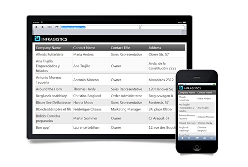
igGrid のレスポンシブ Web デザイン (RWD) モード機能は、さまざまなデバイスでのユーザー エクスペリエンスを向上するためにレスポンシブ Web デザインの概念を採用します。レスポンシブ Web デザイン モードは、複数の画面サイズとフォーム ファクターを単一のコード ベースとデザインでサポートします。 RWD モードでは、グリッドをデバイスの画面サイズに合わせるには以下の構成のどちらかを設定します:
- 列の自動非表示(RWD モードの列非表示機能で構成できます。)
- グリッドのテンプレートで実装できる構造変更及び書式変更
このため、RWD モードが有効になる際、 RWD モード機能でサポートされる定義済みのグリッド テンプレートは igGrid のテンプレートを置き換えます。テンプレートの使用は、行の非表示、異なるフォント及びフォントサイズの使用、複数の行/列の結合など、広範な機能を提供します。 RWD モードは、グリッドを異なる画面サイズに対応させる色々な調整をサポートします。一意の名前を持つ一連の定義済みの調整を「RWD モード プロファイル」と呼びます。各プロファイルは特定の画面サイズの範囲に対して有効になります。異なる画面サイズは異なるデバイス タイプに関連付けられているため、実際に、RWD モード プロファイルはデバイス タイプに関連付けられています。
igGrid コントロールはデバイスの画面の幅に基づいた 3つの定義済みの RWD モードを持っています。これらのプロファイルは CSS3 メディア クエリでアクティブになります:
- Phone - 画面の幅が 767 ピクセル以下の場合。使用可能な規定 CSS クラスは: ui-visible-phone と ui-hidden-phone です。プロフィールの名前は "phone" です。
- Tablet - 画面の幅が 768 ピクセル以上 979 ピクセル以下の場合。使用可能な規定 CSS クラスは: ui-visible-tablet と ui-hidden-tablet です。プロフィールの名前は "tablet" です。
- Desktop - 画面の幅が 980 ピクセル以上の場合。使用可能な規定 CSS クラスは: ui-visible-desktop と ui-hidden-desktop です。プロフィールの名前は "desktop" です。
この API のクラス、オプション、イベント、メソッド、およびテーマに関するさらに詳しい情報は上の関連するタブの下で入手可能です。
次のコード スニペットは、igGrid コントロールを複数列ヘッダーの機能と初期化する方法を示します。
この API を使用した作業方法の詳細についてはここをクリックしてください。igGrid コントロールの必要なスクリプトおよびテーマを参照する方法については、 「Ignite UI で JavaScript リソースを使用する」および Ignite UI のスタイル設定とテーマを参照してください。
コード サンプル
<!doctype html>
<html>
<head>
    <!-- Infragistics Combined CSS -->
    <link href="css/themes/infragistics/infragistics.theme.css" rel="stylesheet" type="text/css" />
    <link href="css/structure/infragistics.css" rel="stylesheet" type="text/css" />
    <!-- jQuery Core -->
    <script src="js/jquery.js" type="text/javascript"></script>
    <!-- jQuery UI -->
    <script src="js/jquery-ui.js" type="text/javascript"></script>
    <!-- Infragistics Combined Scripts -->
    <script src="js/infragistics.core.js" type="text/javascript"></script>
    <script src="js/infragistics.lob.js" type="text/javascript"></script>
    <script type="text/javascript">
        var products = [
            { "ProductID": 1, "Name": "Adjustable Race", "ProductNumber": "AR-5381" },
            { "ProductID": 2, "Name": "Bearing Ball", "ProductNumber": "BA-8327" },
            { "ProductID": 3, "Name": "BB Ball Bearing", "ProductNumber": "BE-2349" },
            { "ProductID": 4, "Name": "Headset Ball Bearings", "ProductNumber": "BE-2908" },
            { "ProductID": 316, "Name": "Blade", "ProductNumber": "BL-2036" },
            { "ProductID": 317, "Name": "LL Crankarm", "ProductNumber": "CA-5965" },
            { "ProductID": 318, "Name": "ML Crankarm", "ProductNumber": "CA-6738" },
            { "ProductID": 319, "Name": "HL Crankarm", "ProductNumber": "CA-7457" },
            { "ProductID": 320, "Name": "Chainring Bolts", "ProductNumber": "CB-2903" }
        ];

        $(function () {
            $("#gridResponsive").igGrid({
                columns: [
                    { headerText: "Product ID", key: "ProductID", dataType: "number" },
                    { headerText: "Product Name", key: "Name", dataType: "string" },
                    { headerText: "Product Number", key: "ProductNumber", dataType: "string" }
                ],
                features:[
                    {
                        name: "Responsive",
                        columnSettings: [
                            {
                                columnKey: "ProductID",
                                classes: "ui-hidden-phone"
                            }
                        ]
                    }
                ],
                width: "100%",
                dataSource: products
            });
        });
    </script>
</head>
<body>
    <table id="gridColumnMoving"></table>
</body>
</html>
関連サンプル
関連トピック
依存関係
-
allowedColumnWidthPerType
- タイプ:
- object
- デフォルト:
- {}
windowWidthToRenderVertically が null 値の場合、グリッドの垂直レンダリングに切り替えるまで
の列の最小幅を決定します。コード サンプル
//Initialize $(".selector").igGrid({ features : [ { name : "Responsive", allowedColumnWidthPerType : { string: 120, number: 50, bool: 50, date: 80, object: 150 } } ] }); //Get var allowedColumnWidthPerType = $(".selector").igGridResponsive("option", "allowedColumnWidthPerType");-
bool
- タイプ:
- number
- デフォルト:
- 50
ブール値列が垂直方向のレンダリングに切り替える前のピクセルでの最小幅。
コード サンプル
//Initialize $(".selector").igGrid({ features : [ { name : "Responsive", allowedColumnWidthPerType : { bool: 50 } } ] }); //Get var allowedBoolColumnWidth = $(".selector").igGridResponsive("option", "allowedColumnWidthPerType").bool; -
date
- タイプ:
- number
- デフォルト:
- 80
日付列が垂直方向のレンダリングに切り替える前のピクセルでの最小幅。
コード サンプル
//Initialize $(".selector").igGrid({ features : [ { name : "Responsive", allowedColumnWidthPerType : { date: 50 } } ] }); //Get var allowedDateColumnWidth = $(".selector").igGridResponsive("option", "allowedColumnWidthPerType").date; -
number
- タイプ:
- number
- デフォルト:
- 50
数値列が垂直方向のレンダリングに切り替える前のピクセルでの最小幅。
コード サンプル
//Initialize $(".selector").igGrid({ features : [ { name : "Responsive", allowedColumnWidthPerType : { number: 50 } } ] }); //Get var allowedNumberColumnWidth = $(".selector").igGridResponsive("option", "allowedColumnWidthPerType").number; -
object
- タイプ:
- number
- デフォルト:
- 150
オブジェクト列が垂直方向のレンダリングに切り替える前のピクセルでの最小幅。
コード サンプル
//Initialize $(".selector").igGrid({ features : [ { name : "Responsive", allowedColumnWidthPerType : { object: 50 } } ] }); //Get var allowedObjectColumnWidth = $(".selector").igGridResponsive("option", "allowedColumnWidthPerType").object; -
string
- タイプ:
- number
- デフォルト:
- 120
文字列の列が垂直方向のレンダリングに切り替える前のピクセルでの最小幅。
コード サンプル
					//Initialize
					$(".selector").igGrid({
						features : [
							{
								name : "Responsive",
								allowedColumnWidthPerType : {
									string: 50
								}
							}
						]
					});

					//Get
					var allowedStringColumnWidth = $(".selector").igGridResponsive("option", "allowedColumnWidthPerType").string;
-
columnSettings
- タイプ:
- array
- デフォルト:
- []
- 要素タイプ:
- object
グリッドの実行環境に基づいて列が反応する方法を指定する列設定値のリスト。
コード サンプル
//Initialize $(".selector").igGrid({ features : [ { name : "Responsive", columnSettings : [ { columnIndex: 0, classes: "ui-hidden-phone" } ] } ] }); //Get var colSettings = $(".selector").igGridResponsive("option", "columnSettings");-
classes
- タイプ:
- string
- デフォルト:
- ""
要素の表示/非表示を決定する定義済みクラスのリスト。
コード サンプル
//Initialize $(".selector").igGrid({ features : [ { name : "Responsive", columnSettings : [ { columnIndex: 0, classes: "ui-hidden-tablet" } ] } ] }); -
columnIndex
- タイプ:
- number
- デフォルト:
- null
列インデックス。列キーの代わりに使用できます。列設定の生成には列を常に識別子として使用することを推奨します。
コード サンプル
//Initialize $(".selector").igGrid({ features : [ { name : "Responsive", columnSettings : [ { columnIndex: 0, classes: "ui-hidden-tablet" } ] } ] }); -
columnKey
- タイプ:
- string
- デフォルト:
- null
列キー。これは、columnIndex が設定されていない場合に各列設定で必要なプロパティです。
コード サンプル
//Initialize $(".selector").igGrid({ features : [ { name : "Responsive", columnSettings : [ { columnKey: "ProductId", classes: "ui-hidden-tablet" } ] } ] }); -
configuration
- タイプ:
- object
- デフォルト:
- null
レスポンシブな機能で使用する構成オブジェクト。ウィジェットの responsiveModes オブジェクトで定義されたキーを使用します。このプロパティが設定されている場合、クラスのプロパティを使用しません。
コード サンプル
						//Initialize
						$(".selector").igGrid({
							features : [
								{
									name : "Responsive",
									columnSettings : [
										{
											columnKey: "ProductDescription",
											configuration: {
												phone: {
													hidden: true
												},
												tablet: {
													template: "<span style='color:green;'>${ProductDescription}</span>"
												}
											}
										}
									]
								}
							]
						});
-
enableVerticalRendering
- タイプ:
- bool
- デフォルト:
- true
グリッドのレスポンシブ垂直レンダリングを有効または無効にします。
コード サンプル
//Initialize $(".selector").igGrid({ features : [ { name : "Responsive", enableVerticalRendering : false } ] }); //Get var enableVerticalRendering = $(".selector").igGridResponsive("option", "enableVerticalRendering"); -
forceResponsiveGridWidth
- タイプ:
- bool
- デフォルト:
- true
このオプションが true に設定されている場合、ウィジェットはグリッドの幅が常に 100% になるようにします。
コード サンプル
//Initialize $(".selector").igGrid({ features : [ { name : "Responsive", forceResponsiveGridWidth : true } ] }); //Get var text = $(".selector").igGridResponsive("option", "forceResponsiveGridWidth"); -
inherit
- タイプ:
- bool
- デフォルト:
- false
子レイアウトで機能継承を有効または無効にします。注: igHierarchicalGrid のみに適用します。
-
propertiesColumnWidth
- タイプ:
- enumeration
- デフォルト:
- 50%
垂直レンダリングが有効な場合のプロパティ列の幅。
メンバー
- string
- タイプ:string
- (%) 文字列としての幅。
- number
- タイプ:number
- パーセンテージで数としての幅。
コード サンプル
//Initialize $(".selector").igGrid({ features : [ { name : "Responsive", propertiesColumnWidth : "30%" } ] }); //Get var propertiesColumnWidth = $(".selector").igGridResponsive("option", "propertiesColumnWidth"); -
reactOnContainerWidthChanges
- タイプ:
- bool
- デフォルト:
- true
このオプションが true に設定されている場合、igGrid コントロールに igResponsiveContainer ウィジェットが追加され、コンテナーの幅が変更されると機能が通知を受けることになります。
コード サンプル
//Initialize $(".selector").igGrid({ features : [ { name : "Responsive", reactOnContainerWidthChanges : true } ] }); //Get var text = $(".selector").igGridResponsive("option", "reactOnContainerWidthChanges"); //Set $(".selector").igGridResponsive("option", "reactOnContainerWidthChanges", true); -
responsiveModes
- タイプ:
- object
- デフォルト:
- null
認識された環境のタイプと構成。
コード サンプル
//Initialize $(".selector").igGrid({ features : [ { name : "Responsive", responsiveModes : { phone: "infragistics", tablet: "infragistics", desktop: "infragistics" } } ] }); //Get var text = $(".selector").igGridResponsive("option", "responsiveModes"); //Set var responsiveModes = { phone: "infragistics", tablet: "infragistics", desktop: "infragistics" }; $(".selector").igGridResponsive("option", "responsiveModes", responsiveModes); -
responsiveSensitivity
- タイプ:
- number
- デフォルト:
- 20
グリッドが応答できるようにウィンドウのサイズを変更するために必要なピクセル数。
コード サンプル
//Initialize $(".selector").igGrid({ features : [ { name : "Responsive", responsiveSensitivity : 20 } ] }); //Get var text = $(".selector").igGridResponsive("option", "responsiveSensitivity"); -
singleColumnTemplate
- タイプ:
- object
- デフォルト:
- null
モードによって list-view スタイルのレイアウトでレコードを描画するためのテンプレートを指定します。
コード サンプル
//Initialize $(".selector").igGrid({ features : [ { name : "Responsive", singleColumnTemplate: { phone: "<div class='right' style='float: left; font-size: 1.1em;'>" + "<span>Name: </span><span>${Name}</span><br/>" + "<span>Phone: </span><span><a href='${PhoneUrl}'>${Phone}</a></span><br/>" + "<span>HireDate: </span><span>${HireDate}</span><br/>" + "</div>" , tablet: "<div class='right' style='float: left; font-size: 1.1em;'>" + "<span>Name: </span><span>${Name}</span><br/>" + "<span>Phone: </span><span><a href='${PhoneUrl}'>${Phone}</a></span><br/>" + "<span>HireDate: </span><span>${HireDate}</span><br/>" + "</div>" } } ] }); //Get $(".selector").igGridResponsive("option", "singleColumnTemplate") -
valuesColumnWidth
- タイプ:
- enumeration
- デフォルト:
- 50%
垂直レンダリングが有効な場合の値列の幅。
メンバー
- string
- タイプ:string
- (%) 文字列としての幅。
- number
- タイプ:number
- パーセンテージで数としての幅。
コード サンプル
//Initialize $(".selector").igGrid({ features : [ { name : "Responsive", valuesColumnWidth: "60%" } ] }); //Get var valuesColumnWidth = $(".selector").igGridResponsive("option", "valuesColumnWidth"); -
windowWidthToRenderVertically
- タイプ:
- enumeration
- デフォルト:
- null
グリッドが垂直方向にコンテンツを描画することを実行するウィンドウの幅。
メンバー
- string
- タイプ:string
- (px) 文字列としての幅。
- number
- タイプ:number
- 数としての幅。
- null
- タイプ:object
- グリッドは、このモードを自動的に描画するかどうかを決定します。
コード サンプル
				//Initialize
				$(".selector").igGrid({
					features : [
						{
							name : "Responsive",
							windowWidthToRenderVertically: "60%"
						}
					]
				});
				//Get
				var windowWidthToRenderVertically = $(".selector").igGridResponsive("option", "windowWidthToRenderVertically");
Ignite UI コントロール イベントの詳細については、
Ignite UI でイベントを使用するを参照してください。
-
responsiveColumnHidden
- キャンセル可能:
- false
列のコレクションに対して実行される非表示操作の後に発生するイベント。
コード サンプル
//Bind after initialization $(document).on("iggridresponsiveresponsivecolumnhidden", ".selector", function (evt, ui) { //return reference to igGridResponsive object ui.owner; //return reference igGrid object ui.owner.grid; //return column key ui.columnKey; //return column index ui.columnIndex; }); //Initialize $(".selector").igGrid({ features: [{ name: "Responsive", responsiveColumnHidden: function (evt, ui) {...} }] }); -
responsiveColumnHiding
- キャンセル可能:
- true
列のコレクションに対して実行される非表示操作の前に発生するイベント。
コード サンプル
//Bind after initialization $(document).on("iggridresponsiveresponsivecolumnhiding", ".selector", function (evt, ui) { //return reference to igGridResponsive object ui.owner; //return reference igGrid object ui.owner.grid; //return column key ui.columnKey; //return column index ui.columnIndex; }); //Initialize $(".selector").igGrid({ features: [{ name: "Responsive", responsiveColumnHiding: function (evt, ui) {...} }] }); -
responsiveColumnShowing
- キャンセル可能:
- true
列のコレクションに対して実行される表示操作の前に発生するイベント。
コード サンプル
//Bind after initialization $(document).on("iggridresponsiveresponsivecolumnshowing", ".selector", function (evt, ui) { //return reference to igGridResponsive object ui.owner; //return reference igGrid object ui.owner.grid; //return column key ui.columnKey; //return column index ui.columnIndex; }); //Initialize $(".selector").igGrid({ features: [{ name: "Responsive", responsiveColumnShowing: function (evt, ui) {...} }] }); -
responsiveColumnShown
- キャンセル可能:
- false
列のコレクションに対して実行される表示操作の後に発生するイベント。
コード サンプル
//Bind after initialization $(document).on("iggridresponsiveresponsivecolumnshown", ".selector", function (evt, ui) { //return reference to igGridResponsive object ui.owner; //return reference igGrid object ui.owner.grid; //return column key ui.columnKey; //return column index ui.columnIndex; }); //Initialize $(".selector").igGrid({ features: [{ name: "Responsive", responsiveColumnShown: function (evt, ui) {...} }] }); -
responsiveModeChanged
- キャンセル可能:
- false
ウィジェットが環境の変化を検出するときに発生するイベント。
コード サンプル
				//Bind after initialization
				$(document).on("iggridresponsiveresponsivemodechanged", ".selector", function (evt, ui) {
					//return reference to igGridResponsive object
					ui.owner;
					//return reference igGrid object
					ui.owner.grid;
					//return the previous responsive mode
					ui.previousMode;
					//return the current responsive mode
					ui.mode;
				});

				//Initialize
				$(".selector").igGrid({
					features: [{
						name: "Responsive",
						responsiveModeChanged: function (evt, ui) {...}
					}]
				});
-
destroy
- .igGridResponsive( "destroy" );
レスポンシブ ウィジェットを破棄します。
コード サンプル
$(".selector").igGridResponsive("destroy"); -
getCurrentResponsiveMode
- .igGridResponsive( "getCurrentResponsiveMode" );
現在アクティブなレスポンシブ モードを返します。
コード サンプル
var mode = $(".selector").igGridResponsive("getCurrentResponsiveMode");
-
ui-iggrid-responsive-vertical
- 垂直描画が有効な場合、グリッド テーブルに適用されるクラス。