ui.igGridGroupBy
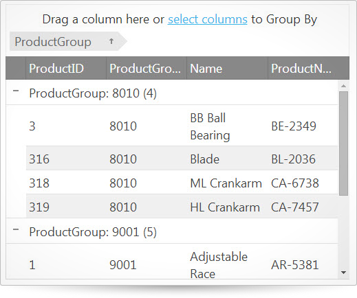
igGrid コントロールおよび igHierarchicalGrid コントロールはどちらも、グリッド内の列グループ機能を備えています。グループ機能を使用するとユーザーは、グリッド内のデータの行を共通の列値でグループ化できます。この API のクラス、オプション、イベント、メソッド、およびテーマに関するさらに詳しい情報は上の関連するタブの下で入手可能です。
次のコード スニペットは、igGrid コントロールを初期化する方法を示します。
この API を使用した作業方法の詳細についてはここをクリックしてください。igGrid コントロールの必要なスクリプトおよびテーマを参照する方法については、 「Ignite UI で JavaScript リソースを使用する」および Ignite UI のスタイル設定とテーマを参照してください。コード サンプル
<!doctype html>
<html>
<head>
    <title>Ignite UI igGridGroupBy</title>
    <!-- Infragistics Combined CSS -->
    <link href="css/themes/infragistics/infragistics.theme.css" rel="stylesheet" type="text/css" />
    <link href="css/structure/infragistics.css" rel="stylesheet" type="text/css" />
    <!-- jQuery Core -->
    <script src="js/jquery.js" type="text/javascript"></script>
    <!-- jQuery UI -->
    <script src="js/jquery-ui.js" type="text/javascript"></script>
	  <script src="js/infragistics.core.js" type="text/javascript"></script>
	  <script src="js/infragistics.lob.js" type="text/javascript"></script>
    <script type="text/javascript">
        $(function () {
            var products = [
                      { "ProductID": 1, "ProductGroup": "9001", "Name": "Adjustable Race", "ProductNumber": "AR-5381" },
                      { "ProductID": 2, "ProductGroup": "9001", "Name": "Bearing Ball", "ProductNumber": "BA-8327" },
                      { "ProductID": 3, "ProductGroup": "8010", "Name": "BB Ball Bearing", "ProductNumber": "BE-2349" },
                      { "ProductID": 4, "ProductGroup": "9001", "Name": "Headset Ball Bearings", "ProductNumber": "BE-2908" },
                      { "ProductID": 316, "ProductGroup": "8010", "Name": "Blade", "ProductNumber": "BL-2036" },
                      { "ProductID": 317, "ProductGroup": "9001", "Name": "LL Crankarm", "ProductNumber": "CA-5965" },
                      { "ProductID": 318, "ProductGroup": "8010", "Name": "ML Crankarm", "ProductNumber": "CA-6738" },
                      { "ProductID": 319, "ProductGroup": "8010", "Name": "HL Crankarm", "ProductNumber": "CA-7457" },
                      { "ProductID": 320, "ProductGroup": "9001", "Name": "Chainring Bolts", "ProductNumber": "CB-2903" }
                  ];

            $("#grid").igGrid({
                autoGenerateColumns: true,
                dataSource: products,
                height: "400px",
                features: [{
                    name: "GroupBy",
                    type: "local",
                    columnSettings: [{
                        columnKey: "ProductGroup",
                        isGroupBy: true
                    }, {
                        columnKey: "ProductID",
                        allowGrouping: false
                    }]
                }]
            });
            $("#grid").igGrid("dataBind");
        });
      </script>
</head>
<body>
    <table id="grid">
    </table>
</body>
</html>
関連サンプル
関連トピック
依存関係
-
collapseTooltip
削除- タイプ:
- string
- デフォルト:
- ""
このオプションは 2017.2 バージョン以降サポートされません。
グループ化された行に、折り畳みインジケーター ツールチップを指定します。locale.collapseTooltip オプションを使用します。コード サンプル
//Initialize $(".selector").igGrid({ features: [ { name: "GroupBy", collapseTooltip: "Collapse group" } ] }); //Get var opValue = $(".selector").igGridGroupBy("option", "collapseTooltip"); //Set $(".selector").igGridGroupBy("option", "collapseTooltip", "Collapse group"); -
columnSettings
- タイプ:
- object
- デフォルト:
- []
グリッドが列でグループ化されるかどうか、グループ化を列で許可するかなど、各列の設定を取得または設定します。
コード サンプル
//Initialize $(".selector").igGrid({ features: [ { name: "GroupBy", columnSettings: [ { columnKey: "Name", isGroupBy: true }, { columnKey: "BoxArt", allowGrouping: false } ] } ] }); //Get var arrayOfColumnSettings = $(".selector").igGridGroupBy("option", "columnSettings");-
allowGrouping
- タイプ:
- bool
- デフォルト:
- true
グループ化に参加する列を有効/無効にします。デフォルトでは、すべての列をグループ化できます。
コード サンプル
//Initialize $(".selector").igGrid({ features: [ { name: "GroupBy", columnSettings: [ { columnKey: "Name", allowGrouping: false } ] } ] }); //Get var groupBySettings = $(".selector").igGridGroupBy("option", "columnSettings"); var allowGroupingFirstColumn = groupBySettings[0].allowGrouping; -
compareFunc
- タイプ:
- enumeration
- デフォルト:
- null
カスタム比較に使用される関数 (文字列または関数) への参照。 関数は以下の引数を受け取ります:
val1: 比較する最初の値
val2: 比較する 2 番目の値
recordsData - 3 つのプロパティを持つオブジェクト: fieldName - 並べ替えたフィールドの名前; record1 - 比較する最初のレコード; record2 - 比較する 2 番目のレコード
関数は以下の数値を返します:
0 - 値が等しい場合
1 - val1 > val2 の場合
-1 - val1 < val2 の場合メンバー
- string
- タイプ:string
- グローバル ウィンドウ オブジェクトにある文字列としての関数名。
- function
- タイプ:function
- カスタム比較で使用される関数。
コード サンプル
//Initialize $(".selector").igGrid({ features: [ { name: "GroupBy", columnSettings: [ { columnKey: "ProductID", isGroupBy: true, compareFunc: function(val1, val2, recordsData) { return val1 > val2 ? 1 : val1 < val2 ? -1 : 0; } } ] } ] }); -
dir
- タイプ:
- enumeration
- デフォルト:
- asc
並べ替え方向 (昇順または降順) を指定します。
コード サンプル
//Initialize $(".selector").igGrid({ features: [ { name: "GroupBy", columnSettings: [ { columnKey: "Name", isGroupBy: true, dir: "desc" } ] } ] }); -
groupComparerFunction
非推奨- タイプ:
- function
- デフォルト:
- null
関数ごとにカスタム グループを指定します。これは列設定、比較する最初と 2 番目の値を受け入れ、ブールを返します。このオプションは非推奨です。compareFunc オプションを使用してください。
コード サンプル
//Initialize $(".selector").igGrid({ features: [ { name: "GroupBy", columnSettings: [{ columnKey: "Name", groupComparerFunction: function (columnSetting, val1, val2) { return (val1 === val2); } }] } ] }); -
groupLabelFormatter
- タイプ:
- enumeration
- デフォルト:
- null
セル値を書式設定するために使用される関数への参照。この関数は、グループ化された列値を許可し、行ラベルの新しい書式設定値を返します。
メンバー
- string
- タイプ:string
- グローバル ウィンドウ オブジェクトにある文字列としての関数名。
- function
- タイプ:function
- セル値を書式設定するために使用される関数。
コード サンプル
//Initialize $(".selector").igGrid({ features: [ { name: "GroupBy", columnSettings: [{ columnKey: "Name", groupLabelFormatter: function(val) {return (val === 1)? "Yes" : "No";} }] } ] }); //Get var groupBySettings = $(".selector").igGridGroupBy("option", "columnSettings"); var labelFormatterFirstColumn = groupBySettings[0].groupLabelFormatter; -
groupSummaries
- タイプ:
- enumeration
- デフォルト:
- []
グループのデータ アイランドごとにデフォルト集計を有効/無効にするか、グループに関係なく特定の列に適用する集計を指定します。
コード サンプル
//Initialize $(".selector").igGrid({ features: [ { name: "GroupBy", groupSummariesPosition: "top", groupSummaries: [ { summaryFunction: "Sum", label: "Sum = ", format: ".##" } ], columnSettings: [ { columnKey: "State", isGroupBy: true, groupSummaries: [ { summaryFunction: "Count", label: "Custom label", summaryTemplate: "{label} : {value}" } ] }, ] } ] });-
format
- タイプ:
- string
- デフォルト:
- null
集計値の書式設定を適用します。
Tこの format オプションはデフォルトで null 値で使用されません。列書式設定が指定される場合、それが使用されます。
このオプションと列書式設定が指定されていない場合、autoFormat オプションに基づいて地域設定を使用するかどうかを決定します。コード サンプル
//Initialize $(".selector").igGrid({ features: [{ name: "GroupBy", columnSettings: [{ columnKey: "ListPrice", groupSummaries: [{ summaryFunction: "Sum", format: "currency" }] }] }] }); -
label
- タイプ:
- string
- デフォルト:
- ""
集計結果のラベル。
コード サンプル
//Initialize $(".selector").igGrid({ features: [{ name: "GroupBy", columnSettings: [{ columnKey: "ListPrice", groupSummaries: [{ summaryFunction: "Avg", label: "Average = " }] }] }] }); -
summaryFunction
- タイプ:
- enumeration
- デフォルト:
- null
適用される集計名または関数を指定します。名前が $.ig.util.defaultSummaryMethods で見つからなく、同じ名前がある関数がウィンドウ内に定義される場合、それを使用します。
メンバー
- string
- タイプ:string
- 使用される集計の名前。すべての集計が $.ig.util.defaultSummaryMethods で定義されます。
- function
- タイプ:function
- 集計として使用されるカスタム関数。
コード サンプル
//Initialize $(".selector").igGrid({ features: [ { name: "GroupBy", columnSettings: [ { columnKey: "Color", isGroupBy: true }, { columnKey: "ListPrice", isGroupBy: true, groupSummaries: [ { summaryFunction: "avg", label: "Average = " }, { // Set a custom function to calculate the difference between // the minimum and the maximum values in the group // The fullData contains the data for all records inside the group summaryFunction: function(data, dataType, fullData) { var valuesList = data.array, min = valuesList[0], max = valuesList[0]; for(i = 1; i < valuesList.length; i++) { if(valuesList[i] < min) min = valuesList[i]; if(valuesList[i] > max) max = valuesList[i]; } return (max - min); }, label: "Delta = " } ] } ] } ] }); -
summaryTemplate
- タイプ:
- string
- デフォルト:
- "{label}{result}"
ラベルおよび集計の結果が表示される方法を指定するテンプレート。
コード サンプル
								//Initialize
								$(".selector").igGrid({
									features: [{
										name: "GroupBy",
										columnSettings: [{
											columnKey: "ListPrice",
											groupSummaries: [{
												summaryFunction: "Count",
												label: " in stock",
												summaryTemplate: "{result}{label}"
											}]
										}]
									}]
								});
-
isGroupBy
- タイプ:
- bool
- デフォルト:
- false
デフォルトで列をグループ化するかどうかを指定します。
コード サンプル
//Initialize $(".selector").igGrid({ features: [ { name: "GroupBy", columnSettings: [ { columnKey: "Name", isGroupBy: true } ] } ] }); -
summaries
- タイプ:
- object
- デフォルト:
- []
各グループの列値で計算するための集計関数のリスト。
コード サンプル
//Initialize $(".selector").igGrid({ features: [ { name: "GroupBy", columnSettings: [ // The code in this example specifies that data must be grouped by // the ListPrice column and the average, the minimum and the maximum // must be calculated and displayed for each group. { columnKey: "ListPrice", isGroupBy: true, summaries: [ { summaryFunction: "avg", text: " Average:" }, { summaryFunction: "min", text: " Minimum:" }, { summaryFunction: "max", text: " Maximum:" } ] } ] } ] });-
customSummary
- タイプ:
- enumeration
- デフォルト:
- null
各グループで呼び出されるカスタム集計関数を指定します。カスタム集計結果を返します。次の定義があるオブジェクトを引数として受けます: {dataRecords: [], array: [], key: "", allGroupData: []}
dataRecords - data view でグループ化されるデータ レコードの配列
array - 指定した列のセル値の配列
key - グループ化された列のキー
allGroupData - グループのデータ レコードの配列 (データ ビューだけでなく、データ ソース全体)。メンバー
- string
- タイプ:string
- グローバル ウィンドウ オブジェクトにある文字列としての関数名。
- function
- タイプ:function
- 集計値を計算するために使用される関数。
コード サンプル
//Initialize $(".selector").igGrid({ features: [ { name: "GroupBy", columnSettings: [ { columnKey: "Color", isGroupBy: true }, { columnKey: "ListPrice", isGroupBy: true, summaries: [ { // Set average price summary value summaryFunction: "avg", text: " Average:" }, { // Set a custom function to calculate the difference between // the minimum and the maximum values in the group summaryFunction: "custom", text: " Delta:", customSummary: function(data) { // Initialize minmum and maximum values with the first element var valuesList = data.array, min = valuesList[0], max = valuesList[0]; // Iterate all values in the list and find minimum and maximum for(i = 1; i < valuesList.length; i++) { if(valuesList[i] < min) min = valuesList[i]; if(valuesList[i] > max) max = valuesList[i]; } // Return difference between minimum and maximum return (max - min); } } ] } ] } ] }); -
summaryFunction
- タイプ:
- enumeration
- デフォルト:
- avg
集計関数
メンバー
- avg
- タイプ:string
- 平均集計関数。
- min
- タイプ:string
- 最小集計関数。
- max
- タイプ:string
- 最大集計関数。
- sum
- タイプ:string
- 合計集計関数。
- count
- タイプ:string
- カウント集計関数。
- custom
- タイプ:string
- カスタム集計関数。
コード サンプル
//Initialize $(".selector").igGrid({ features: [{ name: "GroupBy", columnSettings: [{ columnKey: "ListPrice", summaries: [{ summaryFunction: "avg" }] }] }] }); -
text
- タイプ:
- string
- デフォルト:
- null
値の前に表示される Summary テキストを指定します。
コード サンプル
								//Initialize
								$(".selector").igGrid({
									features: [{
										name: "GroupBy",
										columnSettings: [{
											columnKey: "ListPrice",
											summaries: [{
												summaryFunction: "Avg",
												text: "Average:"
											}]
										}]
									}]
								});
-
defaultSortingDirection
- タイプ:
- enumeration
- デフォルト:
- asc
デフォルトの並べ替え順序 - 昇順または降順。
メンバー
- asc
- タイプ:string
- グループは昇順で並べ替えています。
- desc
- タイプ:string
- グループは降順で並べ替えています。
コード サンプル
//Initialize $(".selector").igGrid({ features: [ { name: "GroupBy", defaultSortingDirection: "desc" } ] }); // Get var defaultDireciton = $(".selector").igGridGroupBy("option", "defaultSortingDirection"); // Set $(".selector").igGridGroupBy("option", "defaultSortingDirection", "desc"); -
dialogWidget
- タイプ:
- string
- デフォルト:
- "igGridModalDialog"
使用するダイアログ ウィジェットの名前。 $.ui.igGridModalDialog から継承します。詳細については、igGrid モーダル ダイアログの拡張 トピックを参照してください。
コード サンプル
//create dialog widget that inherits from $.ui.igGridModalDialog $.widget("ui.CustomDialog", $.ui.igGridModalDialog, {}); //Initialize $(".selector").igGrid({ features : [ { name : "GroupBy", dialogWidget: "CustomDialog" } ] }); //Get var dialogWidget = $(".selector").igGridGroupBy("option", "dialogWidget"); -
emptyGroupByAreaContentSelectColumnsCaption
削除- タイプ:
- string
- デフォルト:
- ""
このオプションは 2017.2 バージョン以降サポートされません。
グループ化ダイアログを開くボタンのキャプションを指定します。locale.emptyGroupByAreaContentSelectColumnsCaption オプションを使用します。コード サンプル
//Initialize $(".selector").igGrid({ features: [{ name: "GroupBy", emptyGroupByAreaContentSelectColumnsCaption: "Select Columns to Group By" }] }); // Get var text = $(".selector").igGridGroupBy("option", "emptyGroupByAreaContentSelectColumnsCaption"); // Set $(".selector").igGridGroupBy("option", "emptyGroupByAreaContentSelectColumnsCaption", "Select Columns to Group By"); -
expandTooltip
削除- タイプ:
- string
- デフォルト:
- ""
このオプションは 2017.2 バージョン以降サポートされません。
グループ化された行に対する拡張インジケーター ツールチップを指定します。locale.expandTooltip オプションを使用します。コード サンプル
//Initialize $(".selector").igGrid({ features: [{ name: "GroupBy", expandTooltip: "Custom expand tooltip" }] }); // Get var opValue = $(".selector").igGridGroupBy("option", "expandTooltip"); // Set $(".selector").igGridGroupBy("option", "expandTooltip", "Custom expand tooltip"); -
expansionIndicatorVisibility
- タイプ:
- bool
- デフォルト:
- true
グループ化された行に、エンド ユーザーが展開・折り畳むことができる展開画像が含まれるかどうかを指定します。このオプションは初期化のみに設定できます。
コード サンプル
//Initialize $(".selector").igGrid({ features: [{ name: "GroupBy", expansionIndicatorVisibility: true }] }); // Get var opValue = $(".selector").igGridGroupBy("option", "expansionIndicatorVisibility"); -
groupByAreaVisibility
- タイプ:
- enumeration
- デフォルト:
- top
groupBy 領域が置かれるグリッドの場所を設定します。
メンバー
- top
- タイプ:string
- GroupBy 領域はグリッド ヘッダーの上に描画されます。
- hidden
- タイプ:string
- GroupBy 領域は描画されません。
- bottom
- タイプ:string
- GroupBy 領域はグリッド フッターの下 (および、ある場合はページャーの上) に描画されます。
コード サンプル
//Initialize $(".selector").igGrid({ features: [{ name: "GroupBy", groupByAreaVisibility: "bottom" }] }); // Get var opValue = $(".selector").igGridGroupBy("option", "groupByAreaVisibility"); // Set $(".selector").igGridGroupBy("option", "groupByAreaVisibility", "hidden"); -
groupByDialogContainment
- タイプ:
- enumeration
- デフォルト:
- owner
グループ化ダイアログのコンテインメント動作を管理します。
owner - グループ化ダイアログはグリッド領域でのみドラッグ可能です。
window - グループ化ダイアログはウィンドウ領域全体でドラッグ可能です。メンバー
- owner
- タイプ:string
- グループ化ダイアログはグリッド領域でのみドラッグ可能です。
- window
- タイプ:string
- グループ化ダイアログはウィンドウ領域全体でドラッグ可能です。
コード サンプル
//Initialize $(".selector").igGrid({ features: [ { name : "GroupBy", groupByDialogContainment : "window" } ] }); //Get var groupByDialogContainment = $(".selector").igGridGroupBy("option", "groupByDialogContainment"); -
groupByLabelWidth
- タイプ:
- number
- デフォルト:
- null
デフォルトでは、ヘッダーの列幅を使用します。指定される場合、すべてのヘッダーのために使用されます。
コード サンプル
//Initialize $(".selector").igGrid({ features: [{ name: "GroupBy", groupByLabelWidth: 100 }] }); // Get var opValue = $(".selector").igGridGroupBy("option", "groupByLabelWidth"); // Set $(".selector").igGridGroupBy("option", "groupByLabelWidth", 100); -
groupByUrlKey
- タイプ:
- string
- デフォルト:
- null
GroupBy expression を指定する URL パラメーター名。groupByUrlKey, groupByUrlKeyAscValue および groupByUrlKeyDescValue を設定した場合、要求は次のようになります: ?<groupByUrlKey>(<columnKey>)=<groupByUrlKeyAscValue/groupByUrlKeyDescValue> (例: ?groupby(col1)=asc)。そうでない場合、並べ替えパラメーターのための OData 変換が使用されます。
コード サンプル
//Initialize $(".selector").igGrid({ features : [ { name : "GroupBy", groupByUrlKey: "myCustomGroupBy", groupByUrlKeyAscValue : "myAsc", groupByUrlKeyDescValue : "myDesc" } ] }); //Get var groupByUrlKey = $(".selector").igGridGroupBy("option", "groupByUrlKey"); //Set $(".selector").igGridGroupBy("option", "groupByUrlKey", "myGroupBy"); -
groupByUrlKeyAscValue
- タイプ:
- string
- デフォルト:
- null
昇順のグループ化を示す URL パラメーター値です。groupByUrlKey の場合、groupByUrlKey, groupByUrlKeyAscValue および groupByUrlKeyDescValue を設定すると要求は次のようになります: ?<groupByUrlKey>(<columnKey>)=<groupByUrlKeyAscValue/groupByUrlKeyDescValue> (例: ?groupby(col1)=asc)。
コード サンプル
//Initialize $(".selector").igGrid({ features : [ { name : "GroupBy", groupByUrlKey: "myCustomGroupBy", groupByUrlKeyAscValue : "myAsc", groupByUrlKeyDescValue : "myDesc" } ] }); //Get var groupByAsc = $(".selector").igGridGroupBy("option", "groupByUrlKeyAscValue"); //Set $(".selector").igGridGroupBy("option", "groupByUrlKeyAscValue", "myAsc"); -
groupByUrlKeyDescValue
- タイプ:
- string
- デフォルト:
- null
降順のグループ化を示す URL パラメーター値です。groupByUrlKey の場合、groupByUrlKeyAscValue および groupByUrlKeyDescValue を設定すると次のようになります: ?<groupByUrlKey>(<columnKey>)=<groupByUrlKeyAscValue/groupByUrlKeyDescValue> (Example: ?groupby(col1)=asc)。
コード サンプル
//Initialize $(".selector").igGrid({ features : [ { name : "GroupBy", groupByUrlKey: "myCustomGroupBy", groupByUrlKeyAscValue : "myAsc", groupByUrlKeyDescValue : "myDesc" } ] }); //Get var groupByDesc = $(".selector").igGridGroupBy("option", "groupByUrlKeyDescValue"); //Set $(".selector").igGridGroupBy("option", "groupByUrlKeyDescValue", "myDesc"); -
groupedColumns
- タイプ:
- array
- デフォルト:
- []
- 要素タイプ:
- object
現在のグループ化される列のリストを返します。このオプションは読み取り専用で、初期化またはランタイムに設定できません。
コード サンプル
// Get var groupedColumns = $(".selector").igGridGroupBy("option", "groupedColumns"); // Enumerates all grouped columns for(i = 0; i < groupedColumns.length; i++) { // Get column object var col = groupedColumns[i].col; // Get the sort order for this column var dir = groupedColumns[i].dir; // Get the key of the grouped column var key = groupedColumns[i].key; // Get the key of the columnLayour if this is hierarchical view var layout = groupedColumns[i].layout; }-
col
- タイプ:
- object
- デフォルト:
- null
グループ化された列の column オブジェクト。
コード サンプル
// Get var groupedColumns = $(".selector").igGridGroupBy("option", "groupedColumns"); // Enumerates all grouped columns for(i = 0; i < groupedColumns.length; i++) { // Get column object var col = groupedColumns[i].col; } -
dir
- タイプ:
- enumeration
- デフォルト:
- asc
並べ替え順 - 昇順または降順。
コード サンプル
// Get var groupedColumns = $(".selector").igGridGroupBy("option", "groupedColumns"); // Enumerates all grouped columns for(i = 0; i < groupedColumns.length; i++) { // Get the sort order for this column var dir = groupedColumns[i].dir; } -
key
- タイプ:
- string
- デフォルト:
- null
グループ化された列のキー。
コード サンプル
// Get var groupedColumns = $(".selector").igGridGroupBy("option", "groupedColumns"); // Enumerates all grouped columns for(i = 0; i < groupedColumns.length; i++) { // Get the key of the grouped column groupedColumns.key } -
layout
- タイプ:
- string
- デフォルト:
- null
グリッドが階層型の場合の columnLayout のキー。
コード サンプル
						//	Get
						var groupedColumns = $(".selector").igGridGroupBy("option", "groupedColumns");

						//	Enumerates all grouped columns
						for(i = 0; i < groupedColumns.length; i++) {
							//	Get the key of the columnLayour if this is hierarchical view
							var layout = groupedColumns[i].layout;
						}
-
groupedRowTextTemplate
- タイプ:
- string
- デフォルト:
- "${key}: ${val} (${count})"
jQuery のテンプレート 作成ガイドラインに付随する、グループ化された行のテキストのテンプレート。テンプレートの利用可能な変数は ${key}、${val}、および ${count} です。
コード サンプル
//Initialize $(".selector").igGrid({ features: [ { name: "GroupBy", groupedRowTextTemplate: "Cost $ ${val} (Count: ${count})" } ] }); // Get var opValue = $(".selector").igGridGroupBy("option", "groupedRowTextTemplate"); // Set $(".selector").igGridGroupBy("option", "groupedRowTextTemplate", "Cost $ ${val} (Count: ${count})"); -
groupSummaries
- タイプ:
- enumeration
- デフォルト:
- []
列によってグループ化するときに各グループの下部に行として表示されるデフォルト集計を指定します。 このオプションは、各列の columnSettings で定義される groupSummaries より優先度が低くなります。
すべてのデフォルト集計が $.ig.util.defaultSummaryMethods で定義されます。コード サンプル
//Initialize $(".selector").igGrid({ features: [ { name : "GroupBy", groupSummaries : true } ] });-
format
- タイプ:
- string
- デフォルト:
- null
集計値の書式設定を適用します。
この format オプションはデフォルトで null 値で使用されません。列書式設定が指定される場合、それが使用されます。
このオプションと列書式設定が指定されていない場合、autoFormat オプションに基づいて地域設定を使用するかどうかを決定します。コード サンプル
//Initialize $(".selector").igGrid({ features: [{ name: "GroupBy", groupSummaries: [{ summaryFunction: "Sum", format: "currency" }] }] }); -
label
- タイプ:
- string
- デフォルト:
- ""
集計結果のラベル。
コード サンプル
//Initialize $(".selector").igGrid({ features: [{ name: "GroupBy", groupSummaries: [{ summaryFunction: "Avg", label: "Average = " }] }] }); -
summaryFunction
- タイプ:
- enumeration
- デフォルト:
- ""
適切な列に適用される集計名を指定します。
メンバー
- function
- タイプ:function
- 集計として使用されるカスタム関数。
コード サンプル
//Initialize $(".selector").igGrid({ features: [{ name: "GroupBy", groupSummaries: [ { summaryFunction: "Sum", label: "Sum = " }, { summaryFunction: "Count", label: "Count = " } ] }] }); -
summaryTemplate
- タイプ:
- string
- デフォルト:
- "{label}{value}"
ラベルおよび集計の結果が表示される方法を指定するテンプレート。
コード サンプル
						//Initialize
						$(".selector").igGrid({
							features: [{
								name: "GroupBy",
								groupSummaries: [{
									summaryFunction: "Count",
									label: " in stock",
									summaryTemplate: "{result}{label}"
								}]
							}]
						});
-
groupSummariesPosition
- タイプ:
- enumeration
- デフォルト:
- bottom
各グループで groupSummaries の位置を指定します。
メンバー
- top
- タイプ:string
- 各グループの上部に集計行が 1 行表示されます。
- bottom
- タイプ:string
- 各グループの下部に集計行が 1 行表示されます。
- both
- タイプ:string
- 各グループに集計行が 2 行表示されます。上部および下部にも表示されます。
コード サンプル
//Initialize $(".selector").igGrid({ features: [{ name: "GroupBy", groupSummariesPosition: "top" }] }); -
indentation
- タイプ:
- number
- デフォルト:
- 30
グループ化された行の字下げを指定します。複数の列がグループ化された場合、全体の字下げは大きくなります。
コード サンプル
//Initialize $(".selector").igGrid({ features: [ { name: "GroupBy", indentation: 50 } ] }); // Get var opValue = $(".selector").igGridGroupBy("option", "indentation"); // Set $(".selector").igGridGroupBy("option", "indentation", 50); -
inherit
- タイプ:
- bool
- デフォルト:
- false
子レイアウトで機能継承を有効または無効にします。注: igHierarchicalGrid のみに適用します。
-
initialExpand
- タイプ:
- bool
- デフォルト:
- true
グループ化の後に、グループ化された行を最初に展開または折り畳むかどうかを指定します。このオプションは初期化のみに設定できます。
コード サンプル
//Initialize $(".selector").igGrid({ features: [ { name: "GroupBy", initialExpand: false } ] }); // Get var opValue = $(".selector").igGridGroupBy("option", "initialExpand"); // Set $(".selector").igGridGroupBy("option", "initialExpand", false); -
labelDragHelperOpacity
- タイプ:
- number
- デフォルト:
- 0.5
列ヘッダーがドラッグされている間の、ドラッグ マークアップの不透明性を指定します。値は 0 と 1 の間である必要があります。
コード サンプル
//Initialize $(".selector").igGrid({ features: [ { name: "GroupBy", labelDragHelperOpacity: 0.75 } ] }); // Get var opValue = $(".selector").igGridGroupBy("option", "labelDragHelperOpacity"); // Set $(".selector").igGridGroupBy("option", "labelDragHelperOpacity", 0.75); -
language
継承- タイプ:
- string
- デフォルト:
- "en"
ウィジェットのロケール言語設定を取得または設定します。
コード サンプル
//Initialize $(".selector").igGridGroupBy({ language: "ja" }); // Get var language = $(".selector").igGridGroupBy("option", "language"); // Set $(".selector").igGridGroupBy("option", "language", "ja"); -
locale
- タイプ:
- object
- デフォルト:
- {}
-
collapseTooltip
- タイプ:
- string
- デフォルト:
- ""
[グループ化された行を縮小する] ボタンのツールチップを指定します。
コード サンプル
//Initialize $(".selector").igGrid({ features: [{ name: "GroupBy", locale: { collapseTooltip: "Collapse" } }] }); // Get var text = $(".selector").igGridGroupBy("option", "locale").collapseTooltip; // Set $(".selector").igGridGroupBy("option", "locale", { collapseTooltip: "Collapse" }); -
emptyGroupByAreaContent
- タイプ:
- string
- デフォルト:
- ""
グループ領域のテキストを指定します。
コード サンプル
//Initialize $(".selector").igGrid({ features: [{ name: "GroupBy", locale: { emptyGroupByAreaContent: "Group By" } }] }); // Get var text = $(".selector").igGridGroupBy("option", "locale").emptyGroupByAreaContent; // Set $(".selector").igGridGroupBy("option", "locale", { emptyGroupByAreaContent: "Group By" }); -
emptyGroupByAreaContentSelectColumns
- タイプ:
- string
- デフォルト:
- ""
グループ化ダイアログを開くハイパーリンクのテキストを指定します。
コード サンプル
//Initialize $(".selector").igGrid({ features: [{ name: "GroupBy", locale: { emptyGroupByAreaContentSelectColumns: "Select Columns to Group By" } }] }); // Get var text = $(".selector").igGridGroupBy("option", "locale").emptyGroupByAreaContentSelectColumns; // Set $(".selector").igGridGroupBy("option", "locale", { emptyGroupByAreaContentSelectColumns: "Select Columns to Group By" }); -
emptyGroupByAreaContentSelectColumnsCaption
- タイプ:
- string
- デフォルト:
- ""
グループ化ダイアログを開くハイパーリンクのキャプションを指定します。
コード サンプル
//Initialize $(".selector").igGrid({ features: [{ name: "GroupBy", locale: { emptyGroupByAreaContentSelectColumnsCaption: "Select Columns to Group By" } }] }); // Get var text = $(".selector").igGridGroupBy("option", "locale").emptyGroupByAreaContentSelectColumnsCaption; // Set $(".selector").igGridGroupBy("option", "locale", { emptyGroupByAreaContentSelectColumnsCaption: "Select Columns to Group By" }); -
expandTooltip
- タイプ:
- string
- デフォルト:
- ""
[グループ化された行を展開する] ボタンのツールチップを指定します。
コード サンプル
//Initialize $(".selector").igGrid({ features: [{ name: "GroupBy", locale: { expandTooltip: "Expand" } }] }); // Get var text = $(".selector").igGridGroupBy("option", "locale").expandTooltip; // Set $(".selector").igGridGroupBy("option", "locale", { expandTooltip: "Expand" }); -
modalDialogButtonApplyText
- タイプ:
- string
- デフォルト:
- ""
モーダル ダイアログで変更を適用するボタンのテキストを指定します。
コード サンプル
//Initialize $(".selector").igGrid({ features: [{ name: "GroupBy", locale: { modalDialogButtonApplyText: "Apply" } }] }); // Get var text = $(".selector").igGridGroupBy("option", "locale").modalDialogButtonApplyText; // Set $(".selector").igGridGroupBy("option", "locale", { modalDialogButtonApplyText: "Apply" }); -
modalDialogButtonCancelText
- タイプ:
- string
- デフォルト:
- ""
モーダル ダイアログで変更をキャンセルするボタンのテキストを指定します。
コード サンプル
//Initialize $(".selector").igGrid({ features: [{ name: "GroupBy", locale: { modalDialogButtonCancelText: "Cancel" } }] }); // Get var text = $(".selector").igGridGroupBy("option", "locale").modalDialogButtonCancelText; // Set $(".selector").igGridGroupBy("option", "locale", { modalDialogButtonCancelText: "Cancel" }); -
modalDialogCaptionButtonAsc
- タイプ:
- string
- デフォルト:
- ""
グループ化ダイアログで降順に並べ替えられた各列のキャプションを指定します。
コード サンプル
//Initialize $(".selector").igGrid({ features: [{ name: "GroupBy", locale: { modalDialogCaptionButtonAsc: "Ascending" } }] }); // Get var text = $(".selector").igGridGroupBy("option", "locale").modalDialogCaptionButtonAsc; // Set $(".selector").igGridGroupBy("option", "locale", { modalDialogCaptionButtonAsc: "Ascending" }); -
modalDialogCaptionButtonDesc
- タイプ:
- string
- デフォルト:
- ""
グループ化ダイアログで降順に並べ替えられた各列のキャプションを指定します。
コード サンプル
//Initialize $(".selector").igGrid({ features: [{ name: "GroupBy", locale: { modalDialogCaptionButtonDesc: "Descending" } }] }); // Get var text = $(".selector").igGridGroupBy("option", "locale").modalDialogCaptionButtonDesc; // Set $(".selector").igGridGroupBy("option", "locale", { modalDialogCaptionButtonDesc: "Descending" }); -
modalDialogCaptionButtonUngroup
- タイプ:
- string
- デフォルト:
- ""
グループ化ダイアログで [グループ化解除] ボタンのキャプションを指定します。
コード サンプル
//Initialize $(".selector").igGrid({ features: [{ name: "GroupBy", locale: { modalDialogCaptionButtonUngroup: "Ascending" } }] }); // Get var text = $(".selector").igGridGroupBy("option", "locale").modalDialogCaptionButtonUngroup; // Set $(".selector").igGridGroupBy("option", "locale", { modalDialogCaptionButtonUngroup: "Ascending" }); -
modalDialogCaptionText
- タイプ:
- string
- デフォルト:
- ""
グループ化ダイアログでキャプション テキストを指定します。
コード サンプル
//Initialize $(".selector").igGrid({ features: [{ name: "GroupBy", locale: { modalDialogCaptionText: "Dialog Caption" } }] }); // Get var text = $(".selector").igGridGroupBy("option", "locale").modalDialogCaptionText; // Set $(".selector").igGridGroupBy("option", "locale", { modalDialogCaptionText: "Dialog Caption" }); -
modalDialogClearAllButtonLabel
- タイプ:
- string
- デフォルト:
- ""
グループ化ダイアログで [すべてクリア] ボタンのラベルを指定します。
コード サンプル
//Initialize $(".selector").igGrid({ features: [{ name: "GroupBy", locale: { modalDialogClearAllButtonLabel: "Clear All" } }] }); // Get var text = $(".selector").igGridGroupBy("option", "locale").modalDialogClearAllButtonLabel; // Set $(".selector").igGridGroupBy("option", "locale", { modalDialogClearAllButtonLabel: "Clear All" }); -
modalDialogDropDownButtonCaption
- タイプ:
- string
- デフォルト:
- ""
グループ化ダイアログでレイアウト ドロップダウン ボタンのキャプションを指定します。
コード サンプル
//Initialize $(".selector").igGrid({ features: [{ name: "GroupBy", locale: { modalDialogDropDownButtonCaption: "Clear All" } }] }); // Get var text = $(".selector").igGridGroupBy("option", "locale").modalDialogDropDownButtonCaption; // Set $(".selector").igGridGroupBy("option", "locale", { modalDialogDropDownButtonCaption: "Clear All" }); -
modalDialogDropDownLabel
- タイプ:
- string
- デフォルト:
- ""
グループ化ダイアログでレイアウト ドロップダウンのラベルを指定します。
コード サンプル
//Initialize $(".selector").igGrid({ features: [{ name: "GroupBy", locale: { modalDialogDropDownLabel: "Layouts" } }] }); // Get var text = $(".selector").igGridGroupBy("option", "locale").modalDialogDropDownLabel; // Set $(".selector").igGridGroupBy("option", "locale", { modalDialogDropDownLabel: "Layouts" }); -
modalDialogGroupByButtonText
- タイプ:
- string
- デフォルト:
- ""
グループ化ダイアログで [グループ化] ボタンのテキストを指定します。
コード サンプル
//Initialize $(".selector").igGrid({ features: [{ name: "GroupBy", locale: { modalDialogGroupByButtonText: "Ascending" } }] }); // Get var text = $(".selector").igGridGroupBy("option", "locale").modalDialogGroupByButtonText; // Set $(".selector").igGridGroupBy("option", "locale", { modalDialogGroupByButtonText: "Ascending" }); -
modalDialogRootLevelHierarchicalGrid
- タイプ:
- string
- デフォルト:
- ""
モーダル ダイアログ ツリーのレイアウトで表示されるルート レイアウトの名前を指定します。
コード サンプル
//Initialize $(".selector").igGrid({ features: [{ name: "GroupBy", locale: { modalDialogRootLevelHierarchicalGrid: "Clear All" } }] }); // Get var text = $(".selector").igGridGroupBy("option", "locale").modalDialogRootLevelHierarchicalGrid; // Set $(".selector").igGridGroupBy("option", "locale", { modalDialogRootLevelHierarchicalGrid: "Clear All" }); -
removeButtonTooltip
- タイプ:
- string
- デフォルト:
- ""
[グループ化解除] ボタンのツールチップを指定します。
コード サンプル
//Initialize $(".selector").igGrid({ features: [{ name: "GroupBy", locale: { removeButtonTooltip: "Remove" } }] }); // Get var text = $(".selector").igGridGroupBy("option", "locale").removeButtonTooltip; // Set $(".selector").igGridGroupBy("option", "locale", { removeButtonTooltip: "Remove" }); -
summaryIconTitle
- タイプ:
- string
- デフォルト:
- ""
集計アイコンのタイトルを指定します。
コード サンプル
//Initialize $(".selector").igGrid({ features: [{ name: "GroupBy", locale: { summaryIconTitle: "Summary for {0}: {1}" } }] }); // Get var text = $(".selector").igGridGroupBy("option", "locale").summaryIconTitle; // Set $(".selector").igGridGroupBy("option", "locale", { summaryIconTitle: "Summary for {0}: {1}" }); -
summaryRowTitle
- タイプ:
- string
- デフォルト:
- ""
集計行のタイトルを指定します。
コード サンプル
				//Initialize
				$(".selector").igGrid({
					features: [{
						name: "GroupBy",
						locale: {
							summaryRowTitle: "Grouping summary row"
						}
					}]
				});

				//	Get
				var text = $(".selector").igGridGroupBy("option", "locale").summaryRowTitle;

				//	Set
				$(".selector").igGridGroupBy("option", "locale", { summaryRowTitle: "Grouping summary row" });
-
modalDialogAnimationDuration
- タイプ:
- number
- デフォルト:
- 200
モーダル ダイアログを表示または非表示にするアニメーション時間をミリ秒で指定します。
コード サンプル
//Initialize $(".selector").igGrid({ features: [ { name: "GroupBy", modalDialogAnimationDuration: 300 } ] }); // Get var duration = $(".selector").igGridGroupBy("option", "modalDialogAnimationDuration"); // Set $(".selector").igGridGroupBy("option", "modalDialogAnimationDuration", 200); -
modalDialogButtonApplyText
削除- タイプ:
- string
- デフォルト:
- ""
このオプションは 2017.2 バージョン以降サポートされません。
モーダル ダイアログで変更を適用するボタンのテキストを指定します。locale.modalDialogButtonApplyText オプションを使用します。コード サンプル
//Initialize $(".selector").igGrid({ features: [ { name: "GroupBy", modalDialogButtonApplyText: "Apply" } ] }); // Get var text = $(".selector").igGridGroupBy("option", "modalDialogButtonApplyText"); // Set $(".selector").igGridGroupBy("option", "modalDialogButtonApplyText", "Apply"); -
modalDialogButtonCancelText
削除- タイプ:
- string
- デフォルト:
- ""
このオプションは 2017.2 バージョン以降サポートされません。
モーダル ダイアログで変更をキャンセルするボタンのテキストを指定します。locale.modalDialogButtonCancelText オプションを使用します。コード サンプル
//Initialize $(".selector").igGrid({ features: [ { name: "GroupBy", modalDialogButtonCancelText: "Cancel" } ] }); // Get var text = $(".selector").igGridGroupBy("option", "modalDialogButtonCancelText"); // Set $(".selector").igGridGroupBy("option", "modalDialogButtonCancelText", "Cancel"); -
modalDialogCaptionButtonAsc
削除- タイプ:
- string
- デフォルト:
- ""
このオプションは 2017.2 バージョン以降サポートされません。
グループ化ダイアログで昇順に並べ替えられた各列のキャプションを指定します。locale.modalDialogCaptionButtonAsc オプションを使用します。コード サンプル
//Initialize $(".selector").igGrid({ features: [ { name: "GroupBy", modalDialogCaptionButtonAsc: "Acsending" } ] }); // Get var text = $(".selector").igGridGroupBy("option", "modalDialogCaptionButtonAsc"); // Set $(".selector").igGridGroupBy("option", "modalDialogCaptionButtonAsc", "Acsending"); -
modalDialogCaptionButtonDesc
削除- タイプ:
- string
- デフォルト:
- ""
このオプションは 2017.2 バージョン以降サポートされません。
グループ化ダイアログで降順に並べ替えられた各列のキャプションを指定します。 locale.modalDialogCaptionButtonDesc オプションを使用します。コード サンプル
//Initialize $(".selector").igGrid({ features: [ { name: "GroupBy", modalDialogCaptionButtonDesc: "Descending" } ] }); // Get var text = $(".selector").igGridGroupBy("option", "modalDialogCaptionButtonDesc"); // Set $(".selector").igGridGroupBy("option", "modalDialogCaptionButtonDesc", "Descending"); -
modalDialogCaptionButtonUngroup
削除- タイプ:
- string
- デフォルト:
- ""
このオプションは 2017.2 バージョン以降サポートされません。
グループ化ダイアログでキャプション ボタン グループ化解除を指定します。locale.modalDialogCaptionButtonUngroup オプションを使用します。コード サンプル
//Initialize $(".selector").igGrid({ features: [ { name: "GroupBy", modalDialogCaptionButtonUngroup: "Ungroup" } ] }); // Get var text = $(".selector").igGridGroupBy("option", "modalDialogCaptionButtonUngroup"); // Set $(".selector").igGridGroupBy("option", "modalDialogCaptionButtonUngroup", "Ungroup"); -
modalDialogCaptionText
削除- タイプ:
- string
- デフォルト:
- ""
このオプションは 2017.2 バージョン以降サポートされません。
グループ化ダイアログでキャプション テキストを指定します。locale.modalDialogCaptionText オプションを使用します。コード サンプル
//Initialize $(".selector").igGrid({ features: [ { name: "GroupBy", modalDialogCaptionText: "Modal Dialog" } ] }); // Get var text = $(".selector").igGridGroupBy("option", "modalDialogCaptionText"); // Set $(".selector").igGridGroupBy("option", "modalDialogCaptionText", "Modal Dialog"); -
modalDialogClearAllButtonLabel
削除- タイプ:
- string
- デフォルト:
- ""
このオプションは 2017.2 バージョン以降サポートされません。
グループ化ダイアログですべてをクリア ボタンのラベルを指定します。locale.modalDialogClearAllButtonLabel オプションを使用します。コード サンプル
//Initialize $(".selector").igGrid({ features: [ { name: "GroupBy", modalDialogClearAllButtonLabel: "Clear All" } ] }); // Get var text = $(".selector").igGridGroupBy("option", "modalDialogClearAllButtonLabel"); // Set $(".selector").igGridGroupBy("option", "modalDialogClearAllButtonLabel", "Clear All"); -
modalDialogDropDownAreaWidth
- タイプ:
- number
- デフォルト:
- null
グループ化ダイアログでレイアウト ドロップダウンの幅を指定します。
コード サンプル
//Initialize $(".selector").igGrid({ features: [ { name: "GroupBy", modalDialogDropDownAreaWidth: 300 } ] }); // Get var width = $(".selector").igGridGroupBy("option", "modalDialogDropDownAreaWidth"); // Set $(".selector").igGridGroupBy("option", "modalDialogDropDownAreaWidth", 300); -
modalDialogDropDownButtonCaption
削除- タイプ:
- string
- デフォルト:
- ""
このオプションは 2017.2 バージョン以降サポートされません。
グループ化ダイアログでレイアウト ドロップダウン ボタンのキャプションを指定します。locale.modalDialogDropDownButtonCaption オプションを使用します。コード サンプル
//Initialize $(".selector").igGrid({ features: [ { name: "GroupBy", modalDialogDropDownButtonCaption: "Layouts" } ] }); // Get var text = $(".selector").igGridGroupBy("option", "modalDialogDropDownButtonCaption"); // Set $(".selector").igGridGroupBy("option", "modalDialogDropDownButtonCaption", "Layouts"); -
modalDialogDropDownLabel
削除- タイプ:
- string
- デフォルト:
- ""
このオプションは 2017.2 バージョン以降サポートされません。
グループ化ダイアログでレイアウト ドロップダウンのラベルを指定します。locale.modalDialogDropDownLabel オプションを使用します。コード サンプル
//Initialize $(".selector").igGrid({ features: [ { name: "GroupBy", modalDialogDropDownLabel: "Layouts" } ] }); // Get var text = $(".selector").igGridGroupBy("option", "modalDialogDropDownLabel"); // Set $(".selector").igGridGroupBy("option", "modalDialogDropDownLabel", "Layouts"); -
modalDialogDropDownWidth
- タイプ:
- number
- デフォルト:
- 200
グループ化ダイアログでレイアウト ドロップダウンの幅を指定します。
コード サンプル
//Initialize $(".selector").igGrid({ features: [ { name: "GroupBy", modalDialogDropDownWidth: 300 } ] }); // Get var width = $(".selector").igGridGroupBy("option", "modalDialogDropDownWidth"); // Set $(".selector").igGridGroupBy("option", "modalDialogDropDownWidth", 300); -
modalDialogGroupByButtonText
削除- タイプ:
- string
- デフォルト:
- ""
このオプションは 2017.2 バージョン以降サポートされません。
グループ化ダイアログでグループ化ボタンのテキストを指定します。locale.modalDialogGroupByButtonText オプションを使用します。コード サンプル
//Initialize $(".selector").igGrid({ features: [ { name: "GroupBy", modalDialogGroupByButtonText: "Group" } ] }); // Get var text = $(".selector").igGridGroupBy("option", "modalDialogGroupByButtonText"); // Set $(".selector").igGridGroupBy("option", "modalDialogGroupByButtonText", "Group"); -
modalDialogGroupByOnClick
- タイプ:
- bool
- デフォルト:
- false
グループ化ダイアログでクリックして列を直ちにグループ化するか、それともグループ化解除するかを指定します。false の場合、グループ化ダイアログに適用ボタンが表示されます。
コード サンプル
//Initialize $(".selector").igGrid({ features: [ { name: "GroupBy", modalDialogGroupByOnClick: true } ] }); // Get var onClick = $(".selector").igGridGroupBy("option", "modalDialogGroupByOnClick"); // Set $(".selector").igGridGroupBy("option", "modalDialogGroupByOnClick", true); -
modalDialogHeight
- タイプ:
- enumeration
- デフォルト:
- ""
グループ化ダイアログの高さを指定します。
メンバー
- string
- タイプ:string
- ダイアログ高さをピクセル (px) またはパーセンテージ (%) に設定できます。値の例: "800px"、"800" (デフォルト単位はピクセル)、"100%"。
- number
- タイプ:number
- ダイアログの高さはピクセルの数値で設定できます。値の例: 800、700。
コード サンプル
//Initialize $(".selector").igGrid({ features: [ { name: "GroupBy", modalDialogHeight: 500 } ] }); // Get var height = $(".selector").igGridGroupBy("option", "modalDialogHeight"); // Set $(".selector").igGridGroupBy("option", "modalDialogHeight", 500); -
modalDialogRootLevelHierarchicalGrid
削除- タイプ:
- string
- デフォルト:
- ""
このオプションは 2017.2 バージョン以降サポートされません。
レイアウト ツリー ダイアログに表示されるルート レイアウトの名前を指定します。locale.modalDialogRootLevelHierarchicalGrid オプションを使用します。コード サンプル
//Initialize $(".selector").igGrid({ features: [ { name: "GroupBy", modalDialogRootLevelHierarchicalGrid: "Root Layout" } ] }); // Get var rootLabel = $(".selector").igGridGroupBy("option", "modalDialogRootLevelHierarchicalGrid"); // Set $(".selector").igGridGroupBy("option", "modalDialogRootLevelHierarchicalGrid", "Root Layout"); -
modalDialogWidth
- タイプ:
- enumeration
- デフォルト:
- 400
グループ化ダイアログの幅を指定します。
メンバー
- string
- タイプ:string
- ダイアログ幅をピクセル (px) またはパーセンテージ (%) に設定できます。値の例: "800px"、"800" (デフォルト単位はピクセル)、"100%"。
- number
- タイプ:number
- ダイアログ幅はピクセルの数値で設定できます。値の例: 800、700。
コード サンプル
//Initialize $(".selector").igGrid({ features: [ { name: "GroupBy", modalDialogWidth: 300 } ] }); // Get var width = $(".selector").igGridGroupBy("option", "modalDialogWidth"); // Set $(".selector").igGridGroupBy("option", "modalDialogWidth", 300); -
pagingMode
- タイプ:
- enumeration
- デフォルト:
- allRecords
ページングが適用され、グループ化された列が 1 つ以上ある場合、ページの処理に含まれるレコードを指定します。
メンバー
- allRecords
- タイプ:string
- すべてのレコード (データ レコードおよびグループ化のメタデータ レコード) がページの処理に含まれます。
- dataRecordsOnly
- タイプ:string
- データ レコードのみがページの処理に含まれます。メタデータ グループ化レコードは無視されます。
コード サンプル
//Initialize $(".selector").igGrid({ features: [ { name: "GroupBy", pagingMode: "dataRecordsOnly" } ] }); // Get var opValue = $(".selector").igGridGroupBy("option", "pagingMode"); -
persist
- タイプ:
- bool
- デフォルト:
- true
状態間でグループ化の永続化を有効/無効にします。詳細については、GroupBy の永続化 を参照できます。
コード サンプル
//Initialize $(".selector").igGrid({ features : [ { name : "GroupBy", persist : false } ] }); //Get var persist = $(".selector").igGridGroupBy("option", "persist"); //Set $(".selector").igGridGroupBy("option", "persist", false); -
regional
継承- タイプ:
- enumeration
- デフォルト:
- en-US
ウィジェットの領域設定を取得または設定します。
コード サンプル
//Initialize $(".selector").igGridGroupBy({ regional: "ja" }); // Get var regional = $(".selector").igGridGroupBy("option", "regional"); // Set $(".selector").igGridGroupBy("option", "regional", "ja"); -
removeButtonTooltip
削除- タイプ:
- string
- デフォルト:
- ""
このオプションは 2017.2 バージョン以降サポートされません。
削除ボタンのツールチップを指定します。locale.removeButtonTooltip オプションを使用します。コード サンプル
//Initialize $(".selector").igGrid({ features: [ { name: "GroupBy", removeButtonTooltip: "Do not group by this column" } ] }); // Get var opValue = $(".selector").igGridGroupBy("option", "removeButtonTooltip"); // Set $(".selector").igGridGroupBy("option", "removeButtonTooltip", "Do not group by this column"); -
resultResponseKey
- タイプ:
- string
- デフォルト:
- null
group by データを応答から取得するためのキーを指定します。このオプションは初期化のみに設定できます。
コード サンプル
// Get var opValue = $(".selector").igGridGroupBy("option", "resultResponseKey"); // Set $(".selector").igGridGroupBy("option", "resultResponseKey", "Cost"); -
summarySettings
- タイプ:
- object
- デフォルト:
- {}
GroupBy 集計の設定を指定します。
コード サンプル
//Initialize $(".selector").igGrid({ features: [{ name: "GroupBy", summarySettings: { multiSummaryDelimiter: " | ", summaryFormat: "#0.00" } }] }); // Get var opValue = $(".selector").igGridGroupBy("option", "summarySettings"); // Set $(".selector").igGridGroupBy("option", "summarySettings", { multiSummaryDelimiter: " | ", summaryFormat: "#0.00" });-
multiSummaryDelimiter
- タイプ:
- string
- デフォルト:
- ","
サマリーをグループ化された行内にインラインで描画する場合、複数サマリーに対する区切り文字を指定します。
コード サンプル
//Initialize $(".selector").igGrid({ features: [{ name: "GroupBy", summarySettings: { multiSummaryDelimiter: " | " } }] }); // Get var summarySettings = $(".selector").igGridGroupBy("option", "summarySettings"); // Get the value of multiSummaryDelimiter summarySettings.multiSummaryDelimiter // Set // Get current summary settings and set a new value to multiSummaryDelimiter var summarySettings = $(".selector").igGridGroupBy("option", "summarySettings"); summarySettings.multiSummaryDelimiter = " | "; // Set the new value to the widget $(".selector").igGridGroupBy("option", "summarySettings", summarySettings); -
summaryFormat
- タイプ:
- string
- デフォルト:
- "#.00"
集計値の形式。デフォルトでは、小数位以下 2 桁が表示されます。有効な書式指定子については、日付、数値、および文字列の書式設定を参照してください。
コード サンプル
					//Initialize
					$(".selector").igGrid({
						features: [{
							name: "GroupBy",
							summarySettings: {
								summaryFormat: "#0.00"
							}
						}]

						//	Get
						var summarySettings = $(".selector").igGridGroupBy("option", "summarySettings");
						//	Get the value of summaryFormat
						summarySettings.summaryFormat

						//	Set
						//	Get current summary settings and set a new value to summaryFormat
						var summarySettings = $(".selector").igGridGroupBy("option", "summarySettings");
						summarySettings.summaryFormat = "#0.00";
						//	Set the new value to the widget
						$(".selector").igGridGroupBy("option", "summarySettings", summarySettings);
					});
-
type
- タイプ:
- enumeration
- デフォルト:
- null
groupBy 操作がクライアント側に実行するか、サーバー側に実行するかどうかを指定します。
メンバー
- local
- タイプ:string
- groupBy 操作をクライアント側に実行します。
- remote
- タイプ:string
- サーバーへの要求によって groupBy 操作を実行します。
コード サンプル
//Initialize $(".selector").igGrid({ features: [ { name: "GroupBy", type: "local" } ] }); // Get var opValue = $(".selector").igGridGroupBy("option", "type"); // Set $(".selector").igGridGroupBy("option", "type", "local"); -
useGridColumnFormatter
- タイプ:
- bool
- デフォルト:
- true
igGrid.columns.formatter または igGrid.columns.format で設定したフォーマッターを使用したグループ化列の書式設定。
コード サンプル
				//Initialize
				$(".selector").igGrid({
					features: [
						{
							name: "GroupBy",
							useGridColumnFormatter: false
						}
					]
				});

				//	Get
				var useGridColumnFormatter = $(".selector").igGridGroupBy("option", "useGridColumnFormatter");

				//	Set
				$(".selector").igGridGroupBy("option", "useGridColumnFormatter", false);
Ignite UI コントロール イベントの詳細については、
Ignite UI でイベントを使用するを参照してください。
-
groupedColumnsChanged
- キャンセル可能:
- false
groupedColumns コレクションが変更されたときに発生するイベント。GroupBy モーダル ダイアログでキー、レイアウト、およびグリッドが設定されなくて、グループ化またはグループ化の解除操作が発生される場合、このイベントが発生されます。
-
evtタイプ: Event
jQuery イベント オブジェクト。
-
uiタイプ: Object
-
ownerタイプ: Object
groupby ウィジェット オブジェクトにアクセスします。
-
owner.gridタイプ: Object
グリッド ウィジェット オプションにアクセスします。
-
groupedColumnsタイプ: Array
現在の groupedColumns への参照を取得します。
-
keyタイプ: String
グループ化されている現在の列のキーへの参照を取得します (モーダル ダイアログから呼び出された場合は設定されません)。
-
layoutタイプ: Object
存在する場合、現在のレイアウト オブジェクトへの参照を取得します (モーダル ダイアログから呼び出された場合は設定されません)。
-
gridタイプ: Object
階層型グリッドの場合、現在の子グリッド要素への参照を取得します (モーダル ダイアログから呼び出された場合は設定されません)。
-
triggeredByタイプ: String
イベントを発生したユーザー操作を取得します。オプションは dragAndDrop|modalDialog|sortStateChanged|removeButton|regroup です。
-
コード サンプル
//Bind after initialization $(document).on("iggridgroupbygroupedcolumnschanged", ".selector", function (evt, ui) { //return browser event evt.originalEvent; // Get a reference to the igGridGroupBy widget that fired the event ui.owner; // Get a reference to the igGrid widget to which the igGridGroupBy is bound ui.owner.grid; // Get a reference to the list of currently grouped columns ui.groupedColumns; // Get a reference to the current grouped column"s key ui.key; // Get a reference to the current layout object, if any ui.layout; // Get a reference to the current child grid element, in case it"s a hierarchical grid ui.grid; }); //Initialize $(".selector").igGrid({ features: [{ name: "GroupBy", groupedColumnsChanged: function (evt, ui) { ... } }] }); -
groupedColumnsChanging
- キャンセル可能:
- true
グループ化される列のコレクションが変更される前に発生されるイベント。このイベントは、[OK] ボタンがモーダル ダイアログからクリックしても発生されます (modalDialogButtonApplyClick イベントが発生した後)。
-
evtタイプ: Event
jQuery イベント オブジェクト。
-
uiタイプ: Object
-
ownerタイプ: Object
groupby ウィジェット オブジェクトにアクセスします。
-
owner.gridタイプ: Object
グリッド ウィジェット オプションにアクセスします。
-
groupedColumnsタイプ: Array
現在の groupedColumns への参照を取得します。
-
newGroupedColumnsタイプ: Object
適用する新しくグループ化された列のオブジェクトを取得します (モーダル ダイアログから呼び出された場合のみに設定されます)。
-
keyタイプ: String
グループ化されている現在の列のキーへの参照を取得します (モーダル ダイアログから呼び出された場合に設定されません)。
-
layoutタイプ: Object
存在する場合、現在のレイアウト オブジェクトへの参照を取得します (モーダル ダイアログから呼び出された場合に設定されません)。
-
gridタイプ: Object
階層型グリッドの場合、現在の子グリッド要素への参照を取得します (モーダル ダイアログから呼び出された場合に設定されません)。
-
triggeredByタイプ: String
イベントを発生したユーザー操作を取得します。オプションは dragAndDrop|modalDialog|sortStateChanged|removeButton|regroup です。
-
コード サンプル
//Bind after initialization $(document).on("iggridgroupbygroupedcolumnschanging", ".selector", function (evt, ui) { //return browser event evt.originalEvent; // Get a reference to the igGridGroupBy widget that fired the event ui.owner; // Get a reference to the igGrid widget to which the igGridGroupBy is bound ui.owner.grid; // Get a reference to the list of currently grouped columns ui.groupedColumns; // Get a reference to the current grouped column"s key ui.key; // Get a reference to the current layout object, if any ui.layout; // Get a reference to the current child grid element, in case it"s a hierarchical grid ui.grid; }); //Initialize $(".selector").igGrid({ features: [{ name: "GroupBy", groupedColumnsChanging: function (evt, ui) { ... } }] }); -
modalDialogButtonApplyClick
- キャンセル可能:
- true
[適用] ボタンをクリックしたときに発生するイベント。
-
evtタイプ: Event
jQuery イベント オブジェクト。
-
uiタイプ: Object
-
ownerタイプ: Object
igGridGroupby ウィジェットへの参照を取得します。
-
owner.gridタイプ: Object
グリッド ウィジェット オプションへの参照を取得します。
-
modalDialogElementタイプ: jQuery
モダル ダイアログ要素への参照を取得します。これは jQuery オブジェクトです。
-
groupedColumnsタイプ: Array
グループ化される列の配列を取得します。
-
groupedColumnLayoutsタイプ: Array
列レイアウトの配列を取得します。
-
sortingExprタイプ: Array
並べ替えた列の配列を取得します。
-
コード サンプル
//Bind after initialization $(document).on("iggridgroupbymodaldialogbuttonapplyclick", ".selector", function (evt, ui) { //return browser event evt.originalEvent; // Get a reference to the igGridGroupBy widget that fired the event. ui.owner; // Get a reference to the igGrid widget to which the igGridGroupBy is bound. ui.owner.grid; // Get a reference to the modal dialog element. This is a jQuery object. ui.modalDialogElement; // Get a reference to the list of currently grouped columns. ui.groupedColumns; // Get a reference to the list of currently grouped layouts. ui.groupedColumnLayouts; // Get a reference to the array of currently sorted columns. ui.sortingExpr; }); //Initialize $(".selector").igGrid({ features: [{ name: "GroupBy", modalDialogButtonApplyClick: function (evt, ui) { ... } }] }); -
modalDialogButtonResetClick
- キャンセル可能:
- true
[リセット] ボタンがクリックされたときに発生されるイベント。
コード サンプル
//Bind after initialization $(document).on("iggridgroupbymodaldialogbuttonresetclick", ".selector", function (evt, ui) { //return browser event evt.originalEvent; // Get a reference to the igGridGroupBy widget that fired the event. ui.owner; // Get a reference to the igGrid widget to which the igGridGroupBy is bound. ui.owner.grid; // Get a reference to the modal dialog element. This is a jQuery object. ui.modalDialogElement; }); //Initialize $(".selector").igGrid({ features: [{ name: "GroupBy", modalDialogButtonResetClick: function (evt, ui) { ... } }] }); -
modalDialogClosed
- キャンセル可能:
- false
モーダル ダイアログが閉じた後に発生するイベント。
コード サンプル
//Bind after initialization $(document).on("iggridgroupbymodaldialogclosed", ".selector", function (evt, ui) { //return browser event evt.originalEvent; // Get a reference to the igGridGroupBy widget that fired the event. ui.owner; // Get a reference to the igGrid widget to which the igGridGroupBy is bound. ui.owner.grid; // Get a reference to the modal dialog element. This is a jQuery object. ui.modalDialogElement; }); //Initialize $(".selector").igGrid({ features: [{ name: "GroupBy", modalDialogClosed: function (evt, ui) { ... } }] }); -
modalDialogClosing
- キャンセル可能:
- true
モーダル ダイアログが閉じる前に発生するイベント。
コード サンプル
//Bind after initialization $(document).on("iggridgroupbymodaldialogclosing", ".selector", function (evt, ui) { //return browser event evt.originalEvent; // Get a reference to the igGridGroupBy widget that fired the event. ui.owner; // Get a reference to the igGrid widget to which the igGridGroupBy is bound. ui.owner.grid; // Get a reference to the modal dialog element. This is a jQuery object. ui.modalDialogElement; }); //Initialize $(".selector").igGrid({ features: [{ name: "GroupBy", modalDialogClosing: function (evt, ui) { ... } }] }); -
modalDialogContentsRendered
- キャンセル可能:
- false
モーダル ダイアログのコンテンツが描画された後に発生するイベント。
コード サンプル
//Bind after initialization $(document).on("iggridgroupbymodaldialogcontentsrendered", ".selector", function (evt, ui) { //return browser event evt.originalEvent; // Get a reference to the igGridGroupBy widget that fired the event. ui.owner; // Get a reference to the igGrid widget to which the igGridGroupBy is bound. ui.owner.grid; // Get a reference to the modal dialog element. This is a jQuery object. ui.modalDialogElement; }); //Initialize $(".selector").igGrid({ features: [{ name: "GroupBy", modalDialogContentsRendered: function (evt, ui) { ... } }] }); -
modalDialogContentsRendering
- キャンセル可能:
- true
モーダル ダイアログのコンテンツが描画される前に発生するイベント。
コード サンプル
//Bind after initialization $(document).on("iggridgroupbymodaldialogcontentsrendering", ".selector", function (evt, ui) { //return browser event evt.originalEvent; // Get a reference to the igGridGroupBy widget that fired the event. ui.owner; // Get a reference to the igGrid widget to which the igGridGroupBy is bound. ui.owner.grid; // Get a reference to the modal dialog element. This is a jQuery object. ui.modalDialogElement; }); //Initialize $(".selector").igGrid({ features: [{ name: "GroupBy", modalDialogContentsRendering: function (evt, ui) { ... } }] }); -
modalDialogGroupColumn
- キャンセル可能:
- false
モーダル ダイアログ内のグループ化される列がクリックされたときに発生するイベント。
コード サンプル
//Bind after initialization $(document).on("iggridgroupbymodaldialoggroupcolumn", ".selector", function (evt, ui) { //return browser event evt.originalEvent; // Get a reference to the igGridGroupBy widget that fired the event. ui.owner; // Get a reference to the igGrid widget to which the igGridGroupBy is bound. ui.owner.grid; // Get the key of the column to be grouped. ui.key; // Get a reference to the list of currently grouped columns. ui.groupedColumns; // Get a reference to the current layout object, if any. ui.layout; }); //Initialize $(".selector").igGrid({ features: [{ name: "GroupBy", modalDialogGroupColumn: function (evt, ui) { ... } }] }); -
modalDialogGroupingColumn
- キャンセル可能:
- true
モーダル ダイアログ内のグループ化される列がクリックされたときに発生するイベント。
コード サンプル
//Bind after initialization $(document).on("iggridgroupbymodaldialoggroupingcolumn", ".selector", function (evt, ui) { //return browser event evt.originalEvent; // Get a reference to the igGridGroupBy widget that fired the event. ui.owner; // Get a reference to the igGrid widget to which the igGridGroupBy is bound. ui.owner.grid; // Get the key of the column to be grouped. ui.key; // Get a reference to the current layout object, if any. ui.layout; }); //Initialize $(".selector").igGrid({ features: [{ name: "GroupBy", modalDialogGroupingColumn: function (evt, ui) { ... } }] }); -
modalDialogMoving
- キャンセル可能:
- false
グループ化ダイアログの位置が変わるたびに発生するイベント。
-
evtタイプ: Event
jQuery イベント オブジェクト。
-
uiタイプ: Object
-
ownerタイプ: Object
igGridGroupBy ウィジェットへの参照を取得します。
-
owner.gridタイプ: Object
グリッド ウィジェット オプションへの参照を取得します。
-
modalDialogElementタイプ: jQuery
列選択要素への参照を取得します。これは jQuery オブジェクトです。
-
originalPositionタイプ: Object
グループ化ダイアログ div の元の位置をページに相対して { top, left } オブジェクトとして取得します。
-
positionタイプ: Object
グループ化ダイアログ div の現在の位置をページに相対して { top, left } オブジェクトとして取得します。
-
コード サンプル
//Bind after initialization $(document).on("iggridgroupbymodaldialogmoving", ".selector", function (evt, ui) { //return browser event evt.originalEvent; // Get a reference to the igGridGroupBy widget that fired the event. ui.owner; // Get a reference to the igGrid widget to which the igGridGroupBy is bound. ui.owner.grid; // Get a reference to the modal dialog element. This is a jQuery object. ui.modalDialogElement; // Get the original position of the GroupBy Dialog div as { top, left } object, relative to the page. ui.originalPosition; // Get the current position of the GroupBy Dialog div as { top, left } object, relative to the page. ui.position; }); //Initialize $(".selector").igGrid({ features: [{ name: "GroupBy", modalDialogMoving: function (evt, ui) { ... } }] }); -
modalDialogOpened
- キャンセル可能:
- false
モーダル ダイアログがすでに開いた後に発生するイベント。
コード サンプル
//Bind after initialization $(document).on("iggridgroupbymodaldialogopened", ".selector", function (evt, ui) { //return browser event evt.originalEvent; // Get a reference to the igGridGroupBy widget that fired the event. ui.owner; // Get a reference to the igGrid widget to which the igGridGroupBy is bound. ui.owner.grid; // Get a reference to the modal dialog element. This is a jQuery object. ui.modalDialogElement; }); //Initialize $(".selector").igGrid({ features: [{ name: "GroupBy", modalDialogOpened: function (evt, ui) { ... } }] }); -
modalDialogOpening
- キャンセル可能:
- true
モーダル ダイアログが開く前に発生するイベント。
コード サンプル
//Bind after initialization $(document).on("iggridgroupbymodaldialogopening", ".selector", function (evt, ui) { //return browser event evt.originalEvent; // Get a reference to the igGridGroupBy widget that fired the event. ui.owner; // Get a reference to the igGrid widget to which the igGridGroupBy is bound. ui.owner.grid; // Get a reference to the modal dialog element. This is a jQuery object. ui.modalDialogElement; }); //Initialize $(".selector").igGrid({ features: [{ name: "GroupBy", modalDialogOpening: function (evt, ui) { ... } }] }); -
modalDialogSortGroupedColumn
- キャンセル可能:
- true
モーダル ダイアログ内のグループ化を解除される列がクリックされたときに発生するイベント。
コード サンプル
//Bind after initialization $(document).on("iggridgroupbymodaldialogsortgroupedcolumn", ".selector", function (evt, ui) { //return browser event evt.originalEvent; // Get a reference to the igGridGroupBy widget that fired the event. ui.owner; // Get a reference to the igGrid widget to which the igGridGroupBy is bound. ui.owner.grid; // Get a reference to the modal dialog element. This is a jQuery object. ui.modalDialogElement; // Get the key of the column to be grouped. ui.key; // Get a reference to the current layout object, if any. ui.layout; // Get whether column should be sorted ascending or descending. ui.isAsc; }); //Initialize $(".selector").igGrid({ features: [{ name: "GroupBy", modalDialogSortGroupedColumn: function (evt, ui) { ... } }] }); -
modalDialogUngroupColumn
- キャンセル可能:
- false
モーダル ダイアログ内のグループ化を解除される列がクリックされたときに発生するイベント。
コード サンプル
//Bind after initialization $(document).on("iggridgroupbymodaldialogungroupcolumn", ".selector", function (evt, ui) { //return browser event evt.originalEvent; // Get a reference to the igGridGroupBy widget that fired the event. ui.owner; // Get a reference to the igGrid widget to which the igGridGroupBy is bound. ui.owner.grid; // Get the key of the column to be grouped. ui.key; // Get a reference to the list of currently grouped columns. ui.groupedColumns; // Get a reference to the current layout object, if any. ui.layout; }); //Initialize $(".selector").igGrid({ features: [{ name: "GroupBy", modalDialogUngroupColumn: function (evt, ui) { ... } }] }); -
modalDialogUngroupingColumn
- キャンセル可能:
- true
モーダル ダイアログ内のグループ化を解除される列がクリックされたときに発生するイベント。
コード サンプル
				//Bind after initialization
				$(document).on("iggridgroupbymodaldialogungroupingcolumn", ".selector", function (evt, ui) {
					//return browser event
					evt.originalEvent;

					//	Get a reference to the igGridGroupBy widget that fired the event.
					ui.owner;

					//	Get a reference to the igGrid widget to which the igGridGroupBy is bound.
					ui.owner.grid;

					//	Get the key of the column to be grouped.
					ui.key;

					//	Get a reference to the current layout object, if any.
					ui.layout;
				});

				//Initialize
				$(".selector").igGrid({
					features: [{
						name: "GroupBy",
						modalDialogUngroupingColumn: function (evt, ui) { ... }
					}]
				});
-
changeLocale
- .igGridGroupBy( "changeLocale" );
ウィジェット要素のすべてのロケールを options.language に指定される言語に変更します。
注: このメソッドは珍しいシナリオのみで使用されます。language または locale オプションのセッターを参照してください。コード サンプル
$(".selector").igGridGroupBy("changeLocale"); -
changeRegional
- .igGridGroupBy( "changeRegional" );
ウィジェット要素の地域設定を options.regional に指定される言語に変更します。
注: このメソッドは珍しいシナリオのみで使用されます。regional オプションのセッターを使用してください。コード サンプル
$(".selector").igGridGroupBy("changeRegional"); -
checkColumnIsGrouped
- .igGridGroupBy( "checkColumnIsGrouped", key:string, layout:string );
指定したキーおよびレイアウトを持つ列がグループ化されるかどうかを確認します。
- key
- タイプ:string
- 列のキー。
- layout
- タイプ:string
- レイアウト名。
コード サンプル
$(".selector").igGridGroupBy("checkColumnIsGrouped", "ProductID", "Product"); -
closeDropDown
- .igGridGroupBy( "closeDropDown" );
レイアウトのドロップダウンを閉じます。
コード サンプル
$(".selector").igGridGroupBy("closeDropDown"); -
closeGroupByDialog
- .igGridGroupBy( "closeGroupByDialog" );
グループ化のモーダル ダイアログを閉じます。
コード サンプル
$(".selector").igGridGroupBy("closeGroupByDialog"); -
collapse
- .igGridGroupBy( "collapse", rowId:string );
指定した id を持つグループ行を縮小します。
- rowId
- タイプ:string
- DOM のグループ行の data-id 属性。
コード サンプル
var groupRows = $(".selector").find("tr[data-grouprow]"); groupRows.each(function() { $(".selector").igGridGroupBy("collapse", $(this).attr("data-id")); }); -
destroy
- .igGridGroupBy( "destroy" );
グループ化機能オブジェクトを破棄します。
コード サンプル
$(".selector").igGridGroupBy("destroy"); -
expand
- .igGridGroupBy( "expand", rowId:string );
指定した id を持つグループ行を展開します。
- rowId
- タイプ:string
- DOM のグループ行の data-id 属性。
コード サンプル
var groupRows = $(".selector").find("tr[data-grouprow]"); groupRows.each(function() { $(".selector").igGridGroupBy("expand", $(this).attr("data-id")); }); -
getGroupedData
- .igGridGroupBy( "getGroupedData", data:array, colKey:string, [idval:string] );
- 返却型:
- array
- 返却型の説明:
- グループ化されたデータ レコードの配列。
指定した列に値によるグループ化されたデータを取得します。注: この関数を呼び出す前に (引数として渡す) データを colKey で並べ替える必要があります。
- data
- タイプ:array
- グループ化に割り当てられる列キー。
- colKey
- タイプ:string
- グループ化に適用される列値。
- idval
- タイプ:string
- オプション
- groupby 列設定 (プライベート関数 _settingFromKey から取得)。
コード サンプル
// Sort the data in the grid's data source var ds = $(".selector").data("igGrid").dataSource, records; ds.sort([{fieldName: "MakeFlag"}], "asc"); // Get all the records that have MakeFlag=true records = $(".selector").igGridGroupBy("getGroupedData", ds.dataView(), "MakeFlag", true); -
groupByColumn
- .igGridGroupBy( "groupByColumn", key:string, [layout:string], [sortingDirection:object] );
列によるグループ。
- key
- タイプ:string
- 列キー - 指定したキーを持つ列によってグループ化します。
- layout
- タイプ:string
- オプション
- Layout は任意のパラメーターです。設定されると、グループ化された列がルート レベルではなく、子レイアウト列であることを意味します。
- sortingDirection
- タイプ:object
- オプション
- 設定されない場合、defaultSortingDirection オプションから取得されます。
コード サンプル
$(".selector").igGridGroupBy("groupByColumn", "columnKey", "layout"); -
groupByColumns
- .igGridGroupBy( "groupByColumns" );
- 返却型:
- object
- 返却型の説明:
- 現在グループ化されている列のコレクションを返します。
列をグループ化列のリストに追加し、グループ化操作を実行して、ビューを更新します。
コード サンプル
var groupedColumns = $(".selector").igGridGroupBy("groupByColumns"); -
openDropDown
- .igGridGroupBy( "openDropDown" );
レイアウトのドロップダウンを開きます。
コード サンプル
$(".selector").igGridGroupBy("openDropDown"); -
openGroupByDialog
- .igGridGroupBy( "openGroupByDialog" );
グループ化のモーダル ダイアログを開きます。
コード サンプル
$(".selector").igGridGroupBy("openGroupByDialog"); -
renderGroupByModalDialog
- .igGridGroupBy( "renderGroupByModalDialog" );
グループ化のモダル ダイアログおよびそのコンテンツを描画します。
コード サンプル
$(".selector").igGridGroupBy("renderGroupByModalDialog"); -
ungroupAll
- .igGridGroupBy( "ungroupAll" );
グループ化列のリストをクリアして、ビューを更新します。
コード サンプル
$(".selector").igGridGroupBy("ungroupAll"); -
ungroupByColumn
- .igGridGroupBy( "ungroupByColumn", key:string, [layout:string] );
指定した列をグループ化列のリストから解除し、グループ化操作を実行して、ビューを更新します。
- key
- タイプ:string
- 列キー - 指定したキーを持つ列によってグループ解除します。
- layout
- タイプ:string
- オプション
- Layout は任意のパラメーターです。設定されると、グループ化された列がルート レベルではなく、子レイアウト列であることを意味します。
コード サンプル
$(".selector").igGridGroupBy("ungroupByColumn", "columnKey", "layout");
-
ui-button ui-corner-all ui-button-icon-only ig-sorting-indicator
- グループ化ダイアログの昇順に並べ替えた列のインジケーターに適用されるクラス。
-
ui-button-icon-primary ui-icon ui-icon-arrowthick-1-n
- グループ化ダイアログの昇順に並べ替えた列のアイコン インジケーターに適用されるクラス。
-
ui-button ui-corner-all ui-button-icon-only ig-sorting-indicator
- グループ化ダイアログの降順に並べ替えた列のインジケーターに適用されるクラス。
-
ui-button-icon-primary ui-icon ui-icon-arrowthick-1-s
- グループ化ダイアログの降順に並べ替えた列のアイコン インジケーターに適用されるクラス。
-
ui-state-hover
- ボタンのホバー状態に適用されるクラス。
-
ui-iggrid-dialog-groupedbuttons ui-button ui-widget ui-state-default ui-corner-all ui-button-icon-only ui-igbutton ui-widget-content ui-igbutton-remove
- グループ化ダイアログの列のグループ化を解除するボタンに適用されるクラス。
-
ui-button-icon-primary ui-icon ui-icon-circle-close
- グループ化ダイアログのすべての (グループ化されない) 列を含むコンテナーに適用されるクラス。
-
ui-iggrid-groupby-dialog-groupedcolumns
- グループ化ダイアログのグループ化される列のコンテナーに適用されるクラス。
-
ui-iggrid-dialog-text
- グループ化ダイアログの各グループ化される列の列名コンテナーに適用されるクラス。
-
ui-widget-content
- グループ化ダイアログの各グループ化される列に適用されるクラス。
-
ui-iggrid-dialog-layouts-dd ui-widget-content ui-corner-all ig-combo-icon-container
- グループ化ダイアログのレイアウト ドロップダウンを含むコンテナーに適用されるクラス。
-
ui-icon ui-icon-triangle-1-s ui-iggrid-dialog-layouts-dd-button
- グループ化ダイアログのレイアウト ドロップダウン ボタンに適用されるクラス。
-
ui-iggrid-dialog-layouts-dd-field
- グループ化ダイアログのレイアウト ドロップダウン フィールドに適用されるクラス。
-
ui-iggrid-dialog-list-groupedcolumns
- グループ化ダイアログのグループ化される列のリストに適用されるクラス。
-
ui-iggrid-dialog-list-ungroupedcolumns
- グループ化ダイアログの (グループ化されない) 列のリストに適用されるクラス。
-
ui-iggrid-dialog-groupby-button
- グループ化ダイアログの (グループ化されない) 列のグループ化ボタンに適用されるクラス。
-
ui-iggrid-dialog-text
- グループ化ダイアログの各 (グループ化されない) 列の列名コンテナーに適用されるクラス。
-
ui-widget-content
- グループ化ダイアログの各 (グループ化されない) 列に適用されるクラス。
-
ui-iggrid-groupby-dialog-ungroupedcolumns
- グループ化ダイアログのグループ化されない列のコンテナーに適用されるクラス。
-
ui-iggrid-dragmarkup
- ドラッグされているマークアップに適用されるクラス。
-
ui-iggrid-featurechooser-dropdown-dialog ui-widget ui-widget-content ui-corner-all
- グループ化ダイアログのレイアウト ツリーを含むコンテナーに適用されるクラス。
-
ui-iggrid-header ui-widget-header
- ヘッダー内で描画されるセルによる特殊グループに適用されるクラス (最初の小さい空のセル)。
-
ui-icon ui-iggrid-icon-groupby
- 機能選択のグループ化項目に適用されるクラス。
-
ui-widget-content ui-iggrid-footerextracell
- フッター内で追加描画されたセルに適用されるクラス。
-
ui-iggrid-groupbyarea
- 領域ごとのグループに適用されるクラス。ここでは列ヘッダーをドロップできます。
-
ui-iggrid-groupbyareahover
- ラベルをドラッグして、ドロップする前に groupby 領域の上にいるときに適用されるクラス。
-
ui-iggrid-groupbyareatext
- 領域ごとのグループ内のテキスト コンテナーに適用されるクラス。
-
ui-icon ui-iggrid-expandbutton ui-icon-plus
- グループ行が折り畳まれる場合に、展開スパン要素ごとのグループに適用されるクラス。
-
ui-icon ui-iggrid-expandbutton ui-iggrid-expandbuttonexpanded ui-icon-minus
- グループ行が展開される場合に、展開スパン要素ごとのグループに適用されるクラス。
-
ui-iggrid-expandcolumn
- groupBy 展開 TD セルに適用されるクラス。
-
ui-iggrid-last-emptycell
- 展開セルの前に以前の空のセルに追加されるクラス。
-
ui-icon ui-icon-circle-close ui-iggrid-groupbyremovebutton
- groupBy 領域でドロップされる各列ラベルに対して表示される削除ボタンに適用されるクラス。ボタンはホバーで表示されます。
-
ui-iggrid-summarycolumn
- groupBy 集計 TD セルに適用されるクラス。
-
ui-iggrid-summaryemptycellcolumn
- groupBy 集計の空 TD セルに適用されるクラス。
-
ui-icon ui-icon-calculator ui-iggrid-groupsummary-icon
-
ui-iggrid-summaryiconcolumn
- groupBy 集計のアイコン TD セルに適用されるクラス。
-
ui-iggrid-groupedcolumnlabel ui-state-default
- 列ヘッダーがそこにドロップされる場合に、groupBy 領域で描画される LI に適用されるクラス。
-
ui-iggrid-groupbylabelrightedge
- bread-crumb の中間にある場合に、groupBy 列ラベルの右端に適用されるクラス。
-
ui-iggrid-groupbylabelrightedgeend
- 右側にそれ以上のラベルがない場合に、三角形に表示されるように groupBy 領域の bread-crumb ラベルの右端に適用されるクラス。
-
ui-iggrid-groupedcolumnlabeltext
- group by ラベル内のテキストに適用されるクラス。
-
ui-iggrid-groupbylayoutlabel
- グリッドが階層型の場合に、groupBy 列ラベルの前の columnLayout 名を指定するテキスト コンテナーに適用されるクラス。
-
ui-iggrid-groupedrow
- すべてのグループ行 TR に適用されるクラス。
-
ui-iggrid-expandheadercellgb
- ヘッダー内で追加描画されたセルに適用されるクラス。
-
ui-iggrid-groupby-dialog-layoutscontainer
- グループ化ダイアログのレイアウト コンテナーに適用されるクラス。
-
ui-iggrid-groupby-dialog-tree
- グループ化ダイアログのレイアウト ツリーのコンテナーに適用されるクラス。
-
ui-iggrid-nongrouprowemptycell
- グループ化された行ではなく、データ セルの前で描画される全てのセルに適用されるクラス。これは、データ行とグループ化された行を適切に整列させるために必要です。
-
ui-iggrid-summaryrow
- すべての集計行 TR に適用されるクラス。