ui.igPopover
igPopover はブラウザーにツールチップのような機能を追加します。
この API のクラス、オプション、イベント、メソッド、およびテーマの詳細は、上記の関連するタブの下に表示されます。
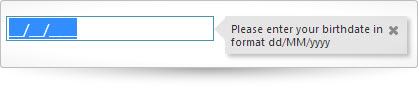
次のコード スニペットは igDateEditor コントロールで igPopover コントロールの初期化方法を示しています。
igPopover コントロールに必要なスクリプトおよびテーマの参照方法についての詳細は、 Ignite UI での JavaScript リソースの使用および Ignite UI のスタイルとテーマの設定をお読みください。
コード サンプル
<!doctype html>
<html>
<head>
    <!-- Infragistics Combined CSS -->
    <link href="css/themes/infragistics/infragistics.theme.css" rel="stylesheet" type="text/css" />
    <link href="css/structure/infragistics.css" rel="stylesheet" type="text/css" />
    <!-- jQuery Core -->
    <script src="js/jquery.js" type="text/javascript"></script>
    <!-- jQuery UI -->
    <script src="js/jquery-ui.js" type="text/javascript"></script>
    <!-- Infragistics Combined Scripts -->
    <script src="js/infragistics.core.js" type="text/javascript"></script>
    <script src="js/infragistics.lob.js" type="text/javascript"></script>
    <script type="text/javascript">
        $(function () {
            $("#dateEditor").igDateEditor();
            $("#dateEditor").igPopover({
                direction: "right",
                position: "start",
                headerTemplate {
                  closeButton: true
                },
                closeOnBlur: true,
                animationDuration: 150,
                maxHeight: null,
                maxWidth: 170,
                showOn: "focus"
            });
        });
    </script>
</head>
<body>
    <input id="dateEditor" type="date" title="Please enter your birthdate in format dd/MM/yyyy" />
</body>
</html>
関連サンプル
依存関係
-
animationDuration
- タイプ:
- number
- デフォルト:
- 150
ポップオーバーを表示/非表示するときのフェード期間を設定します。
コード サンプル
//Initialize $(".selector").igPopover({ animationDuration:200 }); // Get var animationDuration = $(".selector").igPopover("option", "animationDuration"); // Set $(".selector").igPopover("option", "animationDuration", 100); -
appendTo
- タイプ:
- enumeration
- デフォルト:
- body
ポップオーバー DOM に添付する要素を設定します。
メンバー
- string
- タイプ:string
- 要素の有効な jQuery セレクター。
- object
- タイプ:object
- 親 jQuery オブジェクトへの参照。
コード サンプル
//Initialize $(".selector").igPopover({ appendTo: $(".jquerySelector") }); -
closeOnBlur
- タイプ:
- bool
- デフォルト:
- true
ポップオーバーがぼかしで閉じるかどうかを制御します。
コード サンプル
//Initialize $(".selector").igPopover({ closeOnBlur:false }); //Get var closeOnBlur = $(".selector").igPopover("option", "closeOnBlur"); -
containment
- タイプ:
- object
- デフォルト:
- null
ポップオーバーのコンテインメントを設定します。jQuery オブジェクトを受け付けます。
コード サンプル
//Initialize $(".selector").igPopover({ containment:$('#popoverDivElement') }); //Get var containment = $(".selector").igPopover("option", "containment"); // Set $(".selector").igPopover("option", "containment", $('#popoverTooltip' )); -
contentTemplate
- タイプ:
- enumeration
- デフォルト:
- null
ポップオーバー コンテナーのコンテンツを設定します。null の場合、コンテンツはターゲット要素から取得されます。
メンバー
- string
- タイプ:string
- ポップオーバー コンテナーの文字列コンテンツ。
- function
- タイプ:function
- コンテンツを返すコールバックである関数。対象の DOM 要素にアクセスするには、'this' 値を使用します。
コード サンプル
//Initialize //callback function $(".selector").igPopover({ contentTemplate:function() { var imgTemplate = "<img class='map' alt='${value}' src='http://maps.google.com/maps/api/staticmap?zoom=10&size=250x250&maptype=terrain&sensor=false¢er=${value}'>"; var data = [{ value: $( this )[0].value }]; return $.ig.tmpl( imgTemplate, data ); } }); //string content for the popover container $(".selector").igPopover({ contentTemplate:"<img src='http://www.infragistics.com/assets/images/logo.png' title='IG logo' />" }); //Set //Accepts setting the value only if string type is passed $(".selector").igPopover("option", "contentTemplate", "<img src='http://www.infragistics.com/assets/images/logo.png' title='IG logo' />"); //Get var contentFunction = $(".selector").igPopover("option", "contentTemplate"); -
direction
- タイプ:
- enumeration
- デフォルト:
- auto
ターゲット要素に相対してコントロールの表示方向を制御します。
メンバー
- auto
- タイプ:string
- directionPriority プロパティで指定した優先順序で、利用可能なスペースがある側にコントロールを表示します。
- left
- タイプ:string
- ポップオーバーはターゲットの要素の左側に表示されます。
- right
- タイプ:string
- ポップオーバーはターゲットの要素の右側に表示されます。
- top
- タイプ:string
- ポップオーバーはターゲットの要素の上側に表示されます。
- bottom
- タイプ:string
- ポップオーバーはターゲットの要素の下側に表示されます。
コード サンプル
//Initialize $(".selector").igPopover({ direction:"right" }); //Get var direction = $(".selector").igPopover("option", "direction"); //Set $(".selector").igPopover("option", "direction", "top"); -
directionPriority
- タイプ:
- array
- デフォルト:
- []
- 要素タイプ:
- string
ターゲット要素に相対するコントロールが表示スペースを検索する優先度を制御します。
このプロパティは、direction プロパティ値が "auto" または設定されていない場合のみに使用されます。コード サンプル
//Initialize $(".selector").igPopover({ directionPriority:[ "top", "bottom", "left", "right" ] }); //Get var position = $(".selector").igPopover("option", "directionPriority"); //Set $(".selector").igPopover("option", "directionPriority",[ "left", "top", "bottom", "right" ]); -
headerTemplate
- タイプ:
- object
- デフォルト:
- {}
ポップオーバー ヘッダーのコンテンツを設定します。
コード サンプル
//Initialize $(".selector").igPopover({ headerTemplate: { closeButton:true, title :"The title of the popover" } }); //Get var headerTemplate = $(".selector").igPopover("option", "headerTemplate");-
closeButton
- タイプ:
- bool
- デフォルト:
- false
ポップオーバーが [閉じる] ボタンを描画するかどうかを制御します。
コード サンプル
//Initialize $(".selector").igPopover({ headerTemplate { closeButton: true } }); // Get var closeButton = $(".selector").igPopover("option", "headerTemplate"); -
title
- タイプ:
- string
- デフォルト:
- null
ポップオーバー ヘッダーのコンテンツを設定します。
コード サンプル
       //Initialize
        $(".selector").igPopover({
          headerTemplate {
            title : "The title of the popover"
          }
		    });

      // Get
		  var title = $(".selector").igPopover("option", "headerTemplate");
-
height
- タイプ:
- enumeration
- デフォルト:
- null
ポップオーバーの高さを定義します。null を指定すると、auto に解決します。
メンバー
- number
- 高さを数字に設定できます。
- string
- 高さをピクセル (px) に設定できます。
コード サンプル
//Initialize $(".selector").igPopover({ height:200 }); // Get var height = $(".selector").igPopover("option", "height"); -
language
継承- タイプ:
- string
- デフォルト:
- "en"
ウィジェットのロケール言語設定を取得または設定します。
コード サンプル
//Initialize $(".selector").igPopover({ language: "ja" }); // Get var language = $(".selector").igPopover("option", "language"); // Set $(".selector").igPopover("option", "language", "ja"); -
locale
継承- タイプ:
- object
- デフォルト:
- null
ウィジェットのロケール設定を取得または設定します。
コード サンプル
//Initialize $(".selector").igPopover({ locale: {} }); // Get var locale = $(".selector").igPopover("option", "locale"); // Set $(".selector").igPopover("option", "locale", {}); -
maxHeight
- タイプ:
- enumeration
- デフォルト:
- 200
高さが設定されなくても、ポップオーバーの最大高さを定義します。
メンバー
- number
- 最大の高さは数値として設定できます。
- string
- 最大の高さはピクセル (px) として設定できます。
コード サンプル
//Initialize $(".selector").igPopover({ maxHeight:"300px" }); // Get var maxHeight = $(".selector").igPopover("option", "maxHeight"); -
maxWidth
- タイプ:
- enumeration
- デフォルト:
- 200
幅が設定されなくても、ポップオーバーの最大幅を定義します。
メンバー
- number
- maxWidth を数字に設定できます。
- string
- maxWidth をピクセル (px) に設定できます。
コード サンプル
//Initialize $(".selector").igPopover({ maxWidth:"300px" }); //Get var maxWidth = $(".selector").igPopover("option", "maxWidth"); -
minWidth
- タイプ:
- enumeration
- デフォルト:
- 60
幅が設定されなくても、ポップオーバーの最小幅を定義します。
メンバー
- number
- minWidth を数字に設定できます。
- string
- minWidth をピクセル (px) に設定できます。
コード サンプル
//Initialize $(".selector").igPopover({ minWidth:"70px" }); // Get var minWidth = $(".selector").igPopover("option", "minWidth"); -
position
- タイプ:
- enumeration
- デフォルト:
- auto
配置する側でポップオーバーがターゲットの要素より大きいの場合、ターゲット要素に対してポップオーバーの配置を制御します。ポップオーバーがターゲットの要素より小さい場合、表示可能な領域の中央に配置されます。
メンバー
- auto
- タイプ:string
- 「中央 > 終了 > 開始」の優先順序で、利用可能なスペースに基づいて、コントロールは位置を自動的に選択します。
- balanced
- タイプ:string
- ポップオーバーはターゲットの要素の中央に配置されます。
- start
- タイプ:string
- ポップオーバーはターゲットの要素の開始に配置されます。
- end
- タイプ:string
- ポップオーバーはターゲットの要素の終了に配置されます。
コード サンプル
//Initialize $(".selector").igPopover({ position:"balanced" }); //Get var position = $(".selector").igPopover("option", "position"); //Set $(".selector").igPopover("option", "position", "start"); -
regional
継承- タイプ:
- enumeration
- デフォルト:
- en-US
ウィジェットの領域設定を取得または設定します。
コード サンプル
//Initialize $(".selector").igPopover({ regional: "ja" }); // Get var regional = $(".selector").igPopover("option", "regional"); // Set $(".selector").igPopover("option", "regional", "ja"); -
selectors
- タイプ:
- string
- デフォルト:
- null
どの項目がポップオーバーを表示するかを示すセレクター。定義済みの値は [title] です。title 属性以外のことをポップオーバーのコンテンツとして使用するか、イベント デリゲーションのために別のセレクターが必要な場合にカスタマイズします。このオプションを変更する場合、contentTemplate オプションも変更する必要があります。
コード サンプル
/Initialize $(".selector").igPopover({ selectors:"[value],a" // elements which have attribute 'value' and the hyperlinks (anchor elements) }); //Get var selectors = $(".selector").igPopover("option", "selectors"); -
showOn
- タイプ:
- enumeration
- デフォルト:
- mouseenter
ポップオーバーが表示されるイベントを設定します。定義済みの値は mouseenter、click、および focus です。
メンバー
- mouseenter
- タイプ:string
- ポップオーバーはターゲットの要素のマウス入りで表示されます。
- click
- タイプ:string
- ポップオーバーはターゲットの要素のクリックで表示されます。
- focus
- タイプ:string
- ポップオーバーはターゲットの要素のフォーカスで表示されます。
コード サンプル
//Initialize $(".selector").igPopover({ showOn:"focus" }); //Get var showOn = $(".selector").igPopover("option", "showOn"); -
width
- タイプ:
- enumeration
- デフォルト:
- null
ポップオーバーの幅を定義します。null を指定すると、auto に解決します。
メンバー
- number
- 幅を数字で設定できます。
- string
- 幅をピクセル (px) で設定できます。
コード サンプル
					//Initialize
					$(".selector").igPopover({
						width:300
					});
					//Get
					var width = $(".selector").igPopover("option", "width");
Ignite UI コントロール イベントの詳細については、
Ignite UI でイベントを使用するを参照してください。
-
hidden
- キャンセル可能:
- false
ポップオーバーが非表示された後に発生するイベント。
コード サンプル
//Bind after initialization $(document).on("igpopoverhidden", ".selector", function (evt, ui) { //return the triggered event evt; //reference to the igPopover widget. ui.owner; //reference the element the popover hid for. ui.element; // reference the current content displayed in the popover as a string. ui.content; //reference the popover element hidden. ui.popover; }); //Initialize $(".selector").igPopover({ hidden: function (evt, ui) { ... } }); -
hiding
- キャンセル可能:
- true
ポップオーバーが非表示する前に発生するイベント。
コード サンプル
//Bind after initialization (document).on("igpopoverhiding", ".selector", function (evt, ui) { //return the triggered event evt; //reference to the igPopover widget. ui.owner; //reference the element the popover will hide for. ui.element; //reference the current content in the popover as a string. ui.content; //reference the popover element hiding. ui.popover; ); /Initialize (".selector").igPopover({ hiding: function (evt, ui) { ... } }); -
showing
- キャンセル可能:
- true
ポップオーバーが表示する前に発生するイベント。
コード サンプル
//Bind after initialization $(document).on("igpopovershowing", ".selector", function (evt, ui) { //return the triggered event evt; //reference to the igPopover widget. ui.owner; //reference the element the popover will show for. ui.element; //reference the current content to be shown as a string. ui.content; //reference the popover element showing. ui.popover; }); //Initialize $(".selector").igPopover({ showing: function (evt, ui) { ... } }); -
shown
- キャンセル可能:
- false
ポップオーバーが表示された後に発生するイベント。
コード サンプル
				//Bind after initialization
				$(document).on("igpopovershown", ".selector", function (evt, ui) {
					//return the triggered event
					evt;

					//reference to the igPopover widget.
					ui.owner;

					// reference the element the popover showed for.
					ui.element;

					//reference the content that was shown as a string.
					ui.content;

					// reference the popover element shown.
					ui.popover;
				});

				//Initialize
				$(".selector").igPopover({
					shown: function (evt, ui) {
						...
				}
				});
-
changeGlobalLanguage
継承- .igPopover( "changeGlobalLanguage" );
ウィジェットの言語をグローバルの言語に変更します。グローバルの言語は $.ig.util.language の値です。
コード サンプル
$(".selector").igPopover("changeGlobalLanguage"); -
changeGlobalRegional
継承- .igPopover( "changeGlobalRegional" );
ウィジェットの地域設定をグローバルの地域設定に変更します。グローバルの地域設定は $.ig.util.regional にあります。
コード サンプル
$(".selector").igPopover("changeGlobalRegional"); -
changeLocale
継承- .igPopover( "changeLocale", $container:object );
指定したコンテナーに含まれるすべてのロケールを options.language で指定した言語に変更します。
注: このメソッドは珍しいシナリオのみで使用されます。language または locale オプションのセッターを参照してください。- $container
- タイプ:object
- オプションのパラメーター: 設定しない場合、ウィジェットの要素を $container として使用します。
コード サンプル
$(".selector").igPopover("changeLocale"); -
container
- .igPopover( "container" );
- 返却型:
- object
ポップオーバー コンテンツのコンテナーを返します。
コード サンプル
$( ".selector" ).igPopover( "container" );
-
destroy
- .igPopover( "destroy" );
ポップオーバー ウィジェットを破棄します。
コード サンプル
$( ".selector" ).igPopover( "destroy" );
-
getContent
- .igPopover( "getContent" );
- 返却型:
- string
- 返却型の説明:
- ポップオーバー コンテンツ。
ポップオーバー コンテナーの設定されているコンテンツを取得します。
コード サンプル
var currentContent = $( ".selector" ).igPopover( "getContent" );
-
getCoordinates
- .igPopover( "getCoordinates" );
- 返却型:
- object
- 返却型の説明:
- ポップオーバーの座標 (ピクセル)。
ポップオーバーの現在の座標を取得します。
コード サンプル
var coordinates = $( ".selector" ).igPopover( "getCoordinates" );
-
hide
- .igPopover( "hide" );
指定されたターゲットにポップオーバーを非表示します。
コード サンプル
$(".selector").igPopover( "hide" ); -
id
- .igPopover( "id" );
- 返却型:
- string
ポップオーバーにアタッチされた要素の ID を返します。
コード サンプル
var popoverID = $( ".selector" ).igPopover( "id" );
-
setContent
- .igPopover( "setContent", newCnt:string );
ポップオーバー コンテナーのコンテンツを設定します。
- newCnt
- タイプ:string
- 設定するポップオーバー コンテンツ。
コード サンプル
$( ".selector" ).igPopover("setContent", "New Content To be Set"); -
setCoordinates
- .igPopover( "setCoordinates", pos:object );
ポップオーバーを特定の座標に設定します。
- pos
- タイプ:object
- ポップオーバーの座標 (ピクセル)。
コード サンプル
var position = {top: 300, left: 450}; $( ".selector" ).igPopover( "setCoordinates" , position); -
show
- .igPopover( "show", [trg:domelement], [content:string] );
指定されたターゲットにポップオーバーを表示します。
- trg
- タイプ:domelement
- オプション
- ポップオーバーで表示する要素。
- content
- タイプ:string
- オプション
- ポップオーバーを表示するために設定する文字列。
コード サンプル
//show the popover for the target it has been initialized before $(".selector").igPopover( "show" ); //show the popover for a new target and with s new content to be displayed $(".selector").igPopover("show", $( "#popover_target" ),"Content to be displayed in the popover"); -
target
- .igPopover( "target" );
- 返却型:
- object
- 返却型の説明:
- 現在のターゲット。
ポップオーバーの現在のターゲットを取得します。
コード サンプル
var target = $( ".selector" ).igPopover( "target" );
-
ui-igpopover-arrow ui-igpopover-arrow-
- ポップオーバーの矢印に適用されるクラス (ui-igpopover-arrow-top、ui-igpopover-arrow-left など)。
-
ui-widget ui-igpopover
- メインのポップオーバー コンテナーに適用するクラス。
-
ui-icon ui-icon-closethick ui-igpopover-close-button
- [閉じる] ボタンに適用されるクラス。
-
ui-igpopover-title
- タイトルがオプションで定義される場合、タイトル コンテナーに適用されるクラス。